Program Book »Connect & Disconnect« for the Typographic Society Munich [Voluntary Engagement]
PROJECT
EDITORIAL DESIGN, TYPE DESIGN AND PRODUCTION CONCEPT
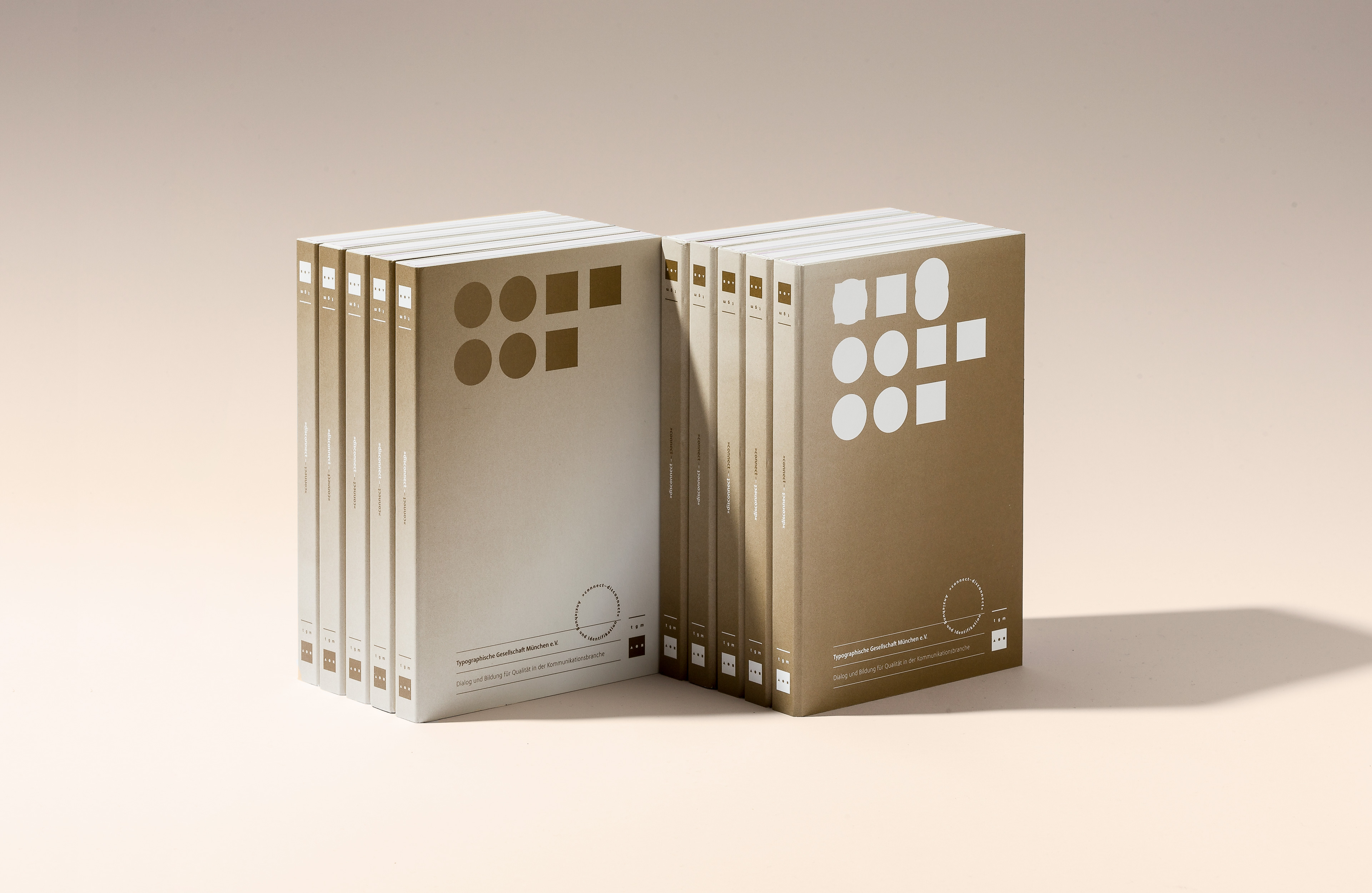
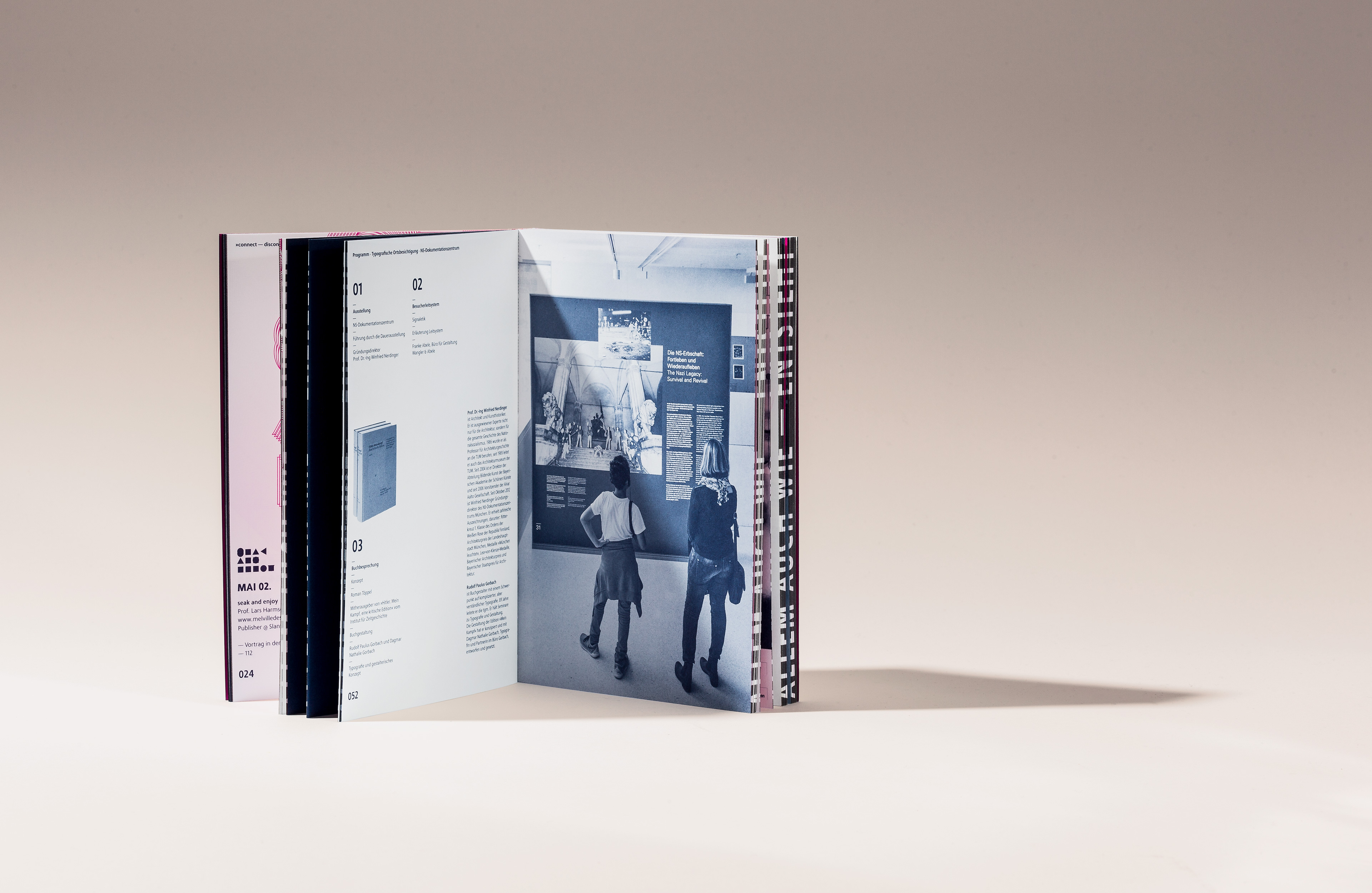
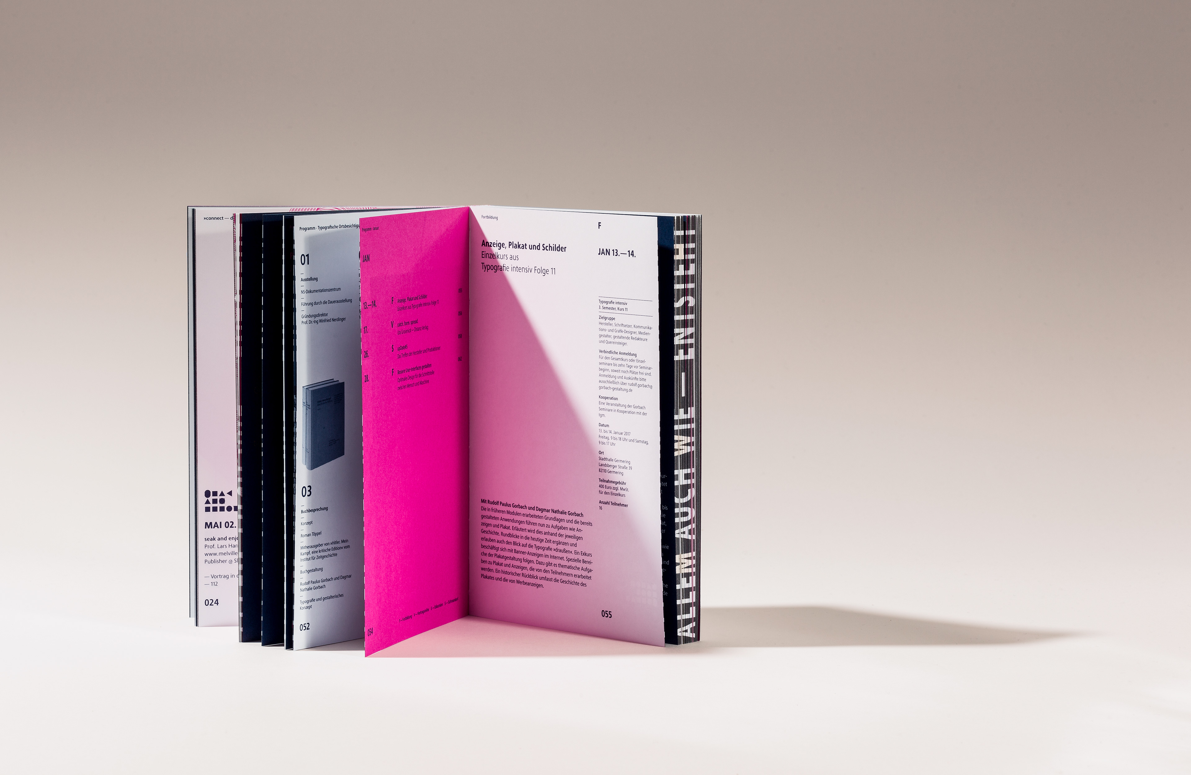
The Typographic Society Munich, founded in 1874, is a prestigious association with over 1,000 members. Driven by its commitment to »Dialogue and Education for Quality in the Communication Industry,« it offers a wide range of courses, seminars and excursions, all organized by its volunteer members.
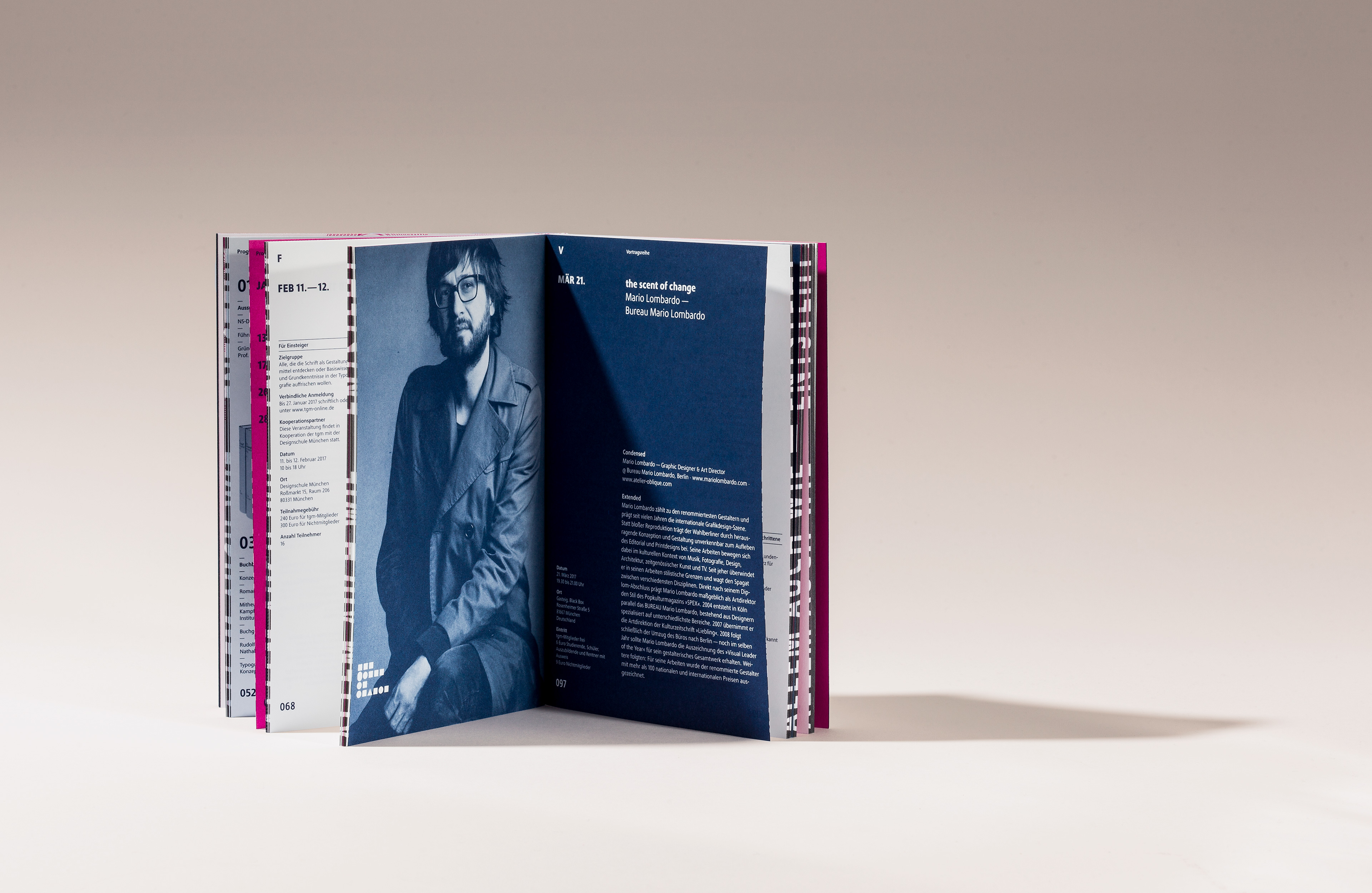
One of the highlights of the program is the lecture series, which over time has brought prominent design figures to the stage, much to the delight of Munich‘s creative community. Notable speakers include Stefan Sagmeister, Eike König, Mirko Borsche, Mario Lombardo, Erik Spiekerman, Paula Scher, Ruedi Baur, Fons Hickmann, Amir Kassaei, Joachim Sauter, Oliviero Toscani, Niklaus Troxler, Gerard Unger, Kurt Weidemann and many others.
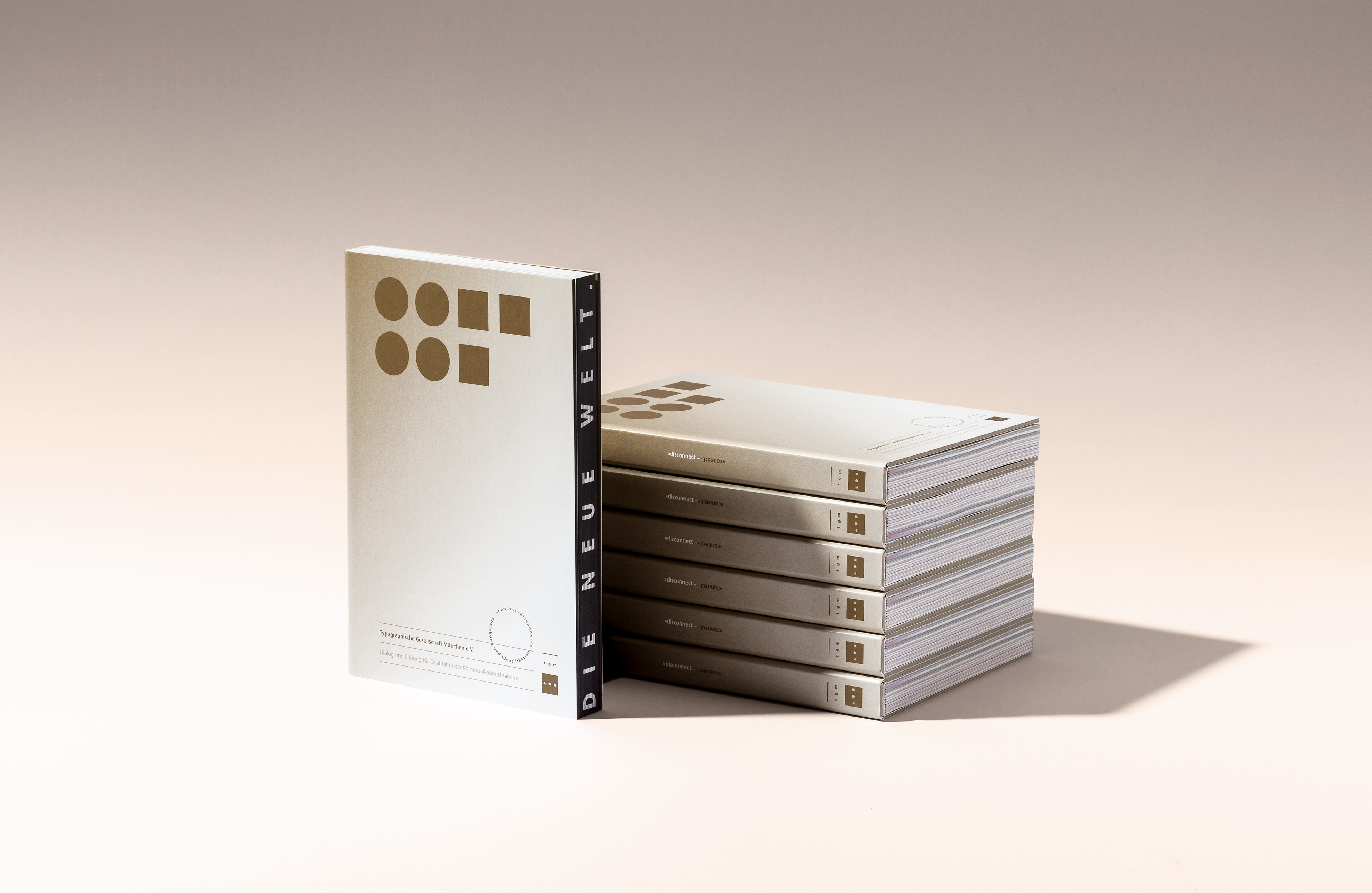
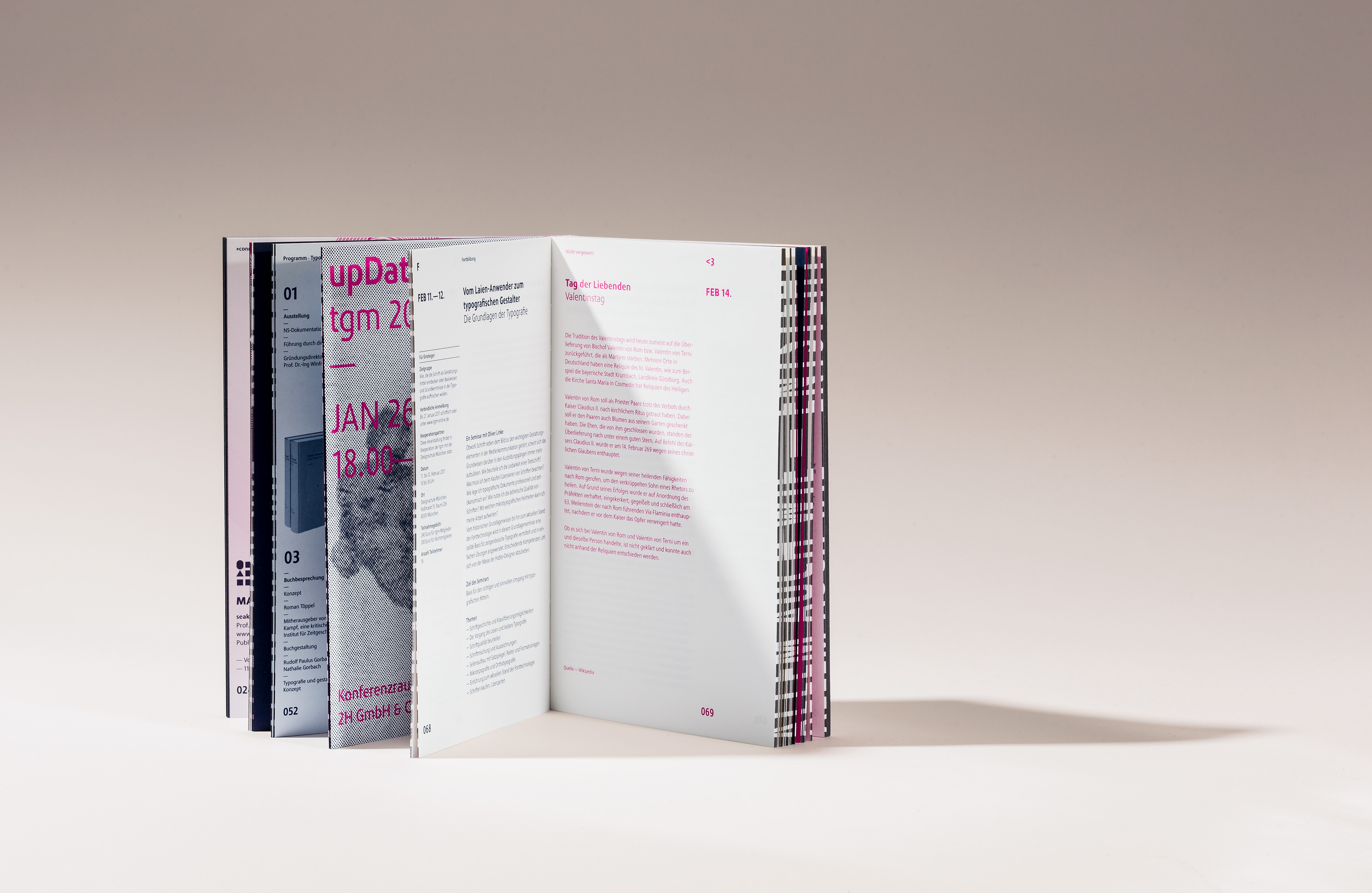
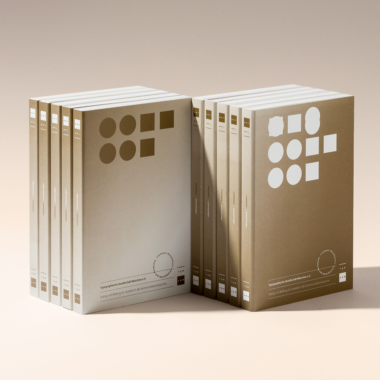
Inspired by my role as one of the chairpersons of the association, I wanted to pull out all the stops in the design and production of the 200-page yearbook.
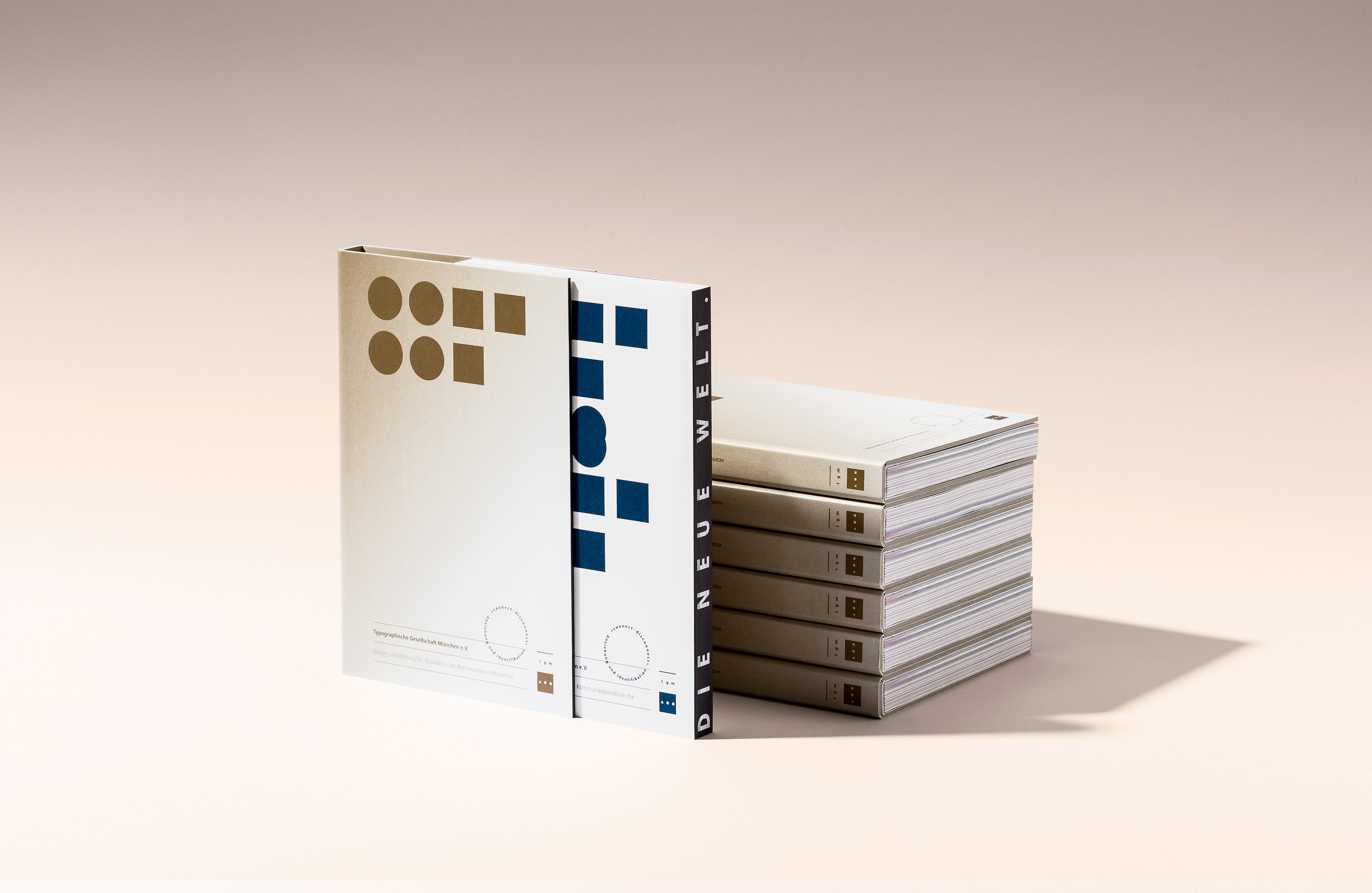
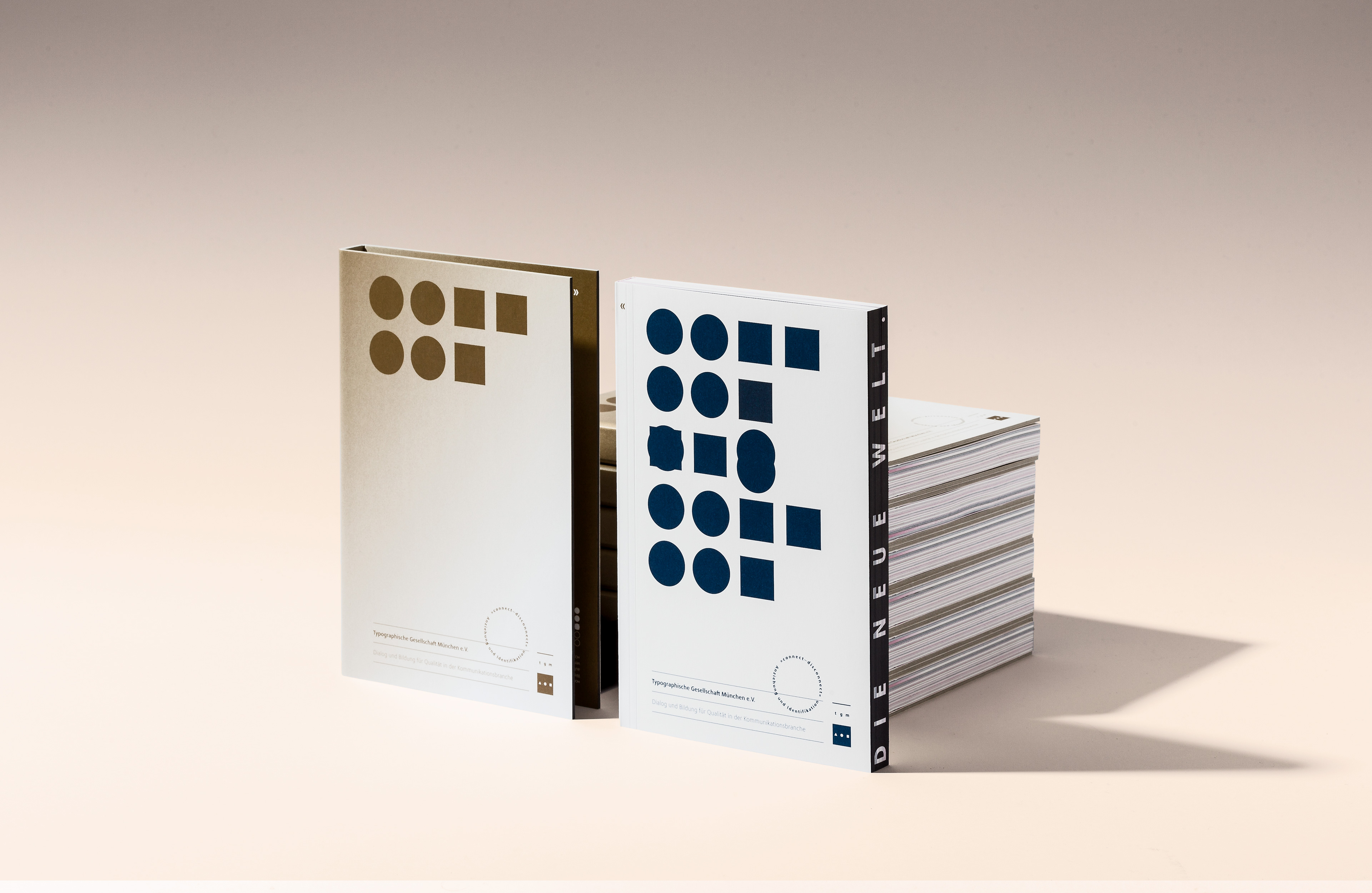
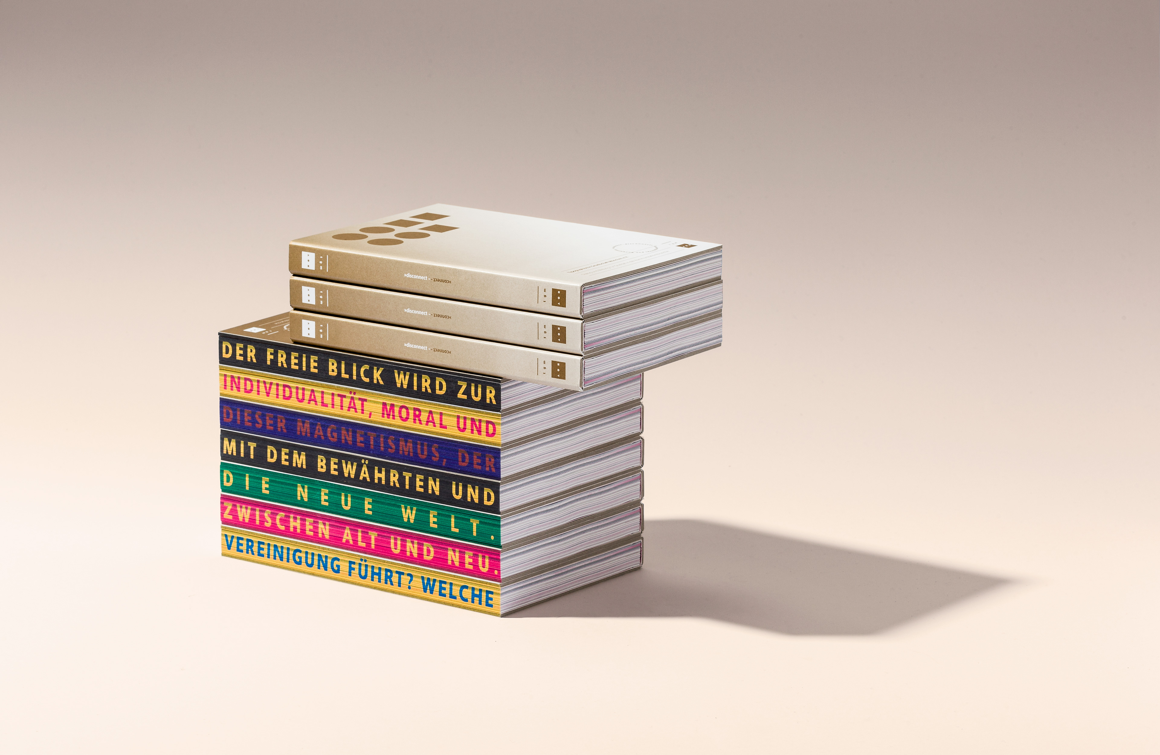
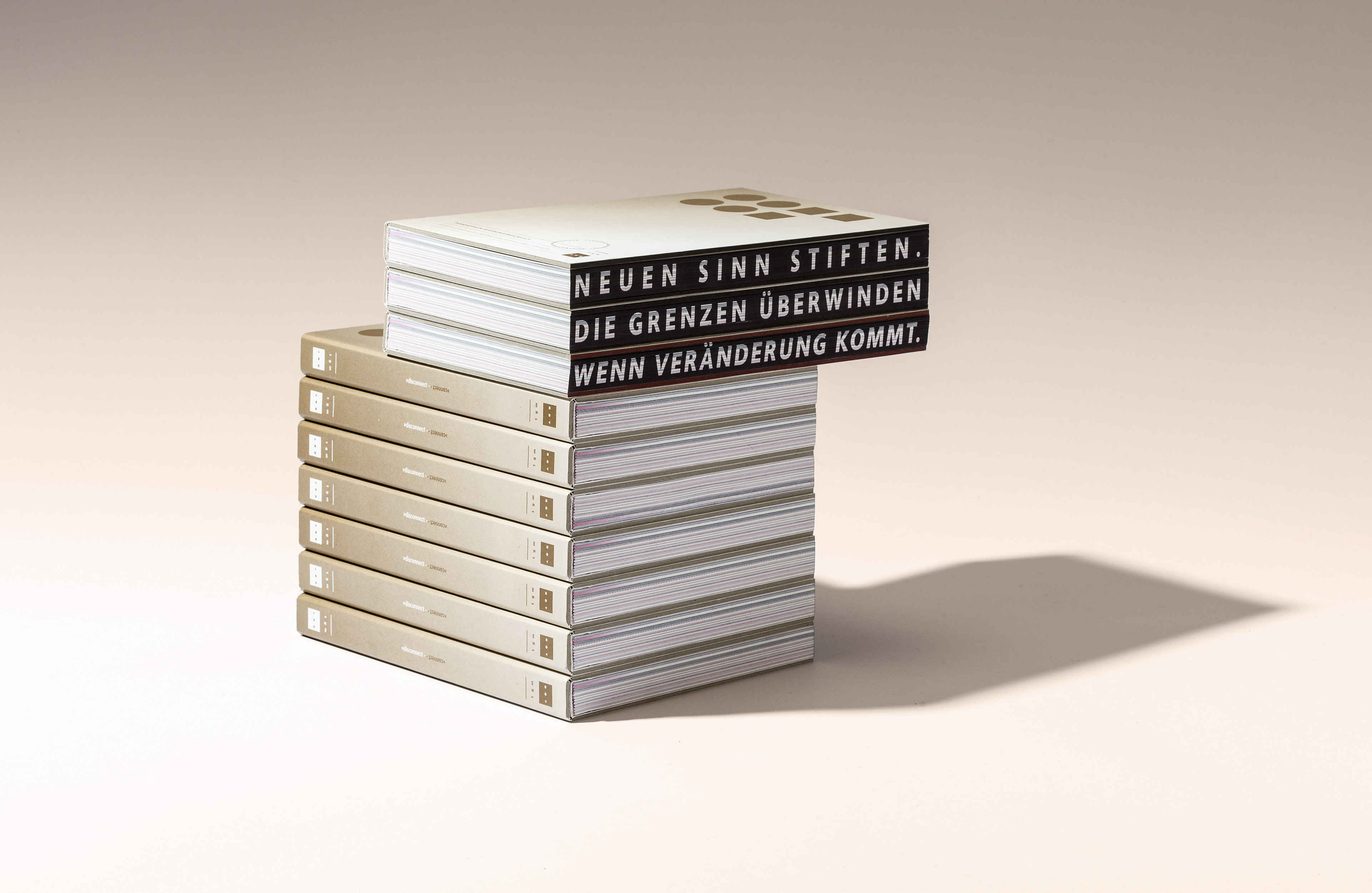
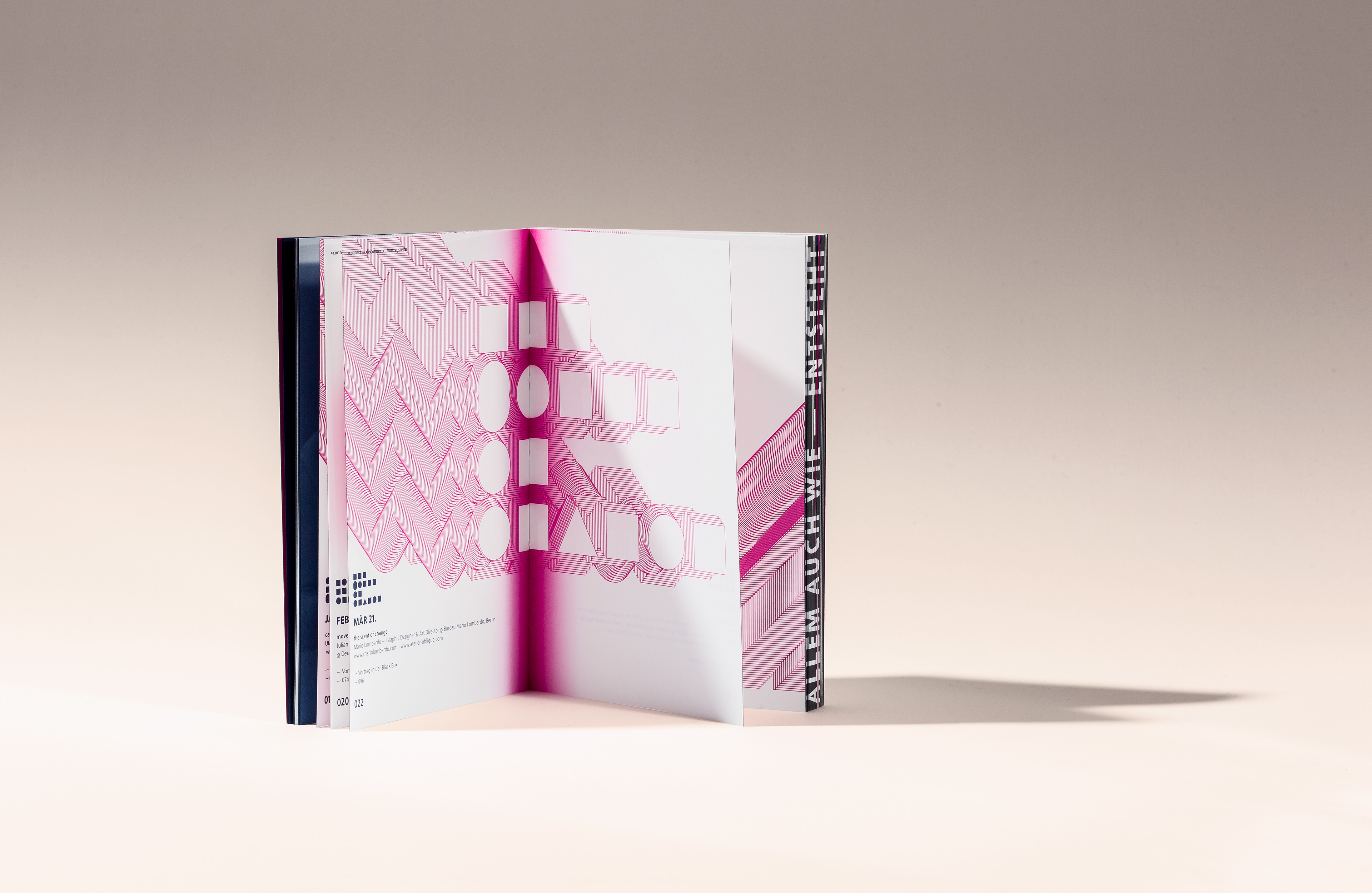
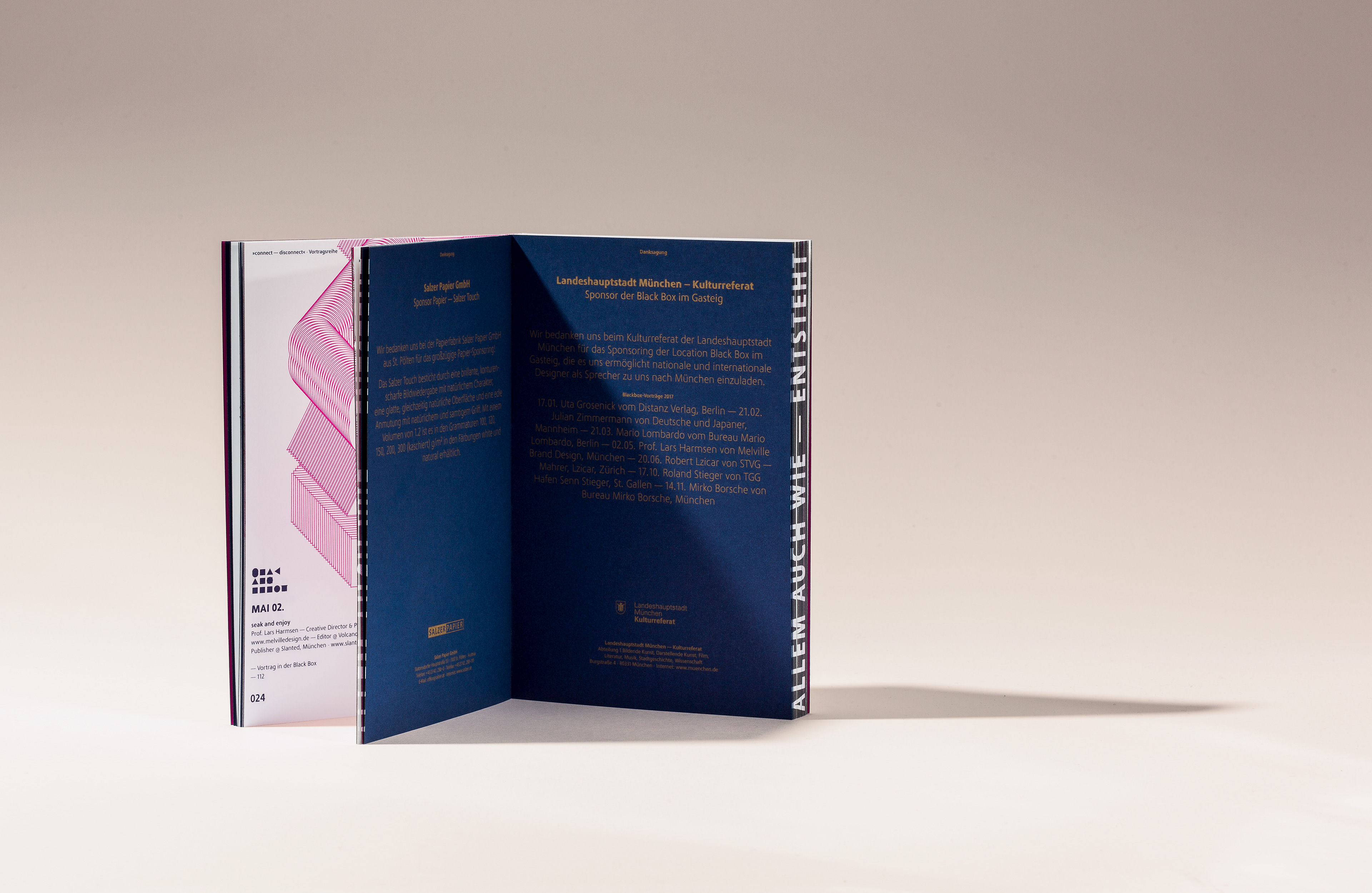
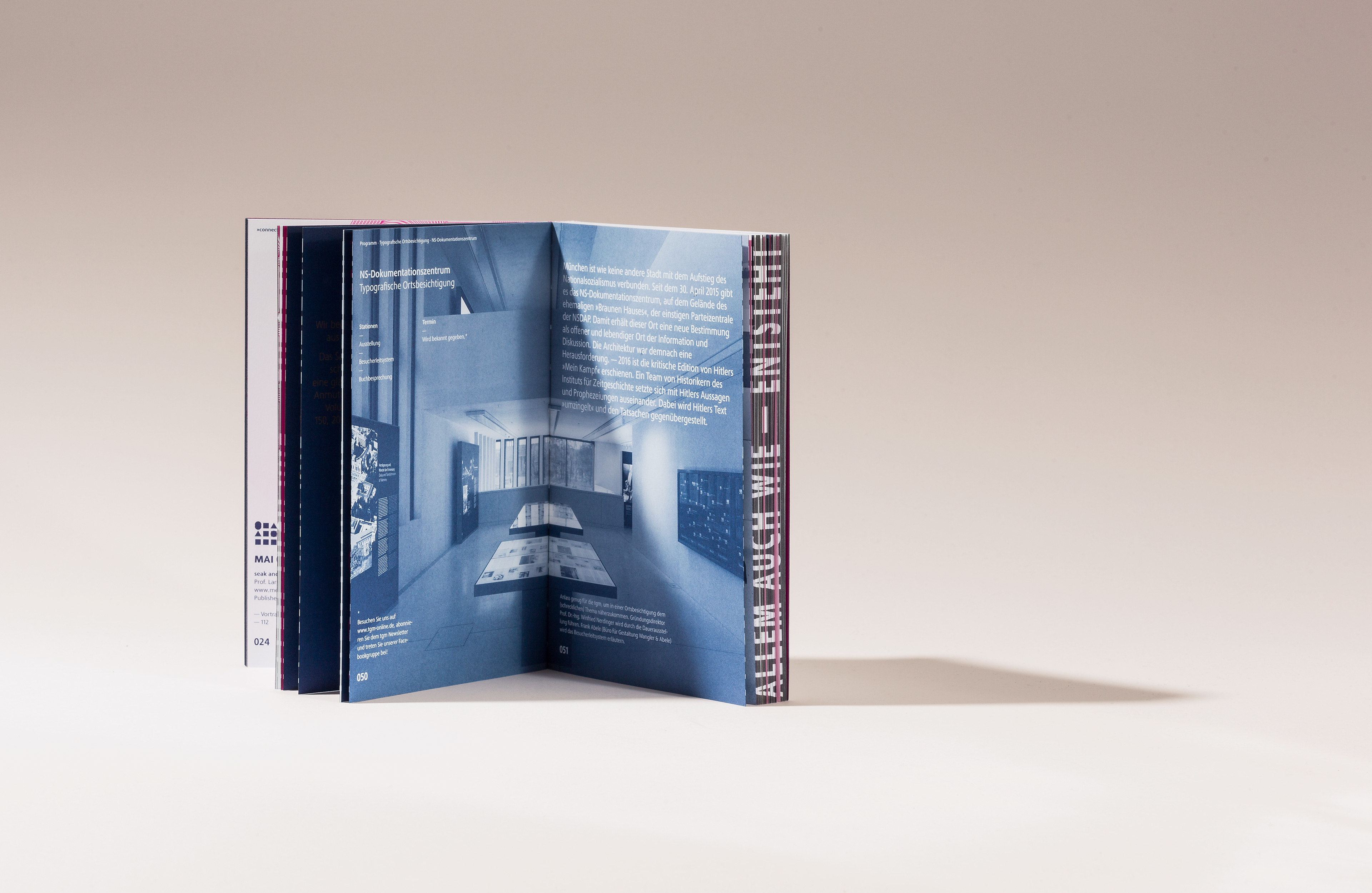
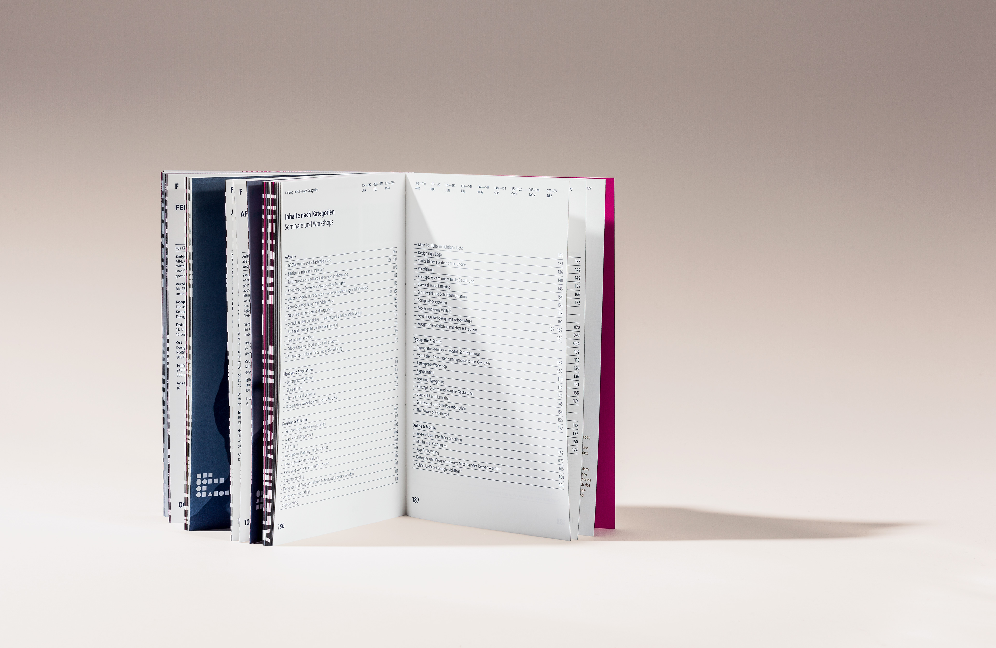
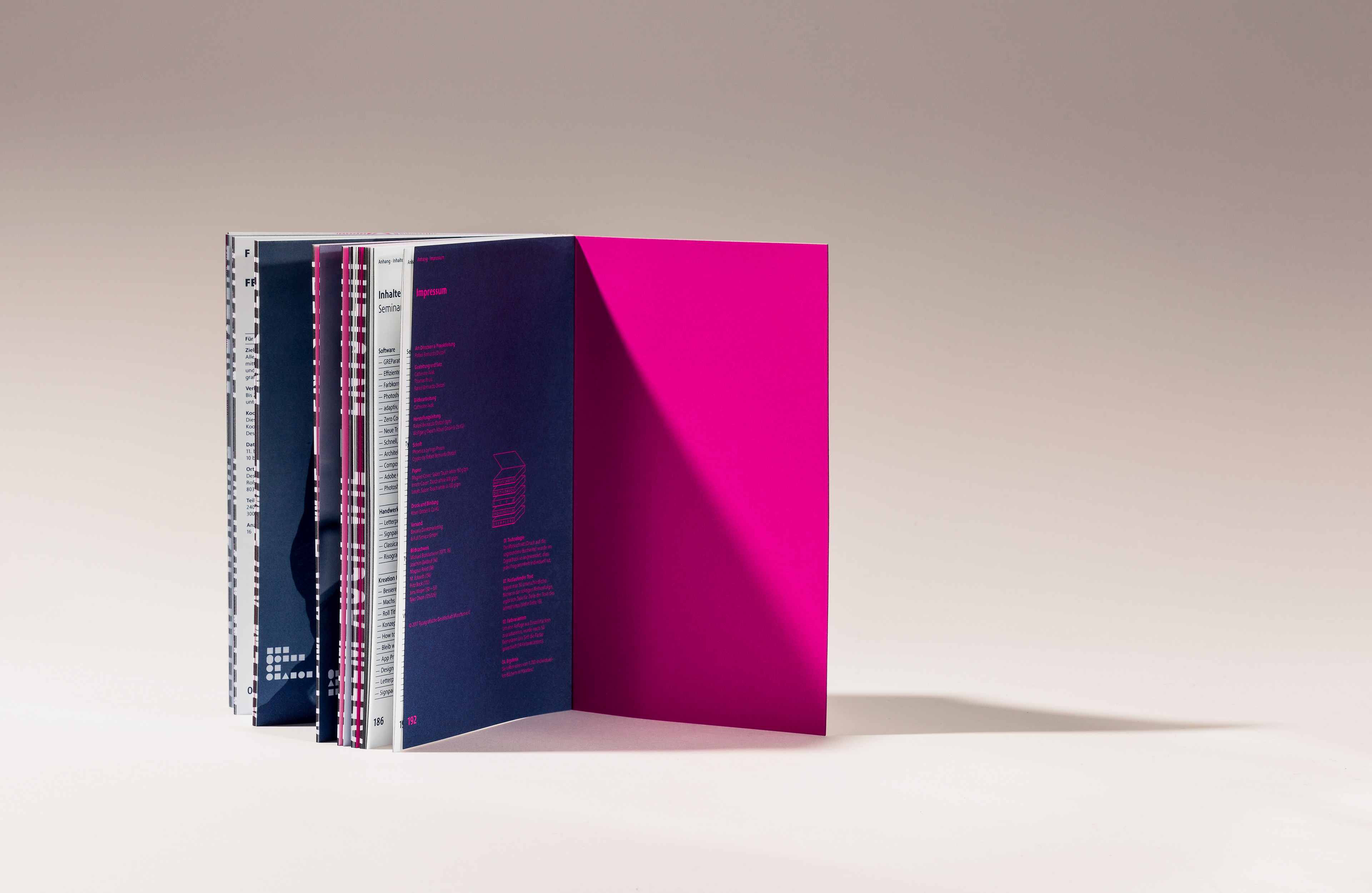
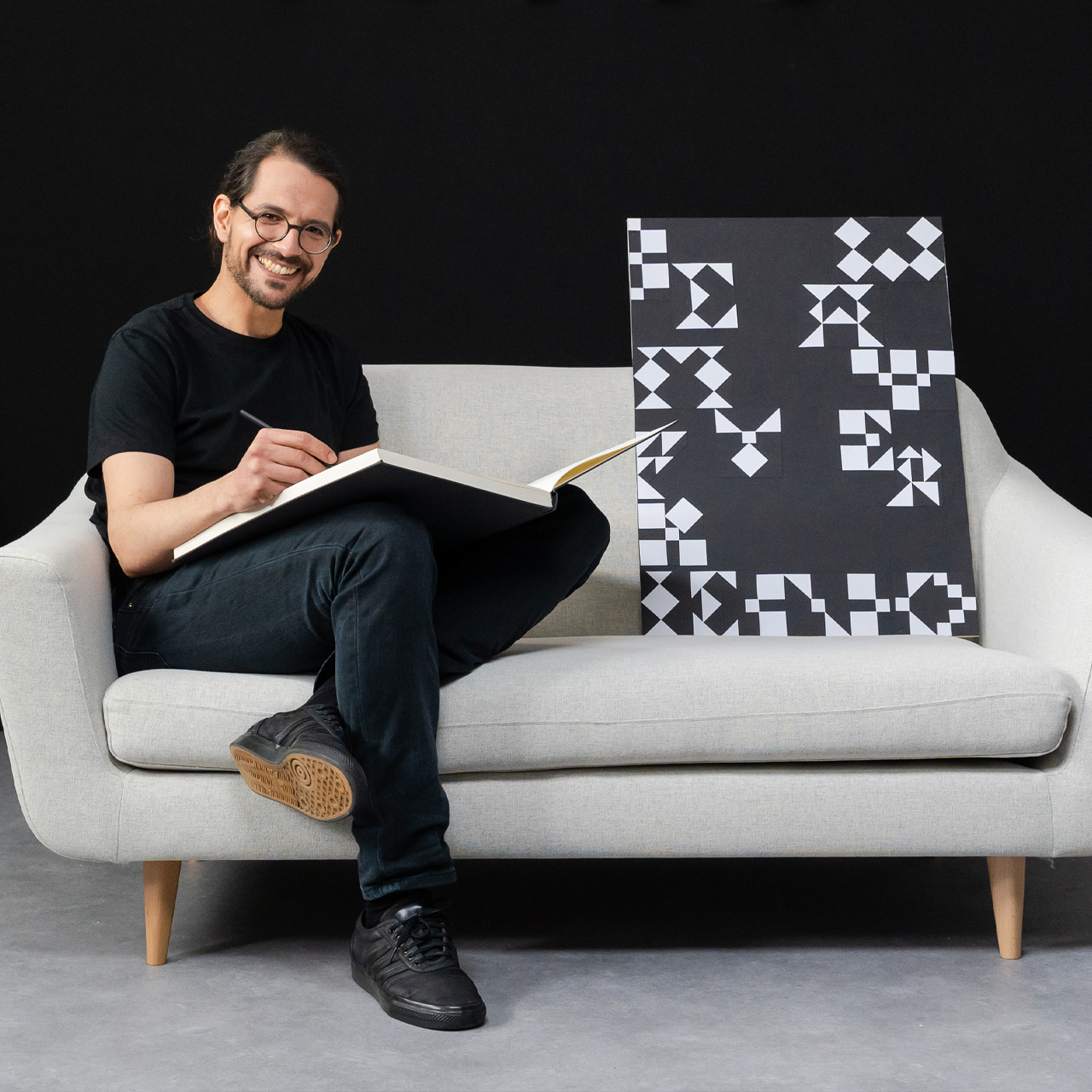
I designed the typeface »Crypto« using elements of triangle, square and circle, derived from the TGM logo. The book was printed exclusively in special colors: gold, bright pink and royal blue. The typographic layout was enriched with numerous functional and playful details, and the yearbook underwent multiple production enhancements. Highlights include the digitally applied edge printing, which allowed each copy to feature one of 50 lines (year text) in one of 35 color variants; and the removable magnetic cover, which gave readers the option to choose between two designs and ponder: »Am I in a connect or disconnect mode right now?«
MAKING OF
This project would not have been possible without the support of many people. Special thanks to Kösel Druck GmbH & Co Kg, the Austrian paper manufacturer Salzer Papier, the design assistance from Catherine Avak and Thomas Pruss and all the association members who contributed to the success of the publication.
CREDITS
. Text und Bild: Typographische Gesellschaft
. Druck: Koesel Druck
. Paper: Salzer Papier
. Case Shoot: Joern Blohm
SERVICES
. Editorial Design
. Type Design
. Produktion concept
BLOG
ARTIKEL, PROJEKTE UND VIDEOS
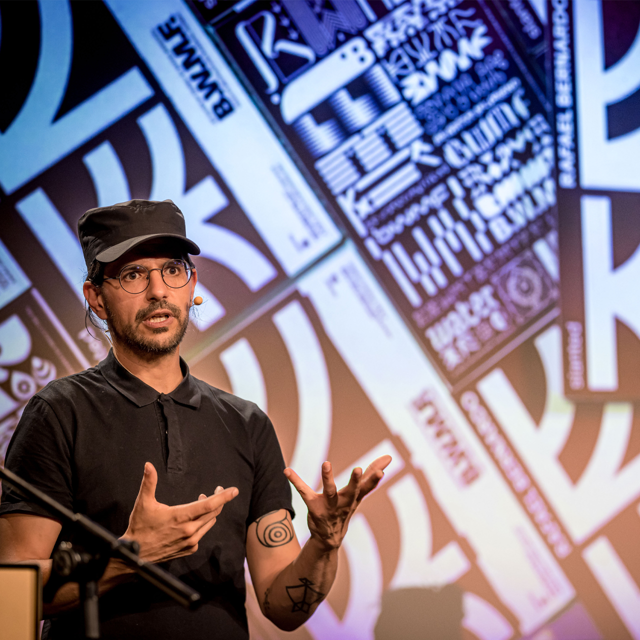
How I developed a methodology to bring creativity into the flow [»Be Water my Friend«]
Article Rafael Bernardo — »Be Water my Friend« Creative Methodology EN
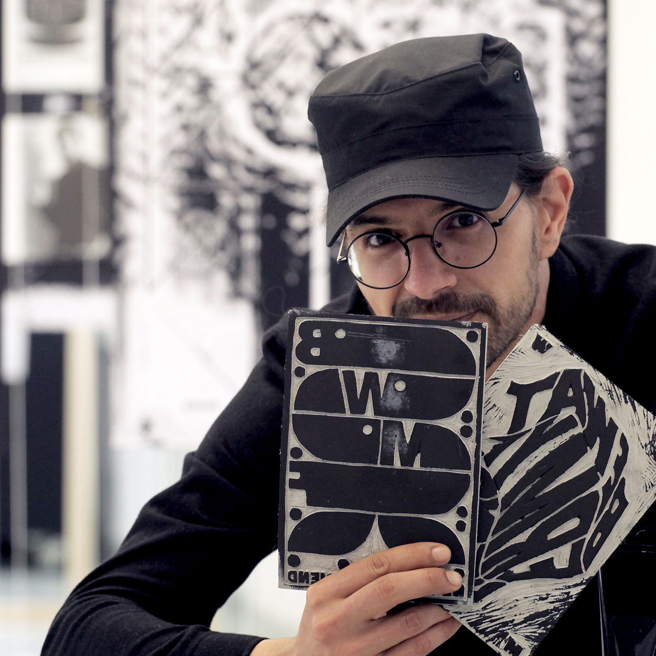
How I rediscovered myself through a personal design project [»Be Water my Friend«]
Article Rafael Bernardo — »Be Water my Friend« Graphic Journey EN
