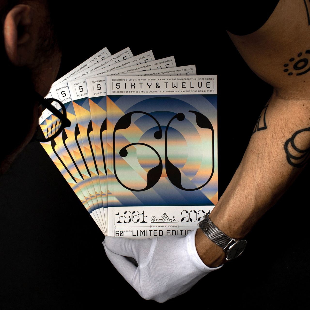
Campaign »Sixty & Twelve« for the Porcelain Manufacturer Rosenthal [60th Anniversary of Rosenthal]
PROJECT
EDITORIAL DESIGN, INFOGRAPHICS AND PRODUCTION CONCEPT
As part of our culture, design is in a constant state of change. This evolution is driven by shifts in the zeitgeist and can be traced through the styles and expressions of past eras. With this perspective, design invites us to embark on a cultural journey through time.
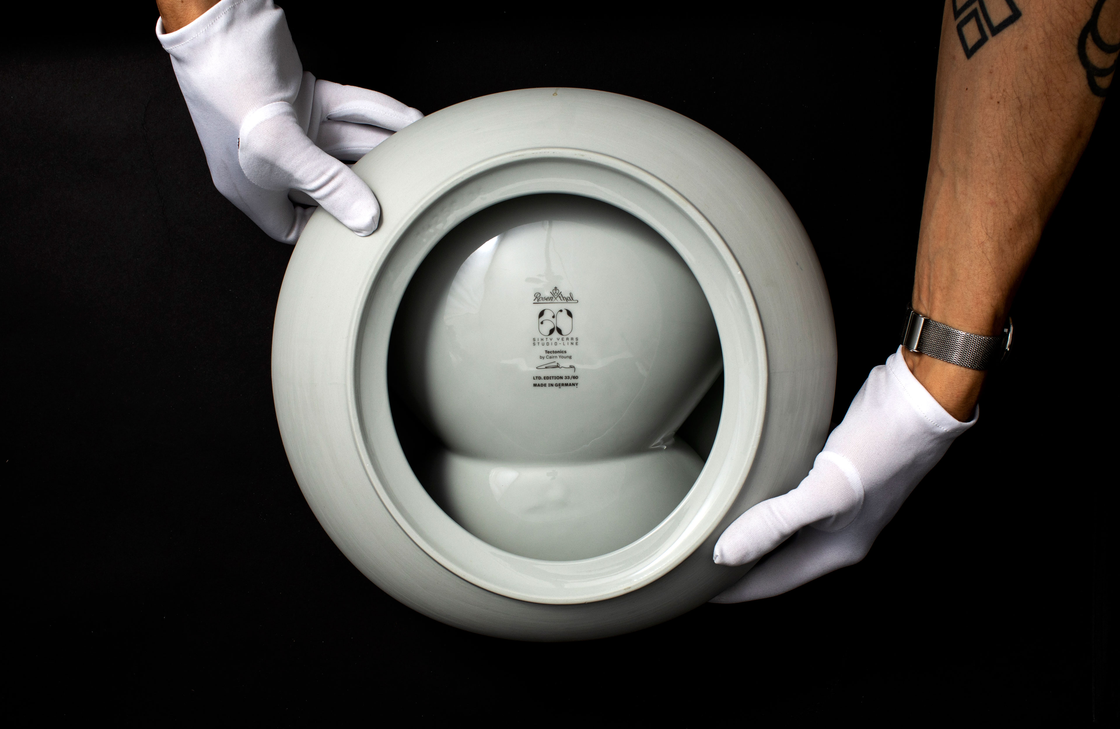
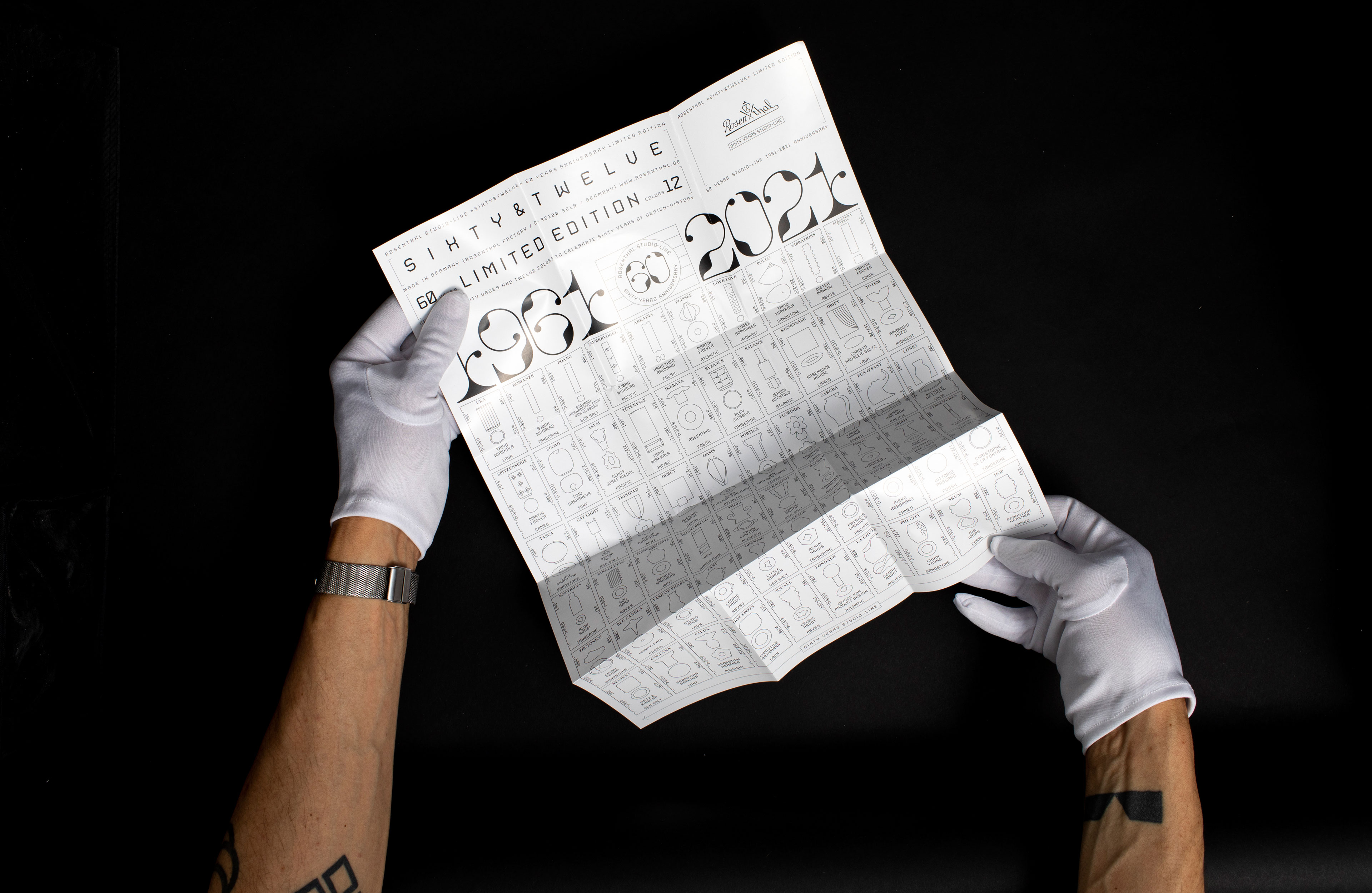
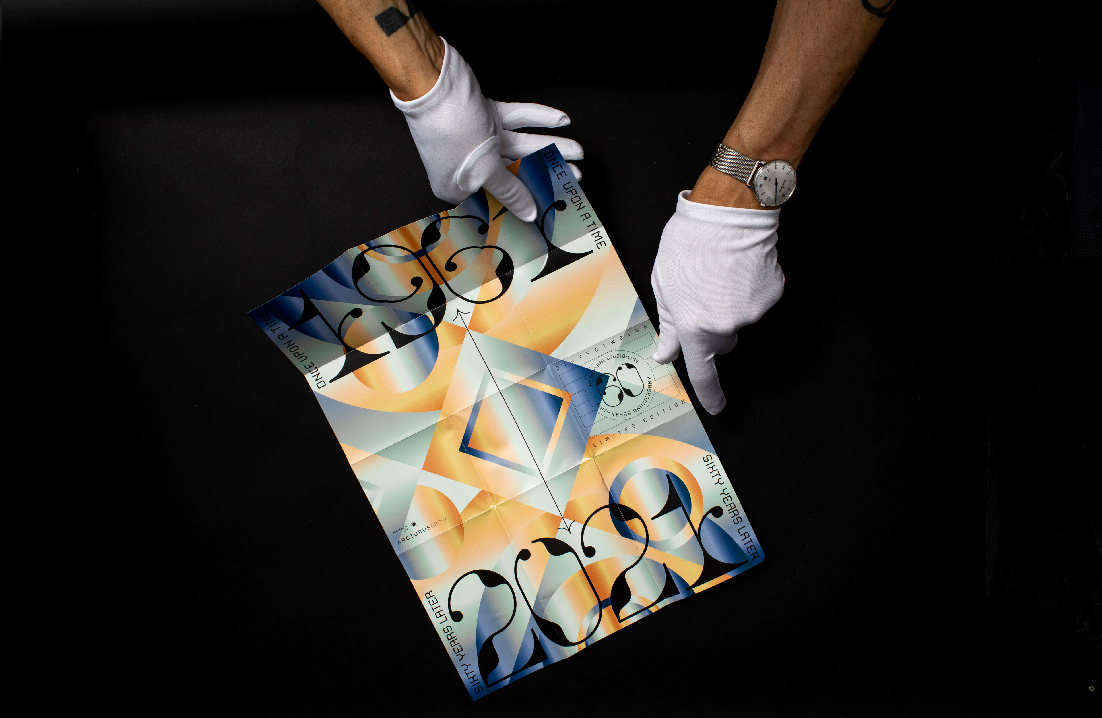
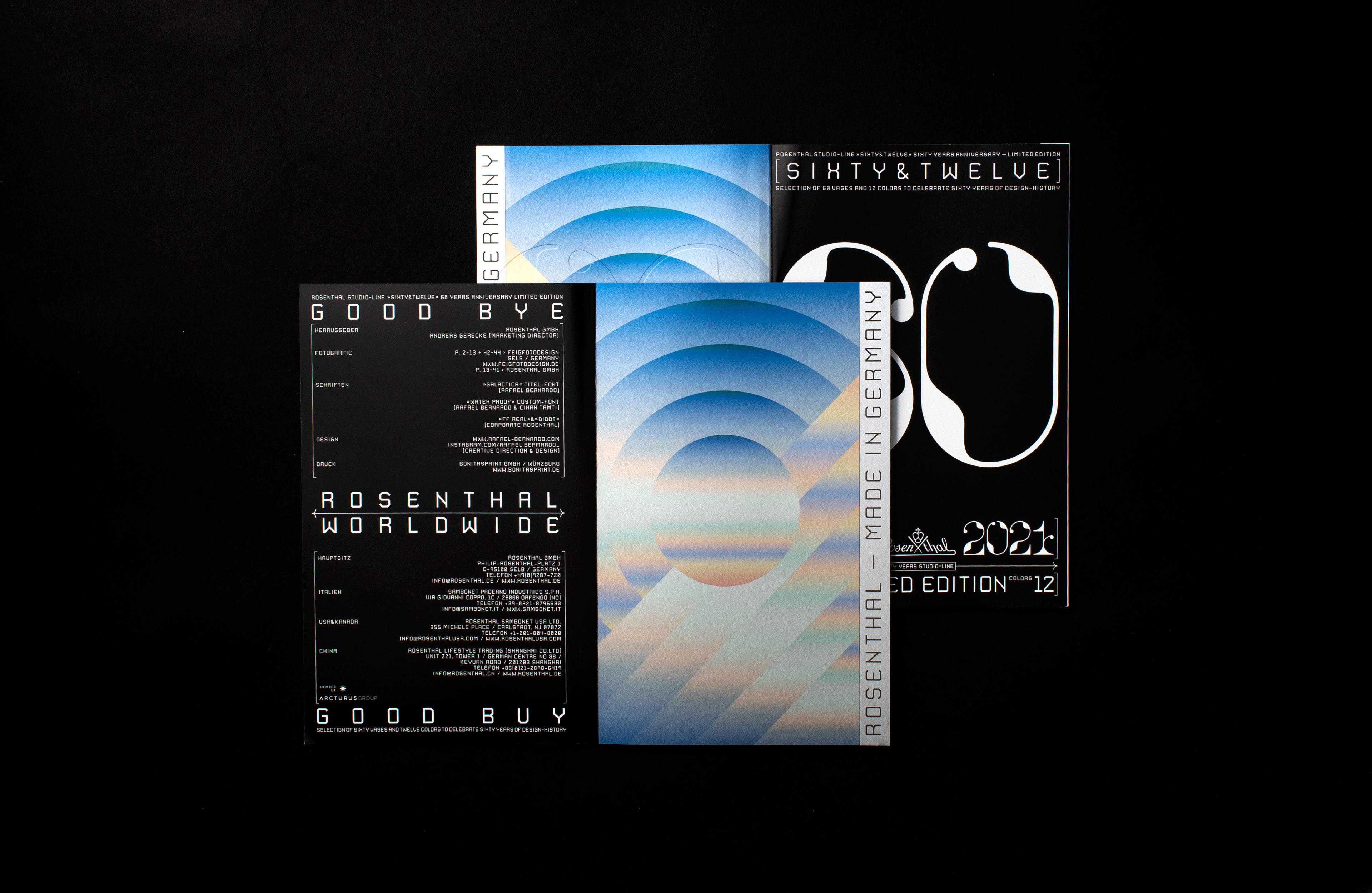
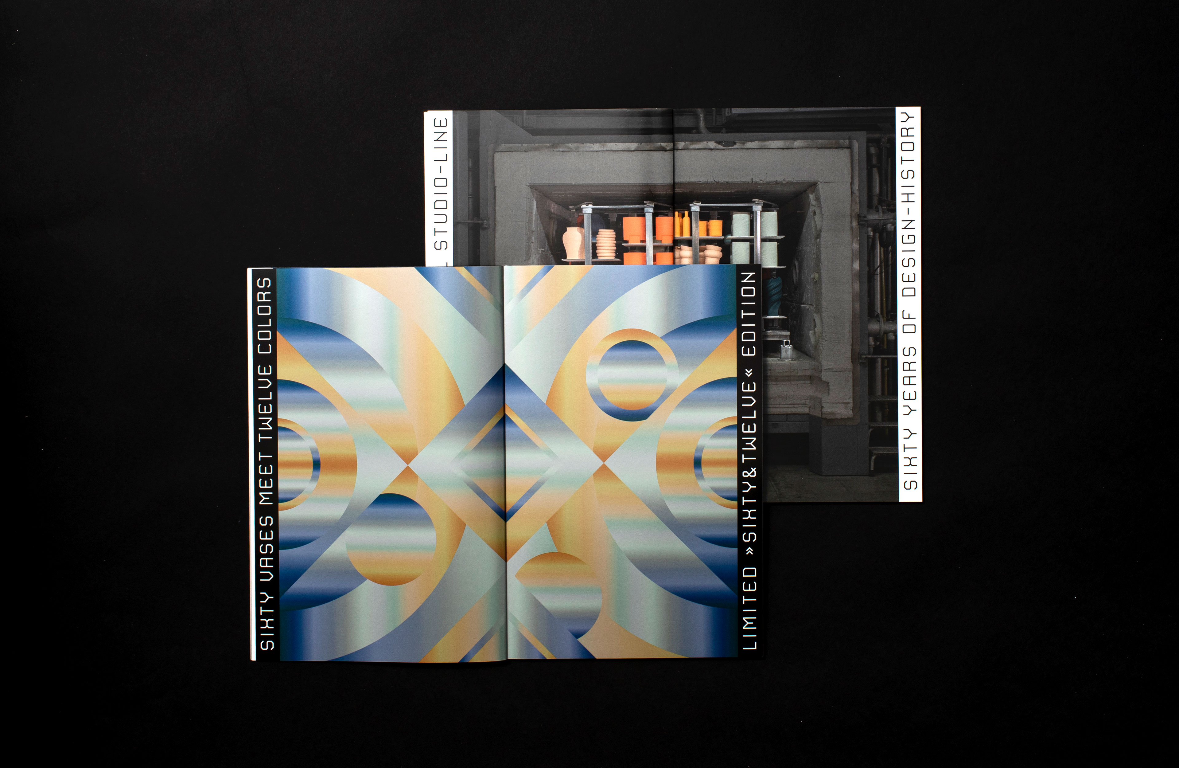
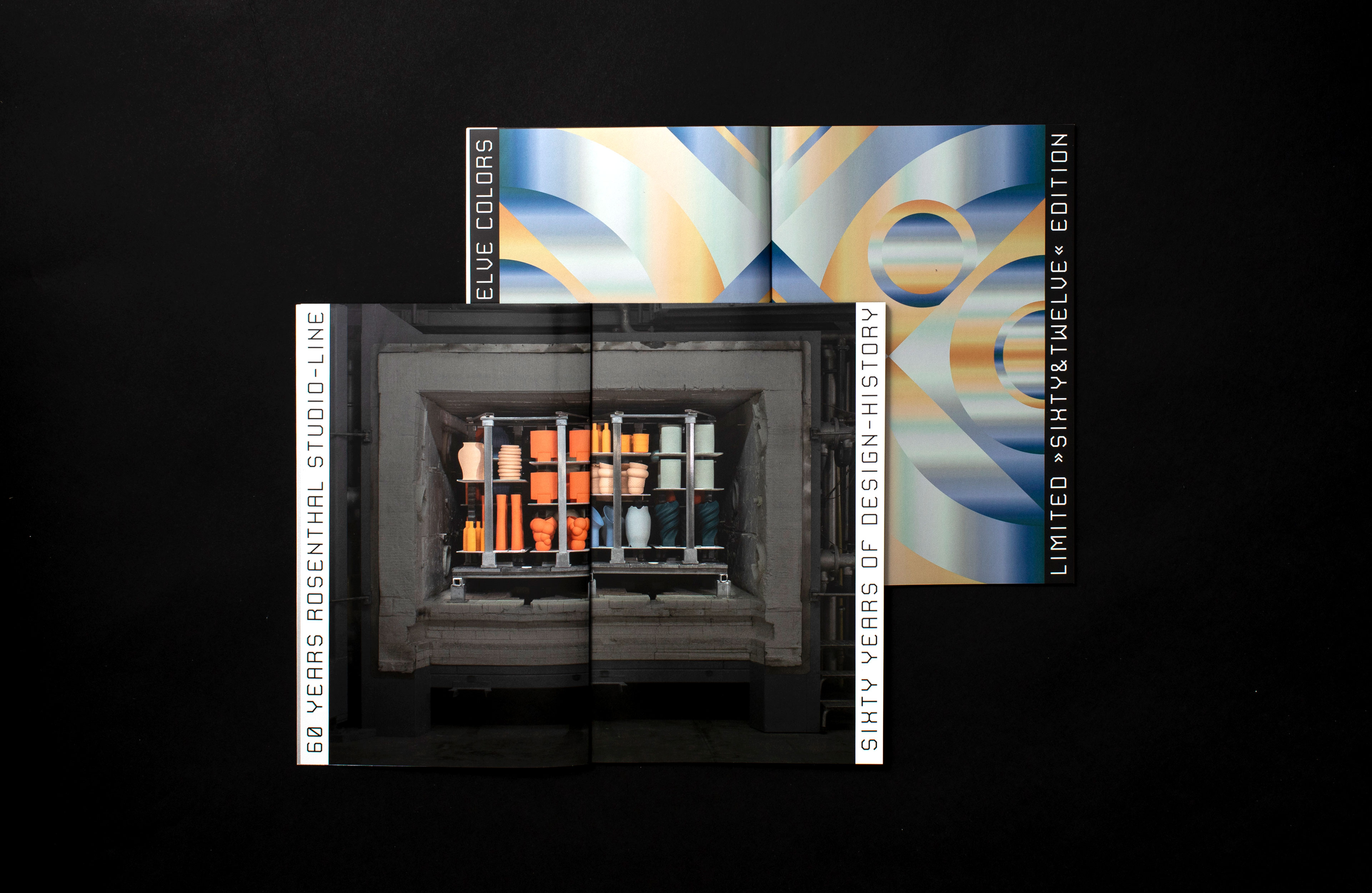
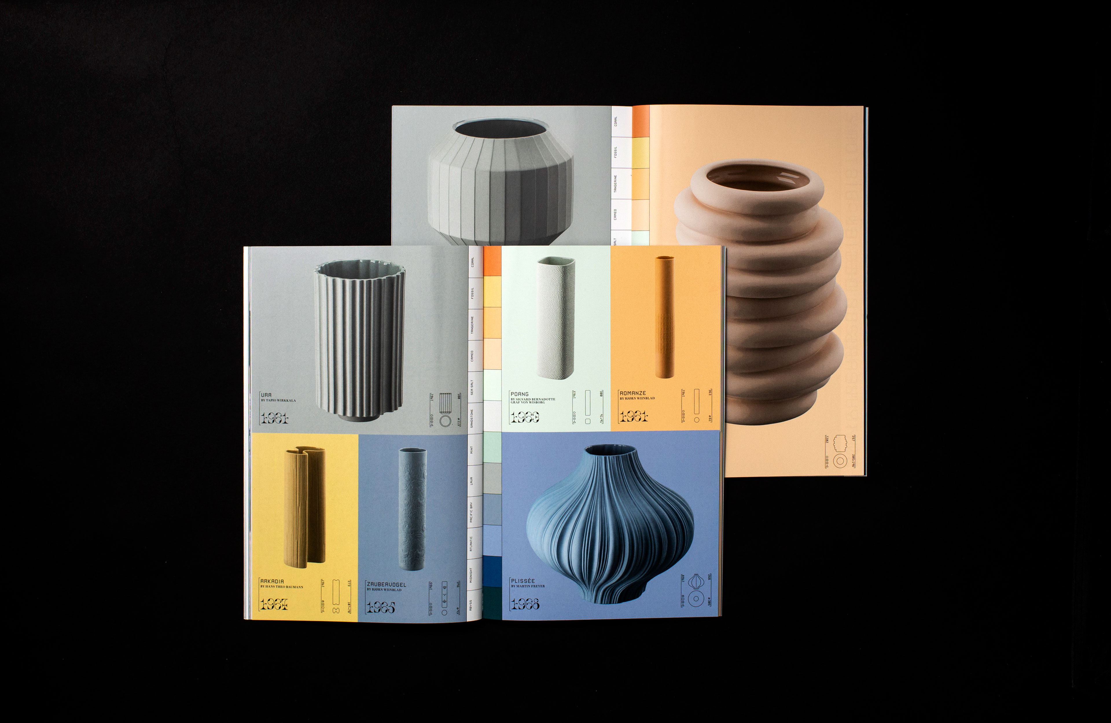
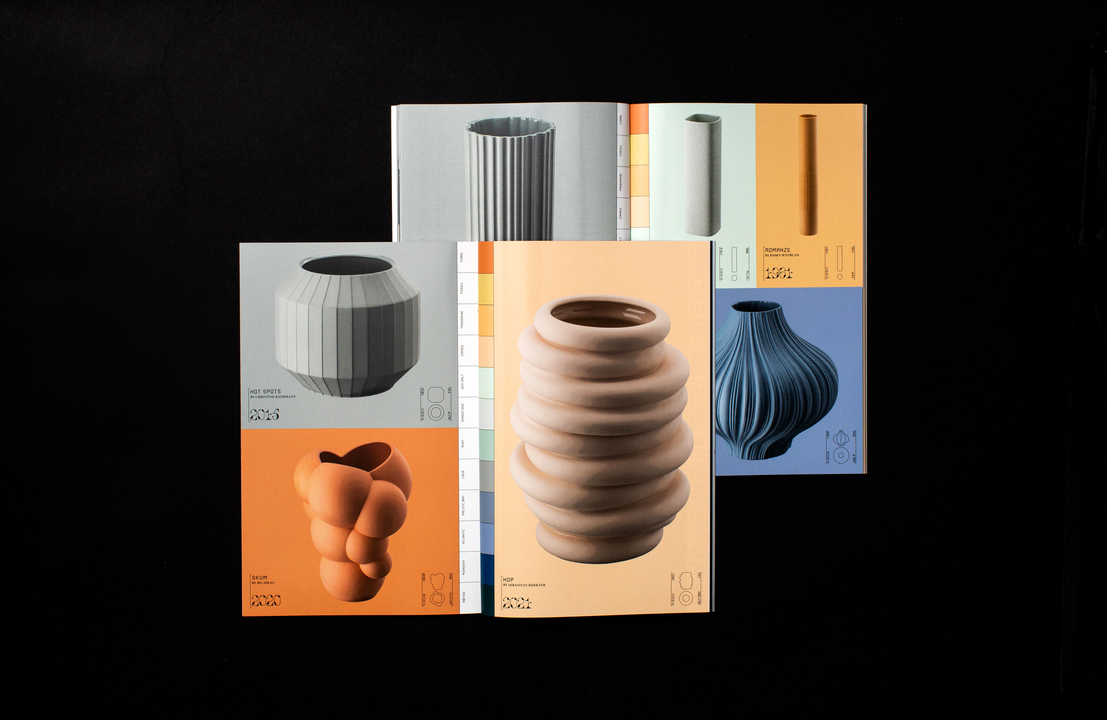
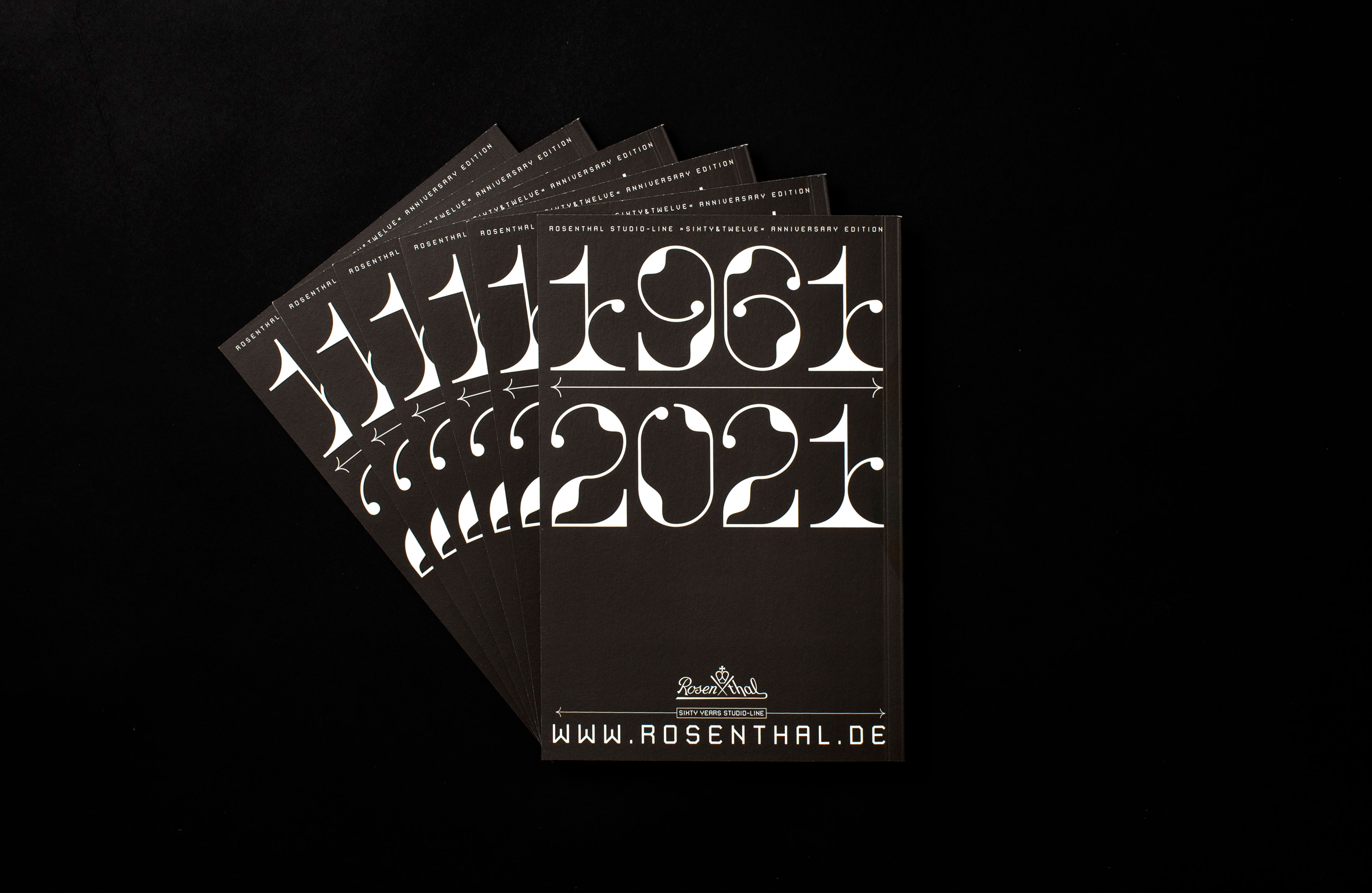
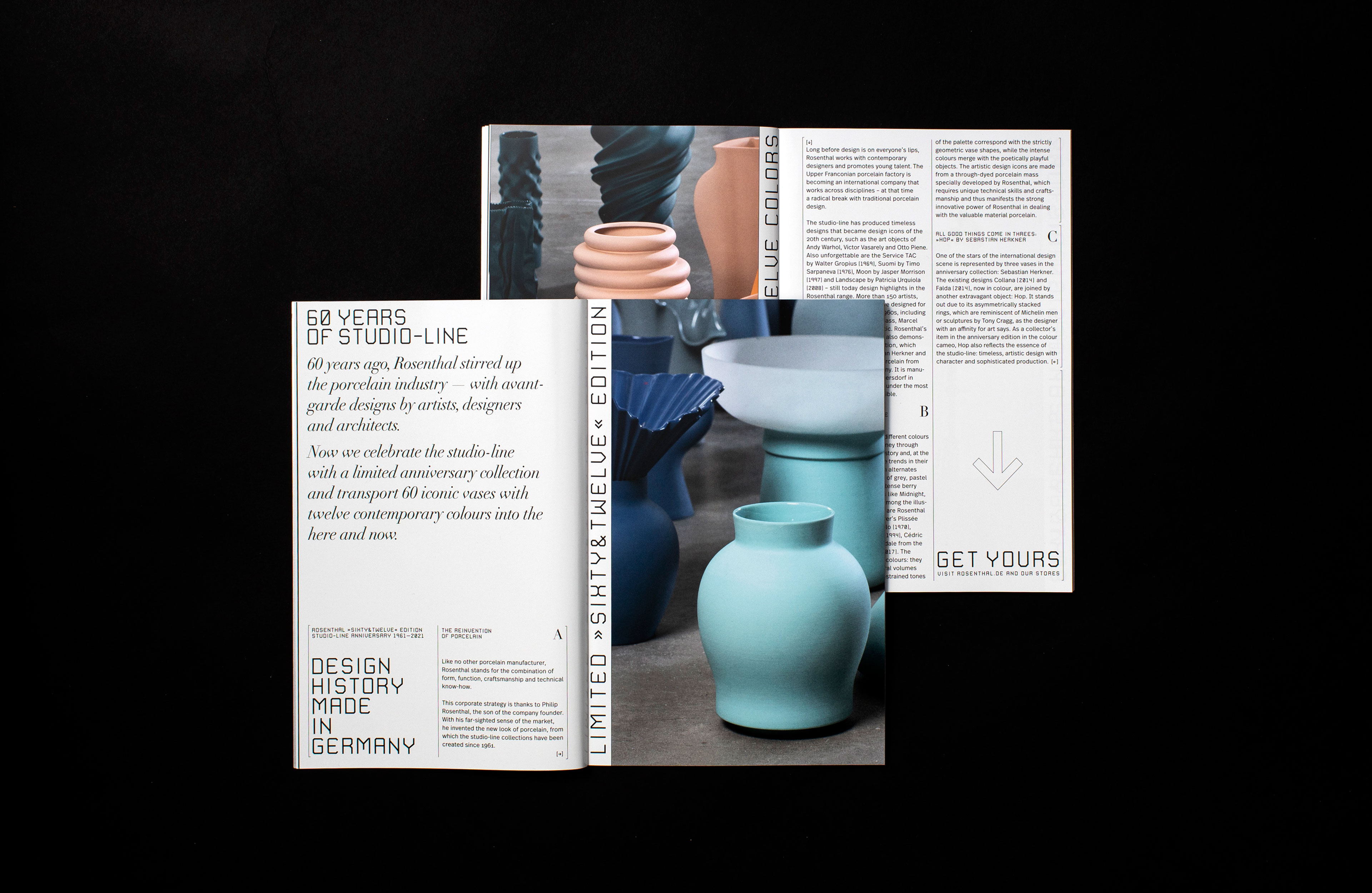
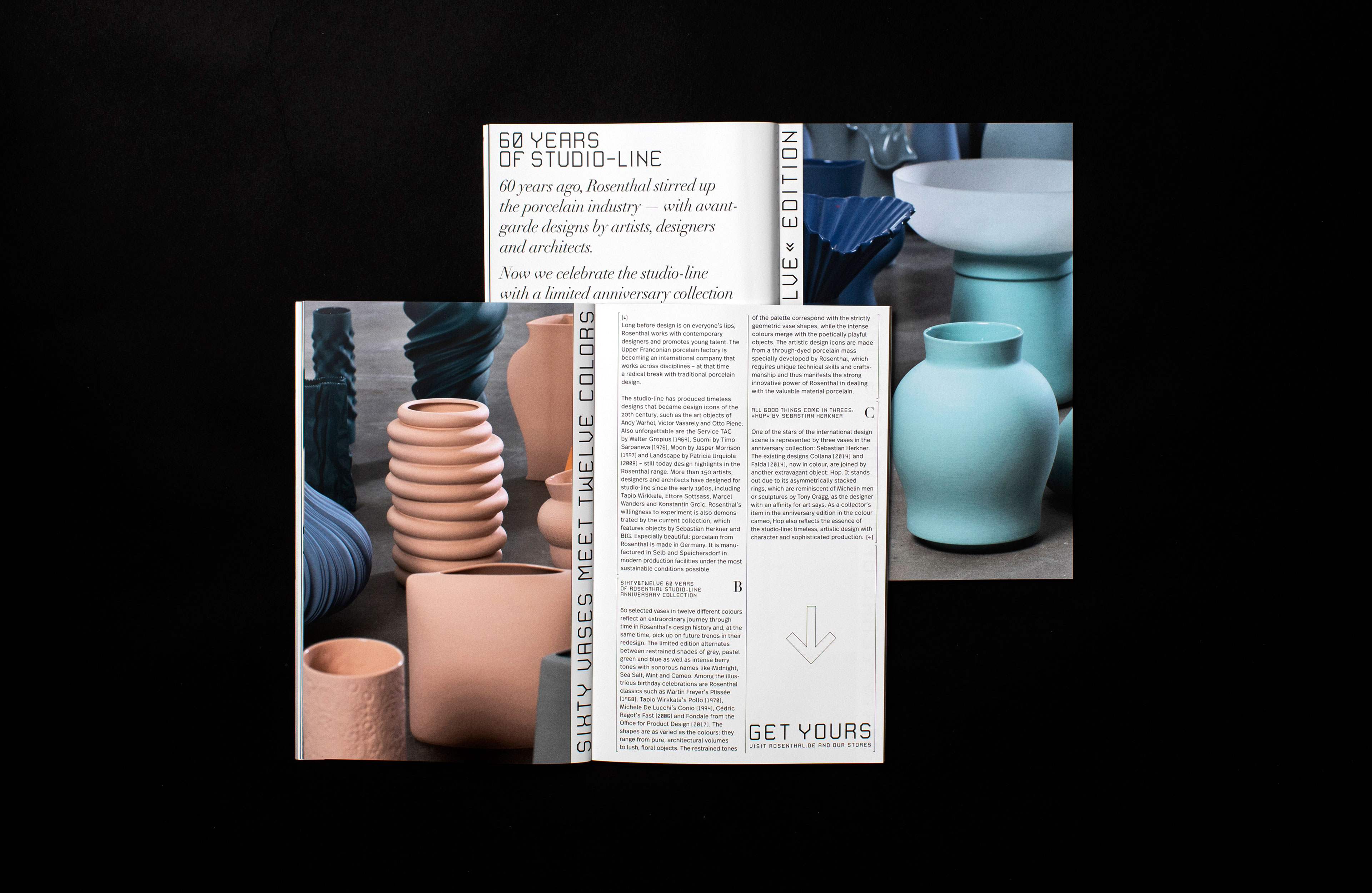
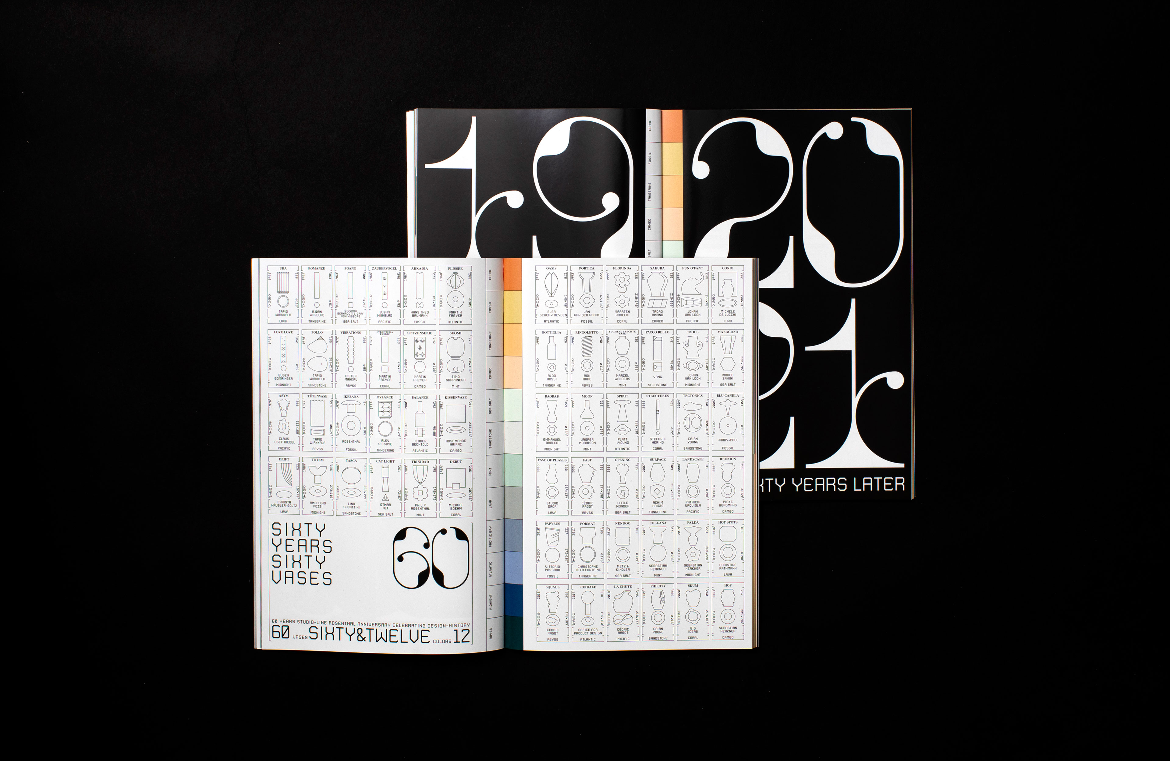
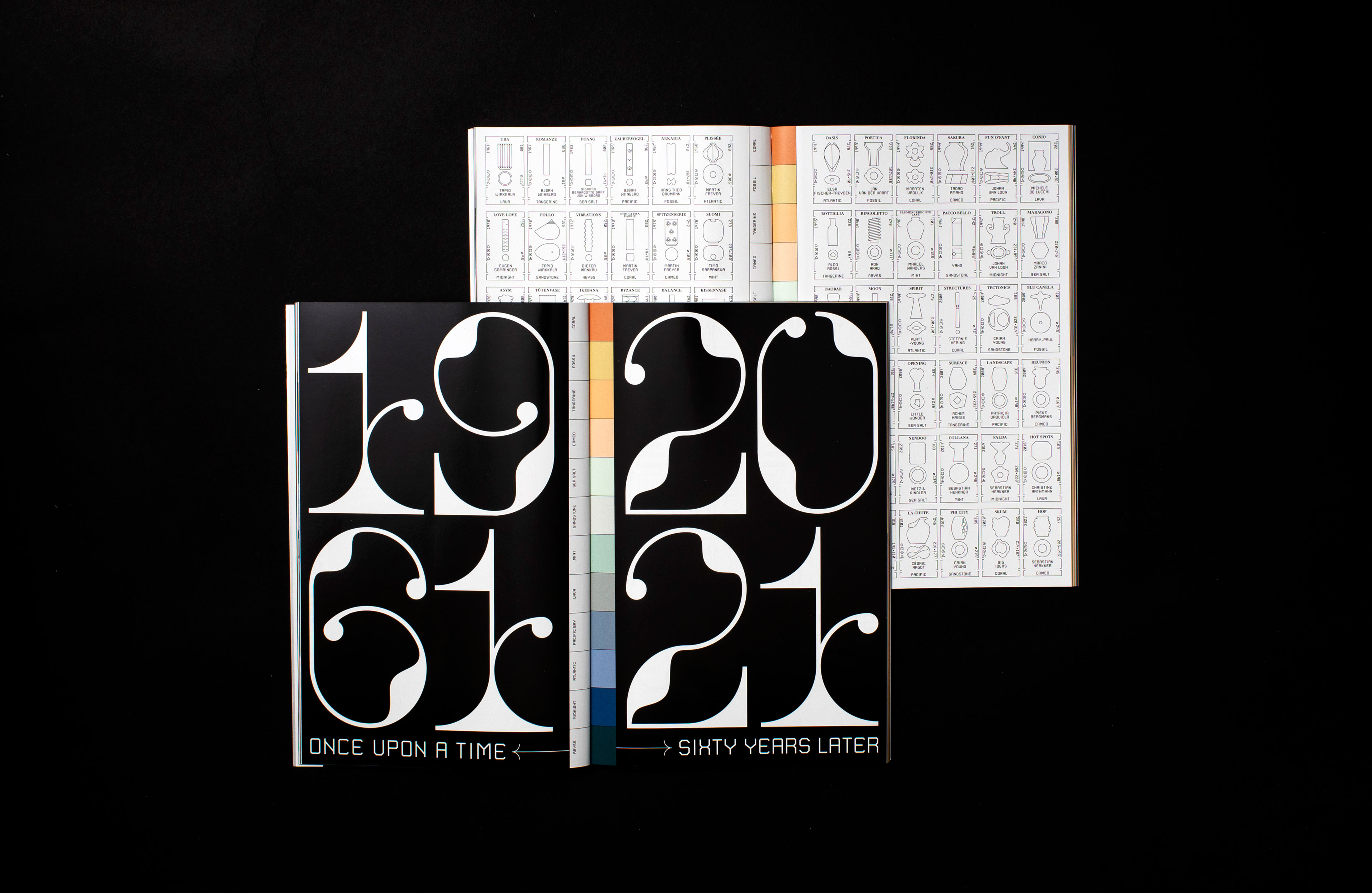
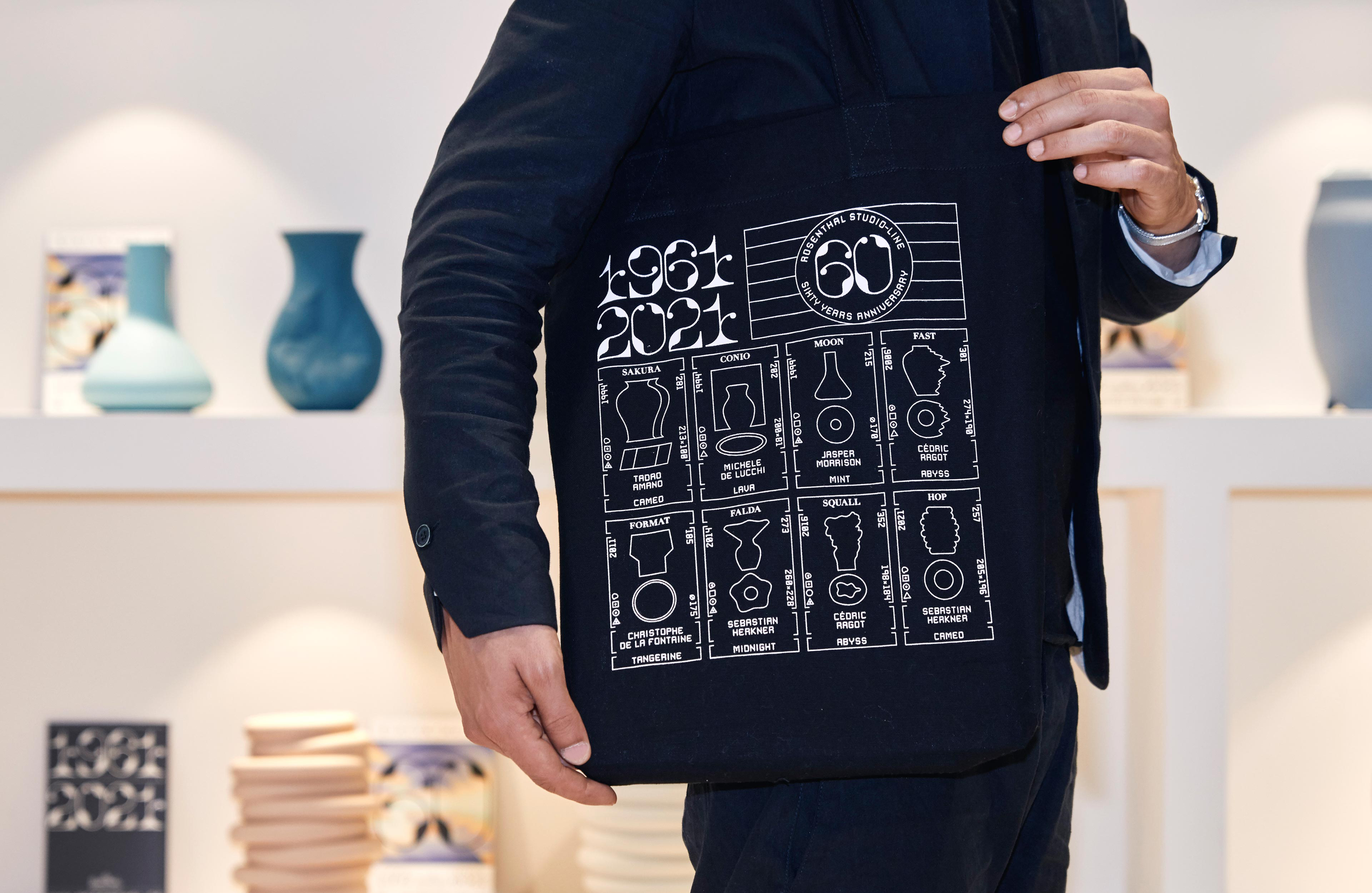
Rosenthal, the porcelain manufacturer, embraced this approach to develop a product series celebrating a campaign marking the company’s 60th anniversary. Each of the past 60 years was represented by a vase, which was produced in 12 different colors using a novel technique—firing colored porcelain.
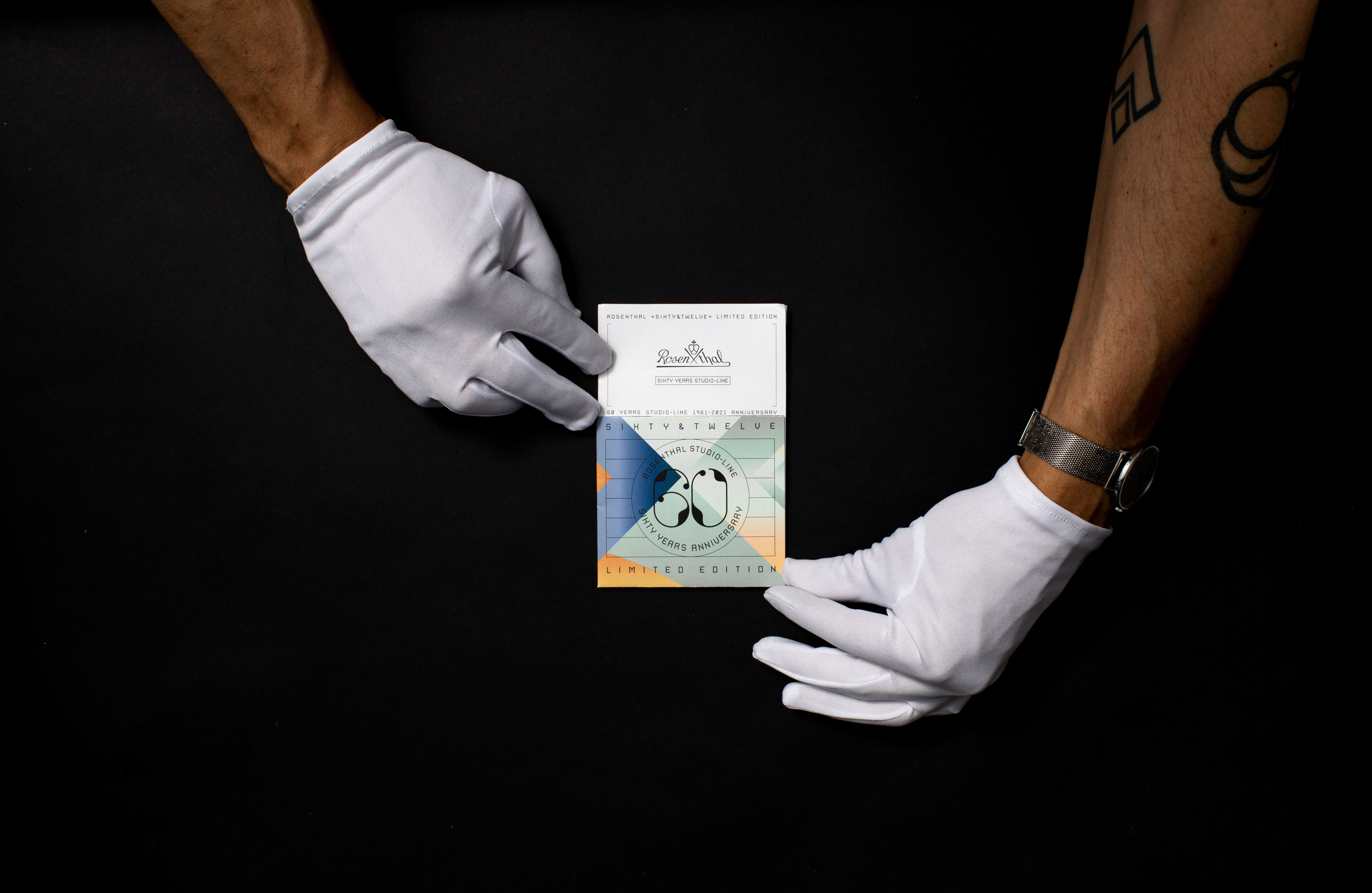
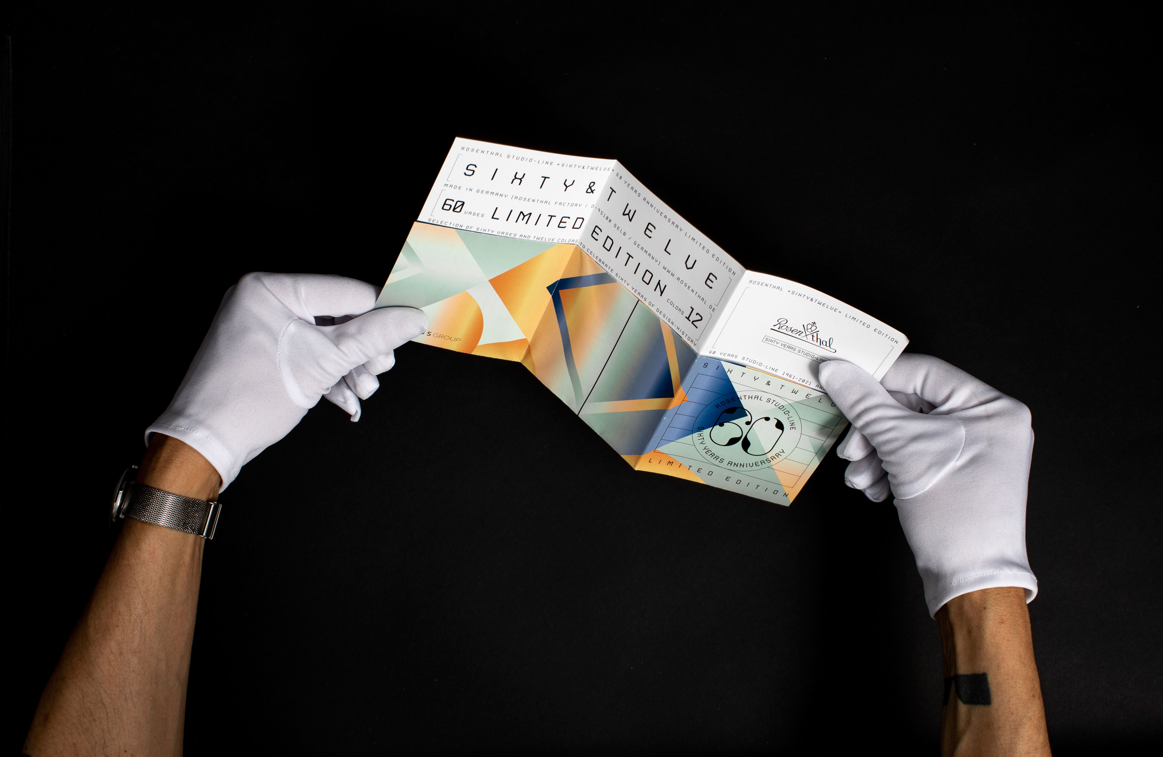
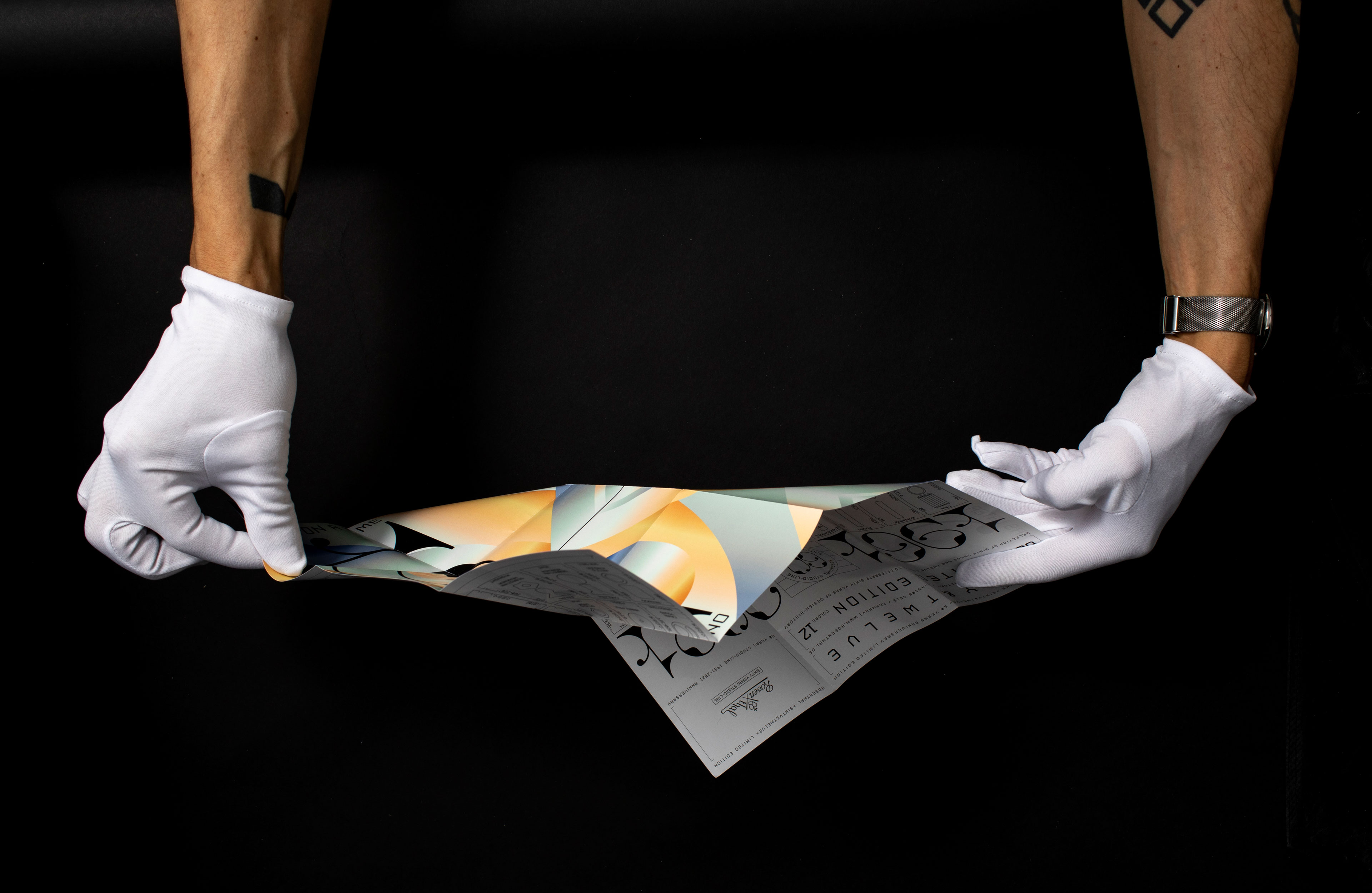
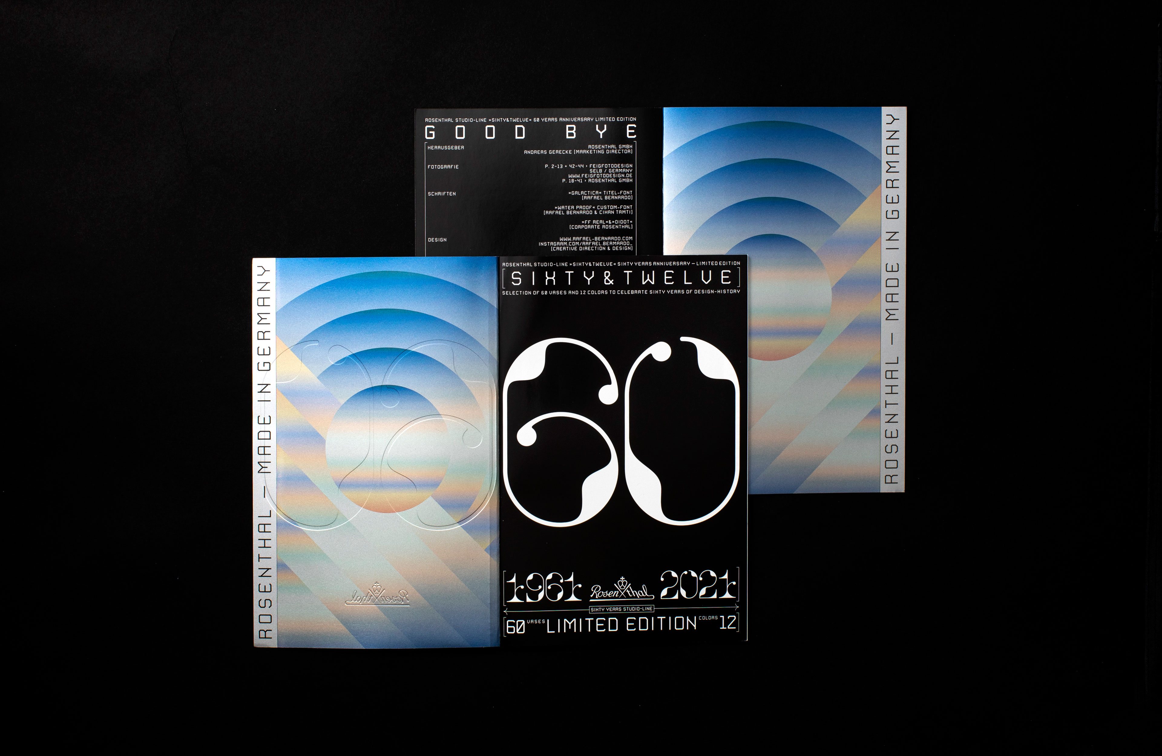
The briefing included a folder of isolated images, the press release text and a carte blanche for designing the campaign, which was to feature a brochure and a fold-out poster as the primary media.
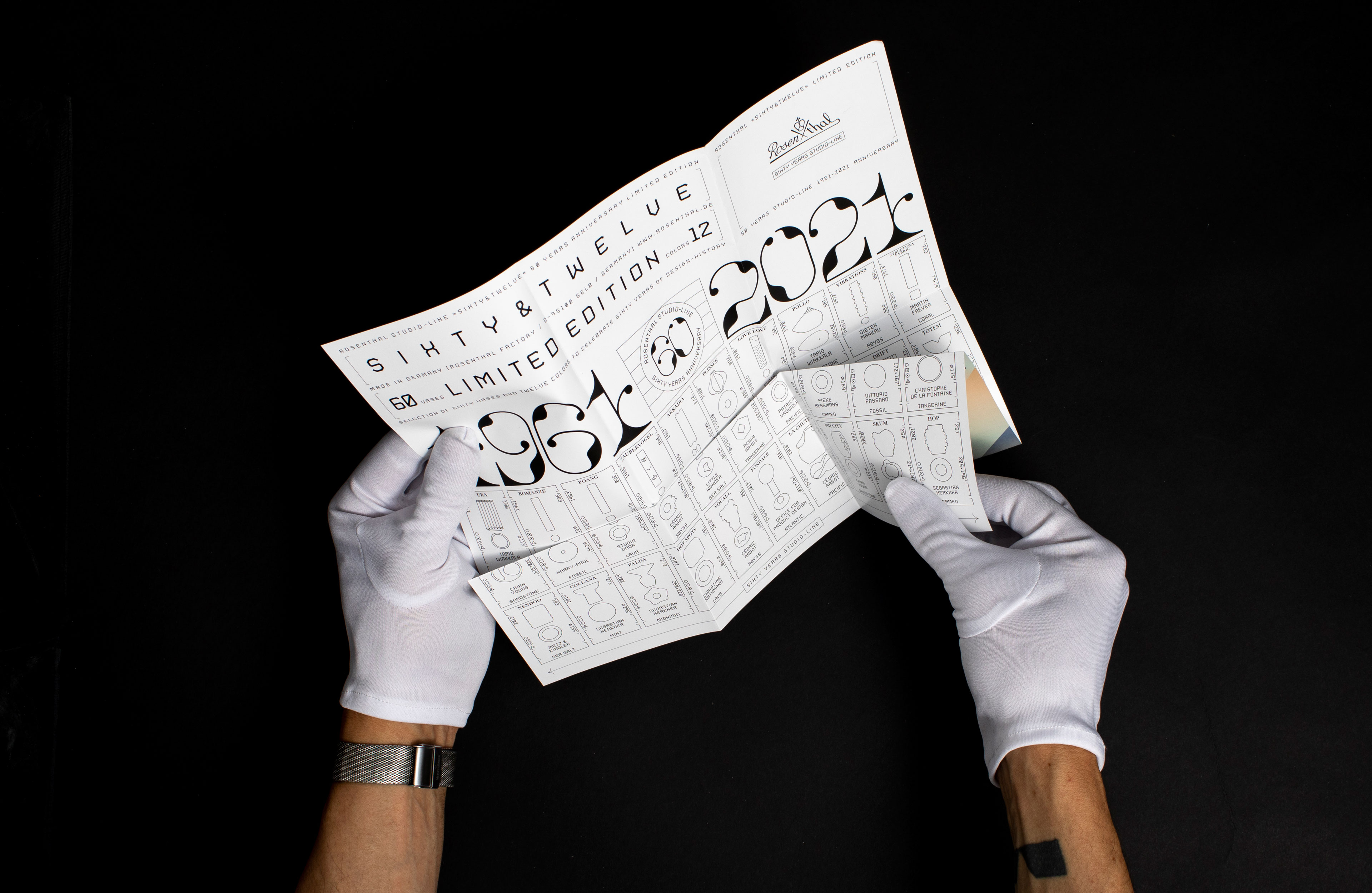
For each vase, an icon was created and a unique typeface was developed for each year, in collaboration with Cihan Tamti. To convey the sequential nature of the assembled yet diverse vases, a clear layout and a color register placed in the brochure‘s spine were used to display an overview of the 12 colors.
Given the strength of the product idea, I chose a highly structured approach, focusing on design serving clear functions. This philosophy—»I don‘t need to invent anything; it‘s enough if the design reflects the product idea«—also inspired the campaign name: Sixty (vases) & Twelve (colors).

MAKING OF
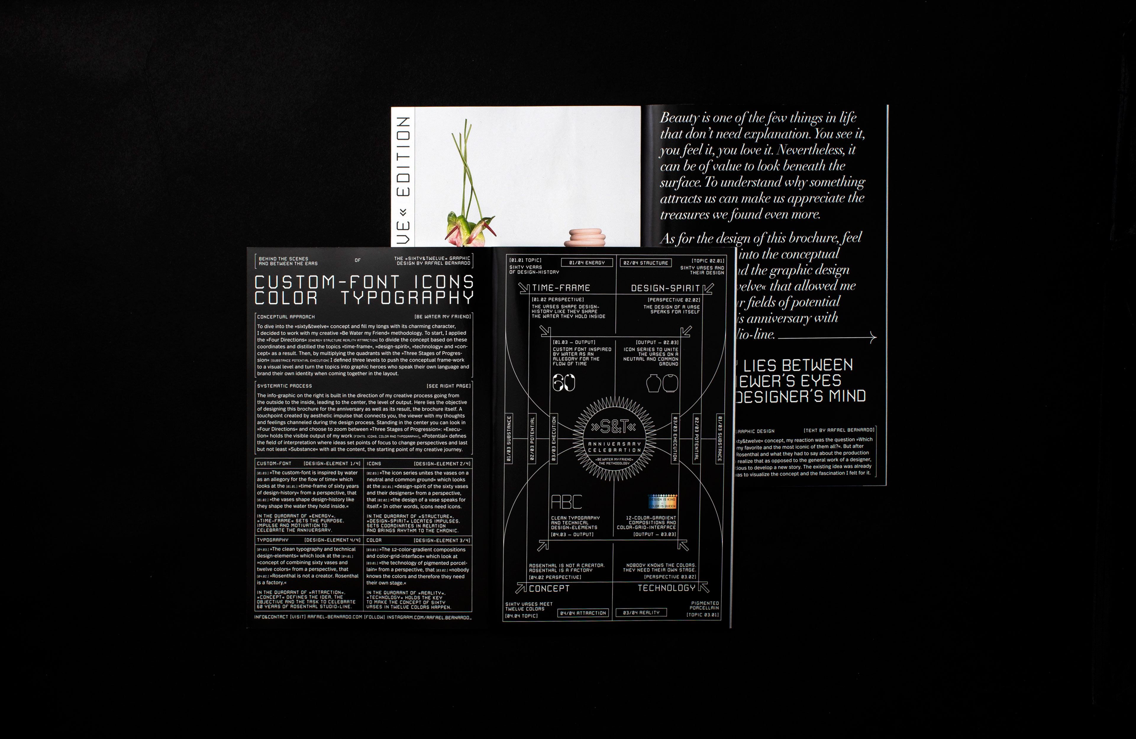
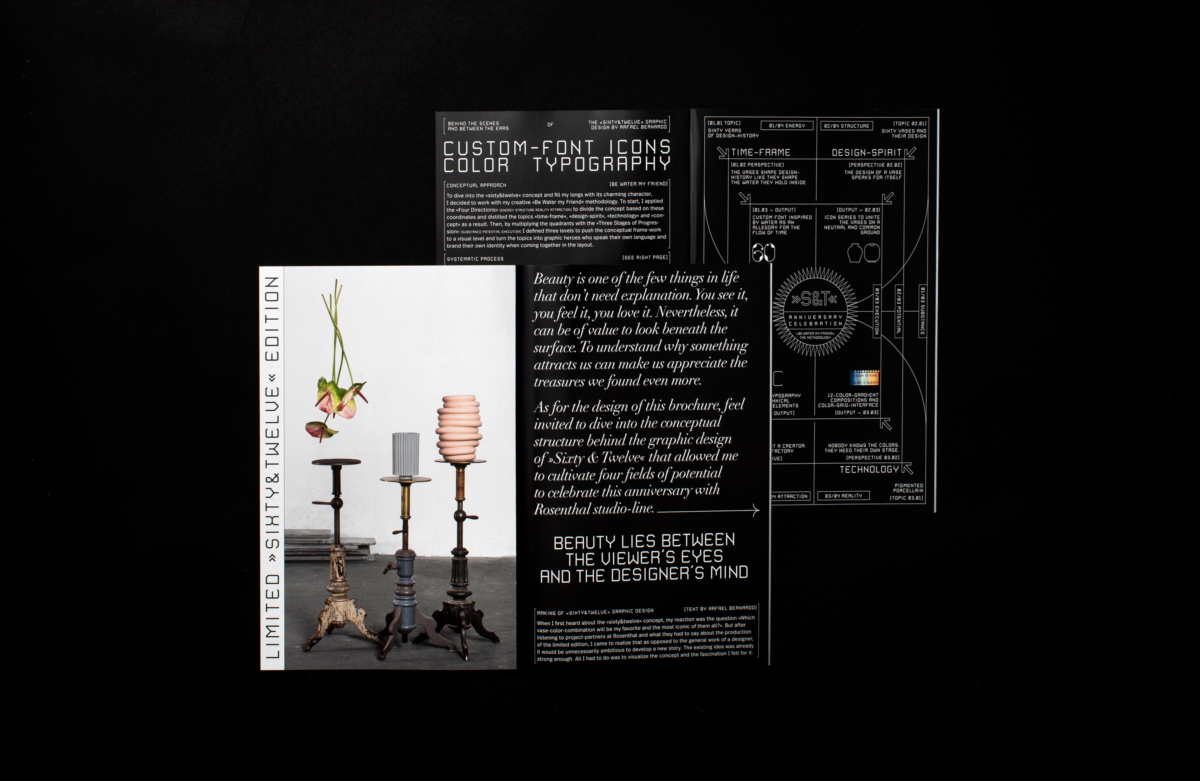
The infographic on the double-page spread reflects my process of conceptualizing the visual elements for the campaign. From the outside in, towards the center from which the result emerges. This represents both the goal of designing this anniversary brochure and the result itself: the brochure.
Standing in the center, you can look in »Four Directions« and zoom between »Three Stages of Progress«: »Execution« contains the visible result of my work [TYPEFACES, ICONS, COLORS, AND TYPOGRAPHY], »Potential« defines the area of interpretation where ideas focus on shifting perspectives, and finally »Substance« includes all content, the starting point of the project.
CREDITS
. Text and Images: Rosenthal
. Type Design Collaboration: Cihan Tamti
. Shoot Case: Thomas Stephan
. Shoot Store: Axel Gundermann
SERVICES
. Naming
. Editorial Design
. Font Design
. Icons and Infografic
. Keyvisual
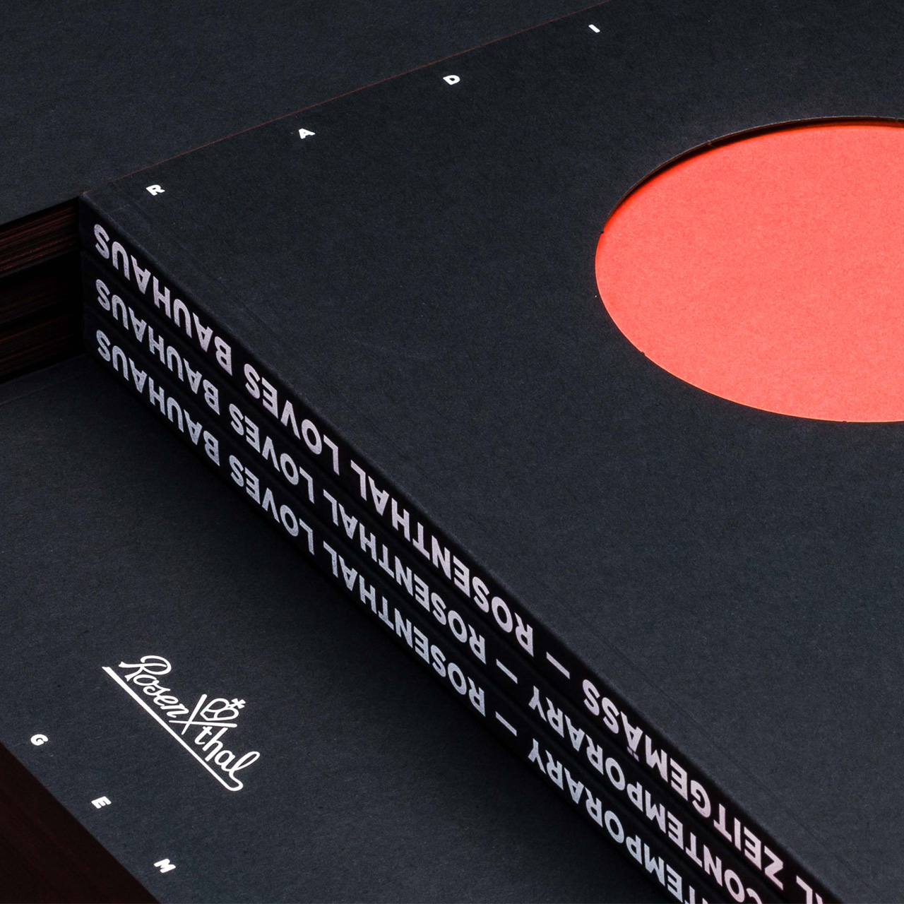
Magazine »Radikal Zeitgemäß« for the porcelain manufacturer Rosenthal [100th Bauhaus Anniversary]
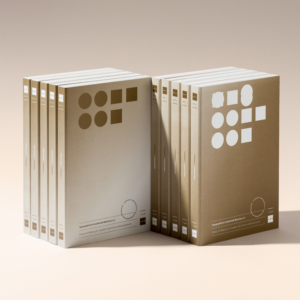
Program Book »Connect & Disconnect« for the Typographic Society Munich [Voluntary Engagement]
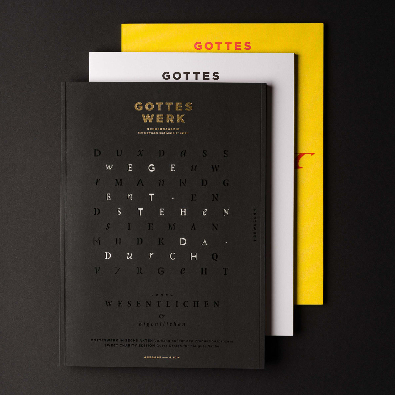
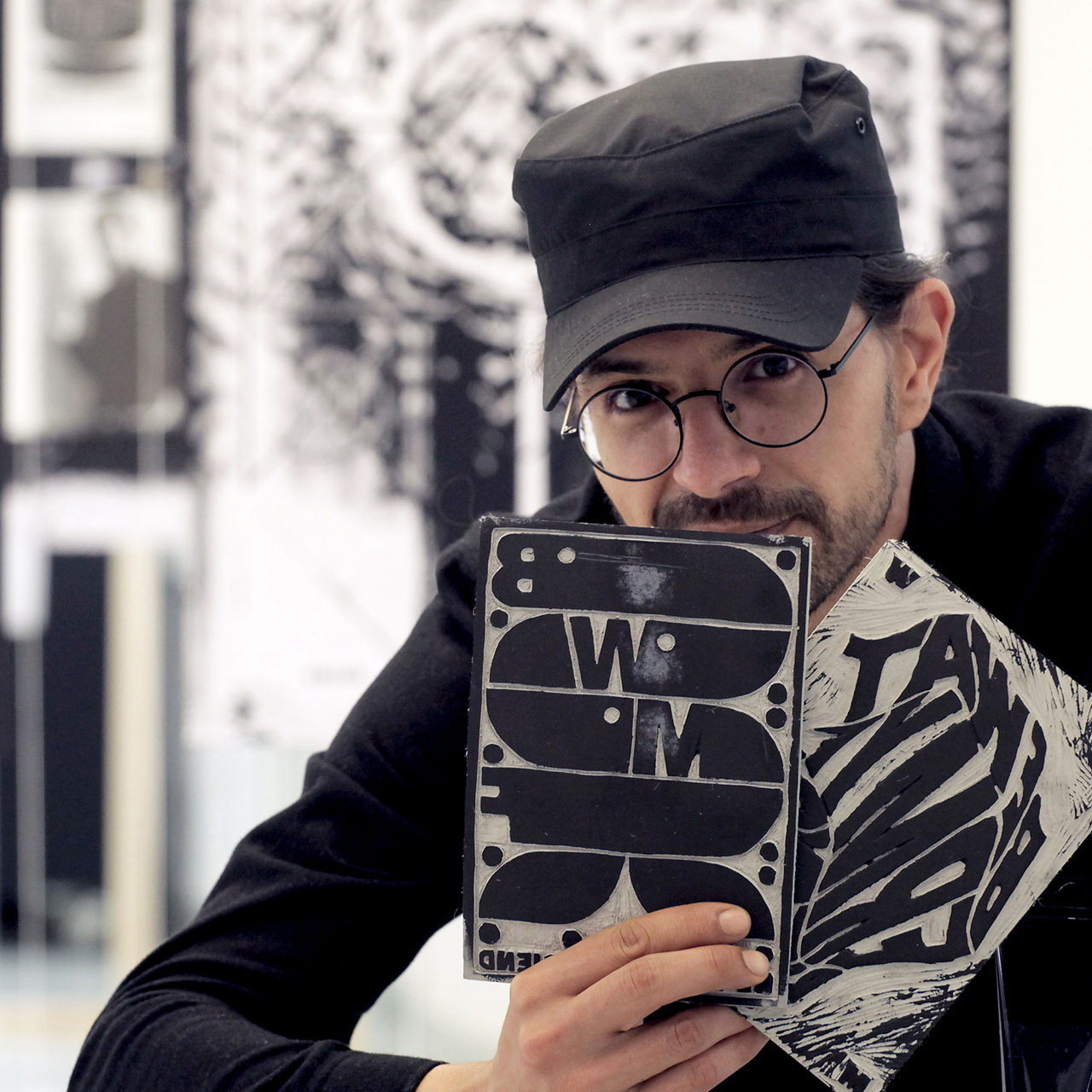
Magazine »GOTTESWERK I–III« for Munich’s oldest printing house [Gotteswinter & Aumaier]
BLOG
ARTIKEL, PROJEKTE UND VIDEOS
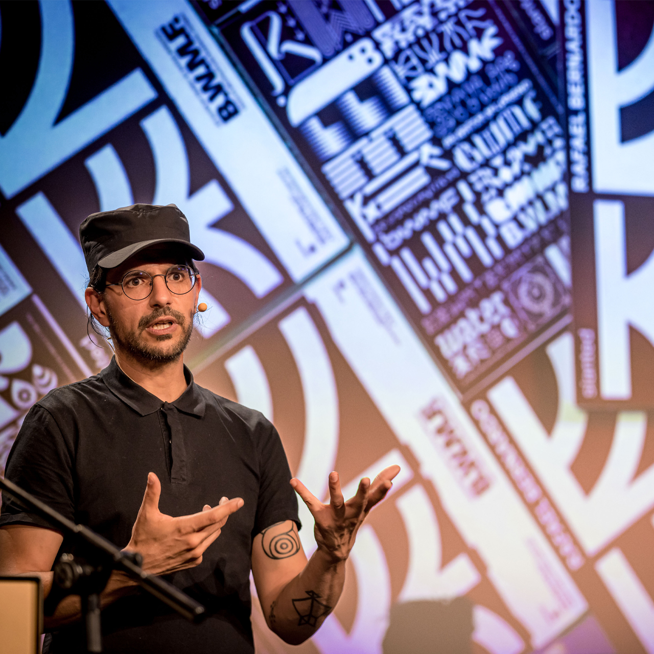
How I developed a methodology to bring creativity into the flow [»Be Water my Friend«]
Article Rafael Bernardo — »Be Water my Friend« Creative Methodology EN
Roundtable with Magdalena Schmid on her project »No One Wins Tonight« [a book about the death penalty]
Roundtable with Sven Saro on his project »Ohne den Hype« [a podcast with and for creatives]
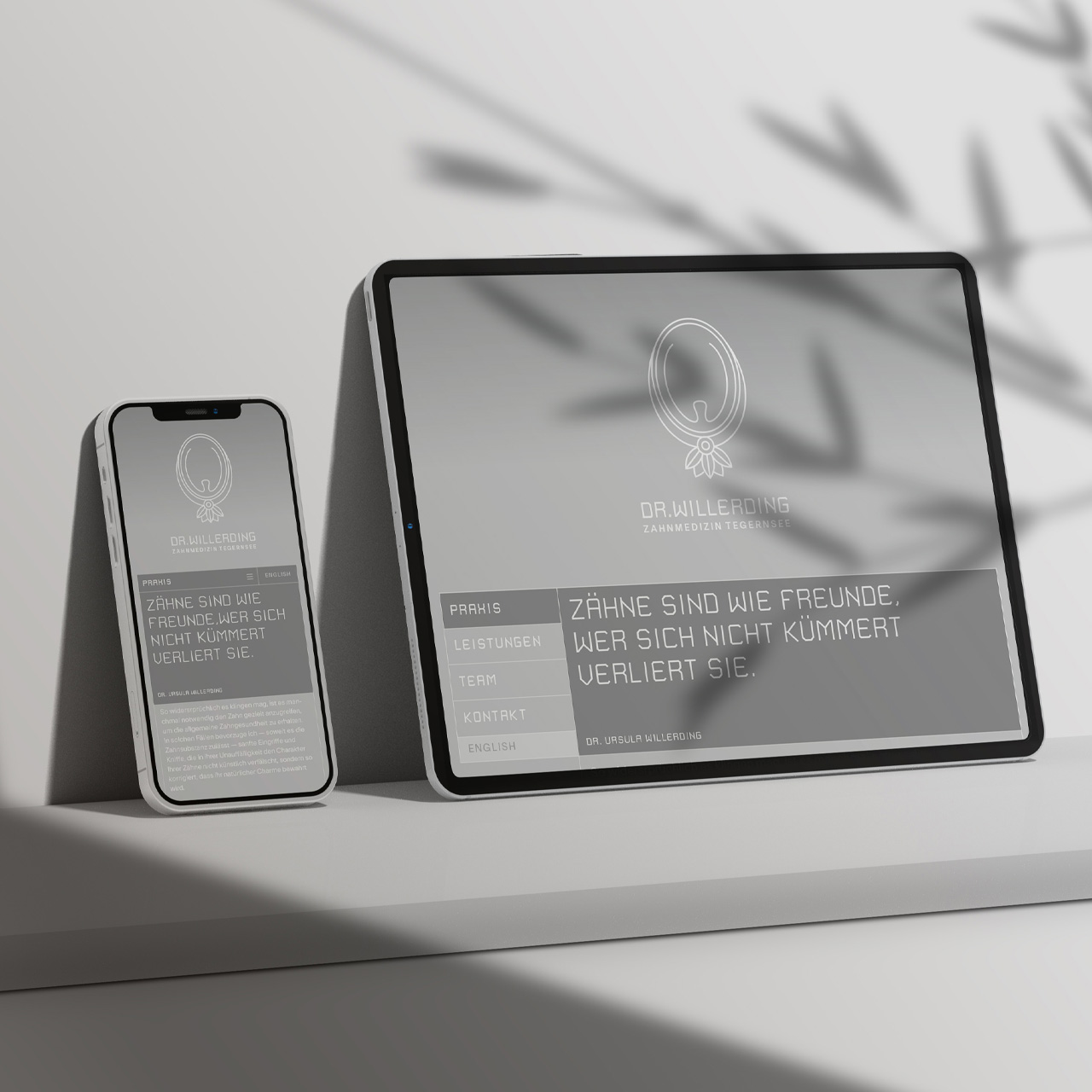
Corporate Design, Stationery, and Website for the Dentist »Dr. Willerding« [Tegernsee]
Magazine »Radikal Zeitgemäß« for the porcelain manufacturer Rosenthal [100th Bauhaus Anniversary]
Campaign »Sixty & Twelve« for the Porcelain Manufacturer Rosenthal [60th Anniversary of Rosenthal]
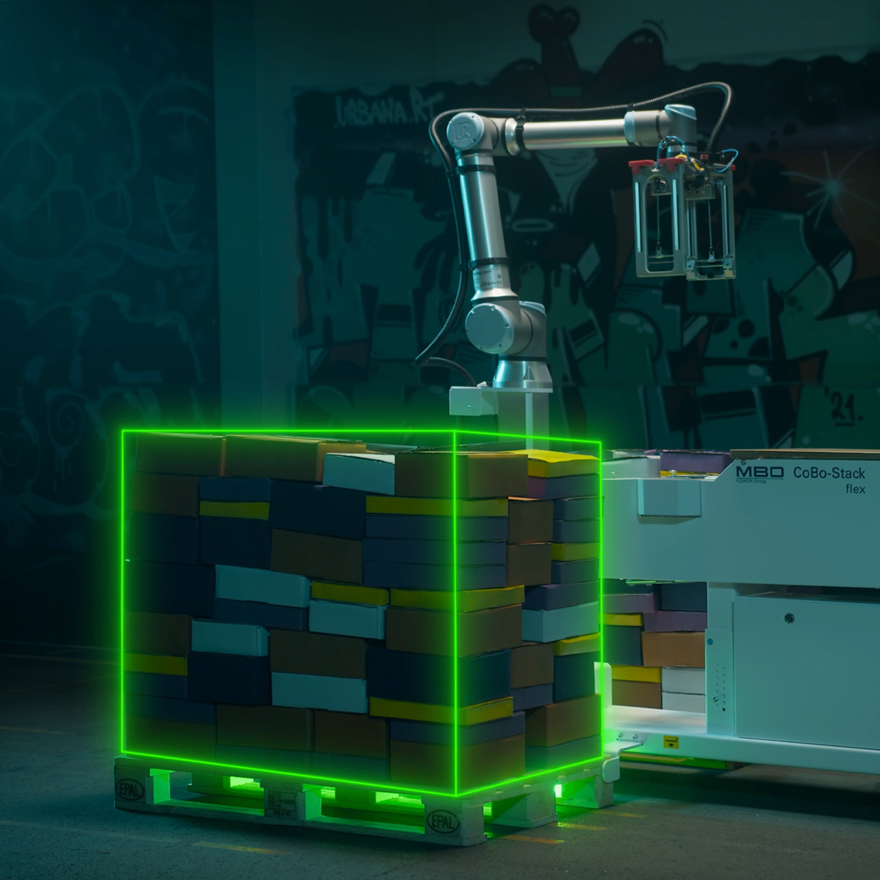
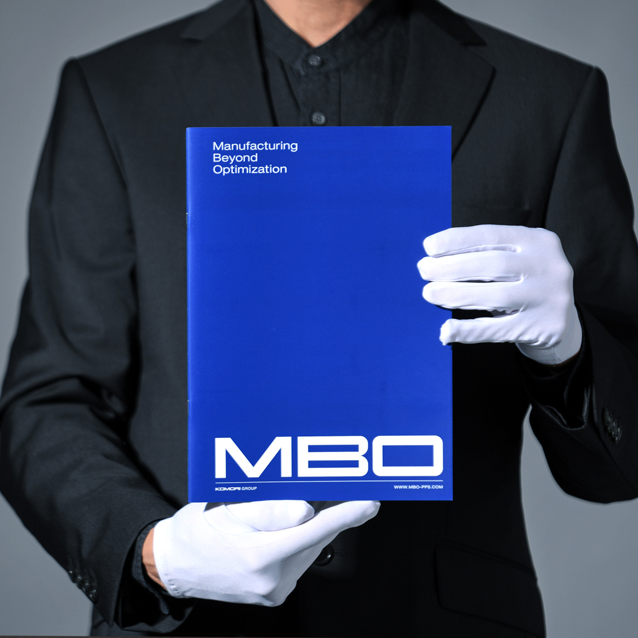
Creative Direction, Storyboard and Video Editing for the Product Video »CoBo Stack by MBO« [Komori Group]
Roundtable with Daniel Rödel — Creativity between profession and vocation [From Bavaria to Peru]
Roundtable with Lars Harmsen on his project »REVISION« [a retrospective on a past full of projects]
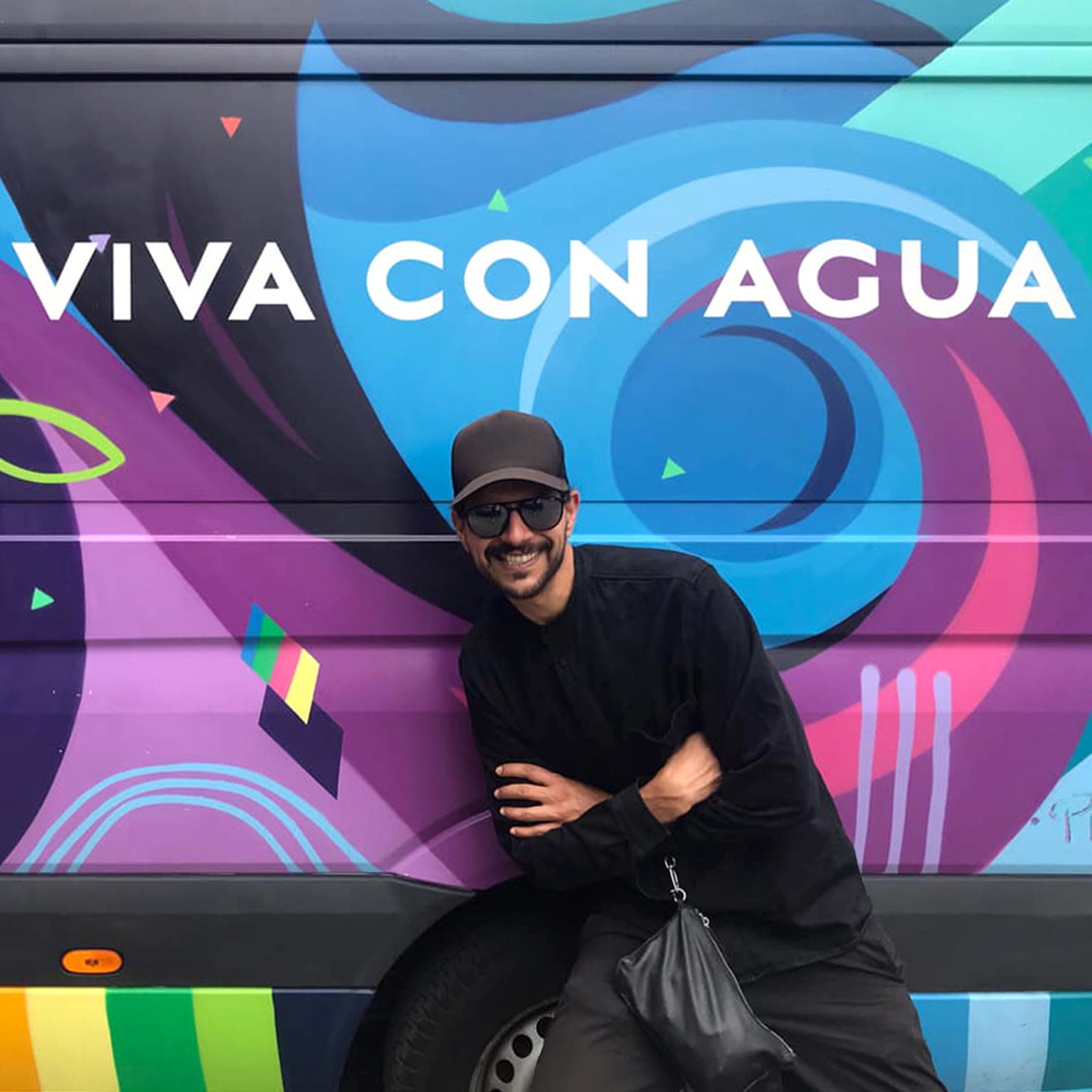
Support for the Nonprofit Organization Viva con Agua St. Pauli [Hamburg, Stuttgart, Munich]

Campaign »Headache Hurts« for headache prevention [ZIES powered by Barmer]
Minimalism and Graphic Design for »Domestika« [an online course]
Program Book »Connect & Disconnect« for the Typographic Society Munich [Voluntary Engagement]
Roundtable with Boris Schmelter on his project »Schmelter Brand Design« [from studio to agency]
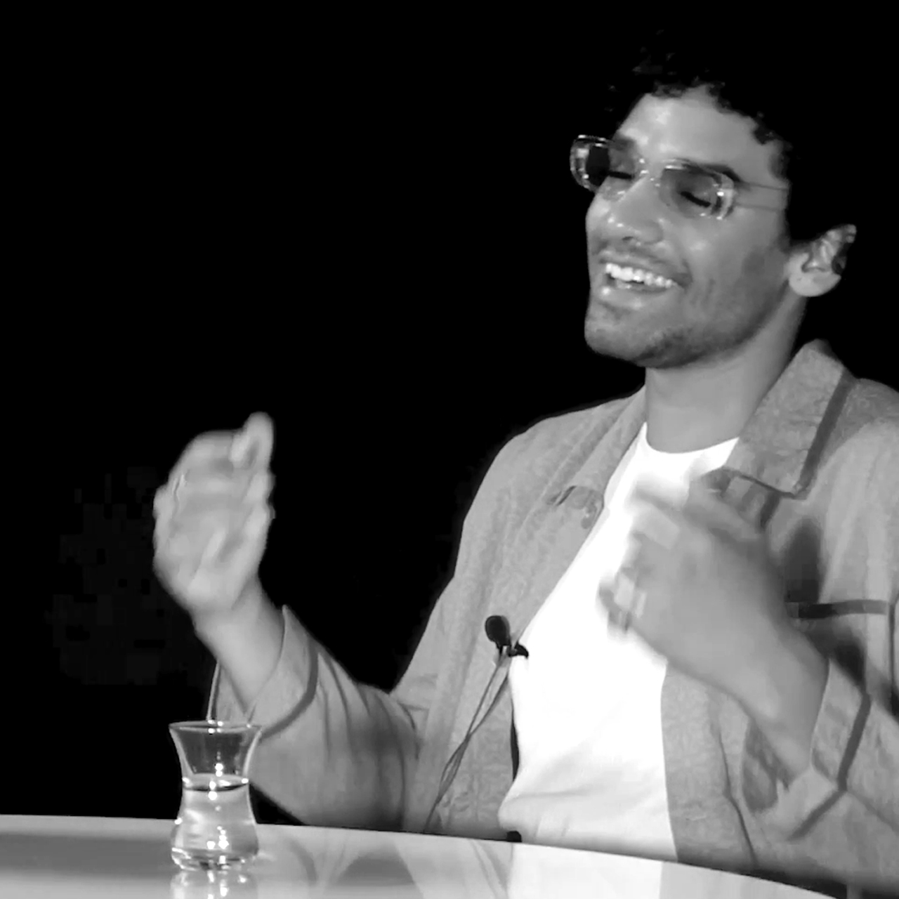
Roundtable with CELLZ on his project »When I‘m Back« [a song about love that is interrupted by duty]
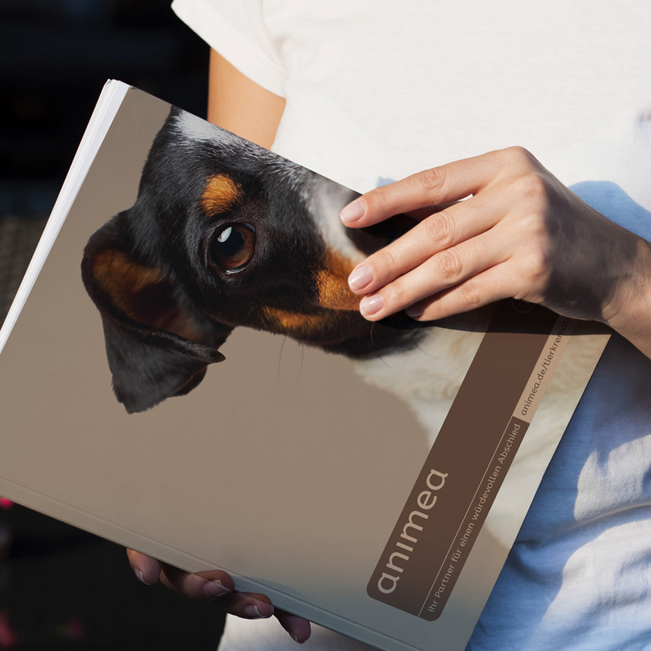
Corporate Design, Icons and Interface Design for »Animea — Pet Cremation« [Mars Incorporated]
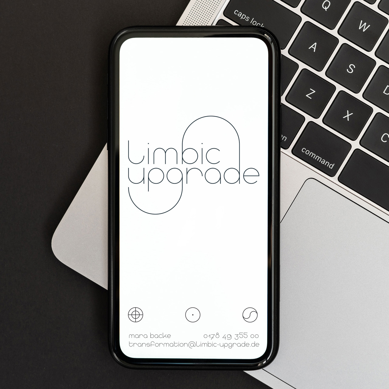
Corporate Design, Typeface Development and Web Design for »Limbic Upgrade« [Mental Health]
How I rediscovered myself through a personal design project [»Be Water my Friend«]
Article Rafael Bernardo — »Be Water my Friend« Graphic Journey EN
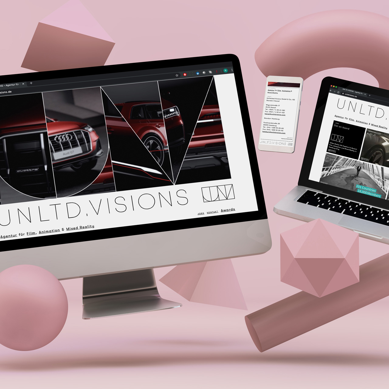
Corporate Design and Website for the Animation Studio »Unlimited Visions« [Hamburg – Kassel]
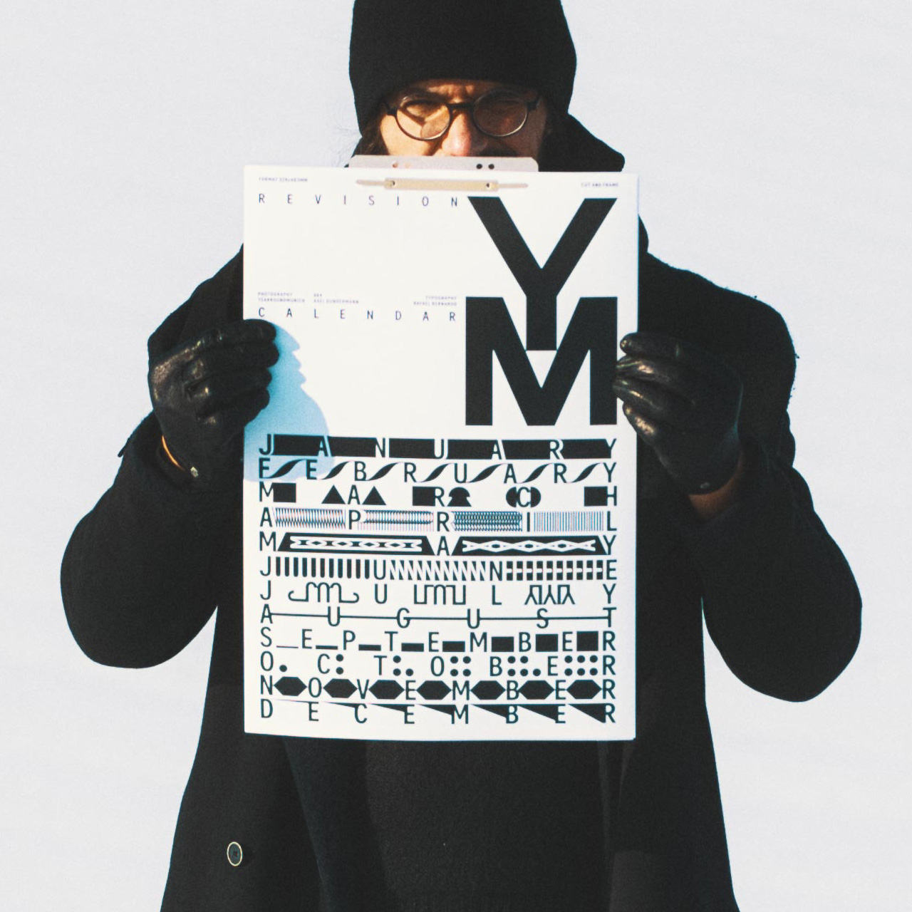
Typographic calendar »REVISION« for DJ and Photographer Axel Gundermann [Yearroundmunich]
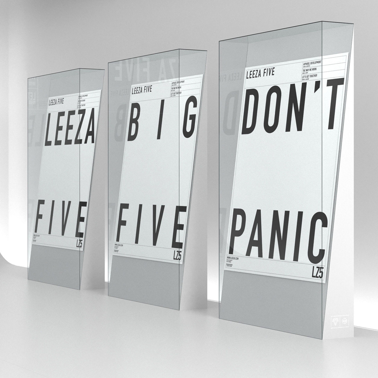
Web and Shop Design for Fashion Design Studio »LEEZA FIVE« [From Zero to Garment]
Magazine »GOTTESWERK I–III« for Munich’s oldest printing house [Gotteswinter & Aumaier]
Lecturer in Typography at the Hochschule für Gestaltung Schwäbisch Gmünd [Lecturing Post]