Magazine »Radikal Zeitgemäß« for the porcelain manufacturer Rosenthal [100th Bauhaus Anniversary]
PROJECT
EDITORIAL DESIGN, INFOGRAPHICS AND PRODUCTION CONCEPT
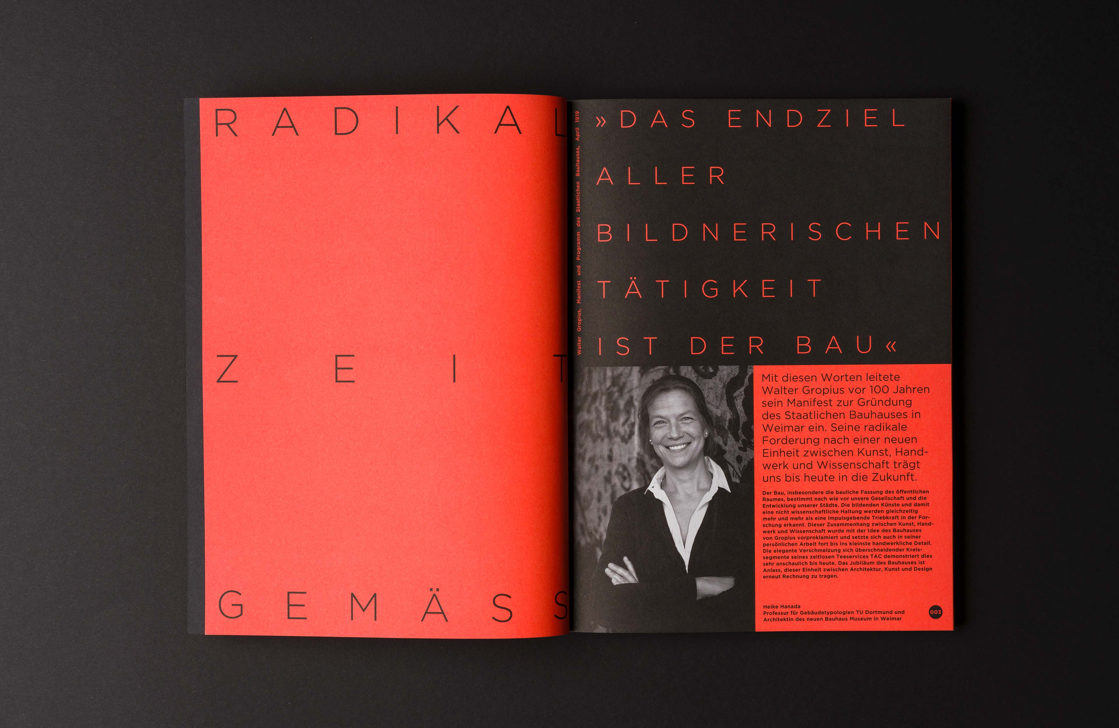
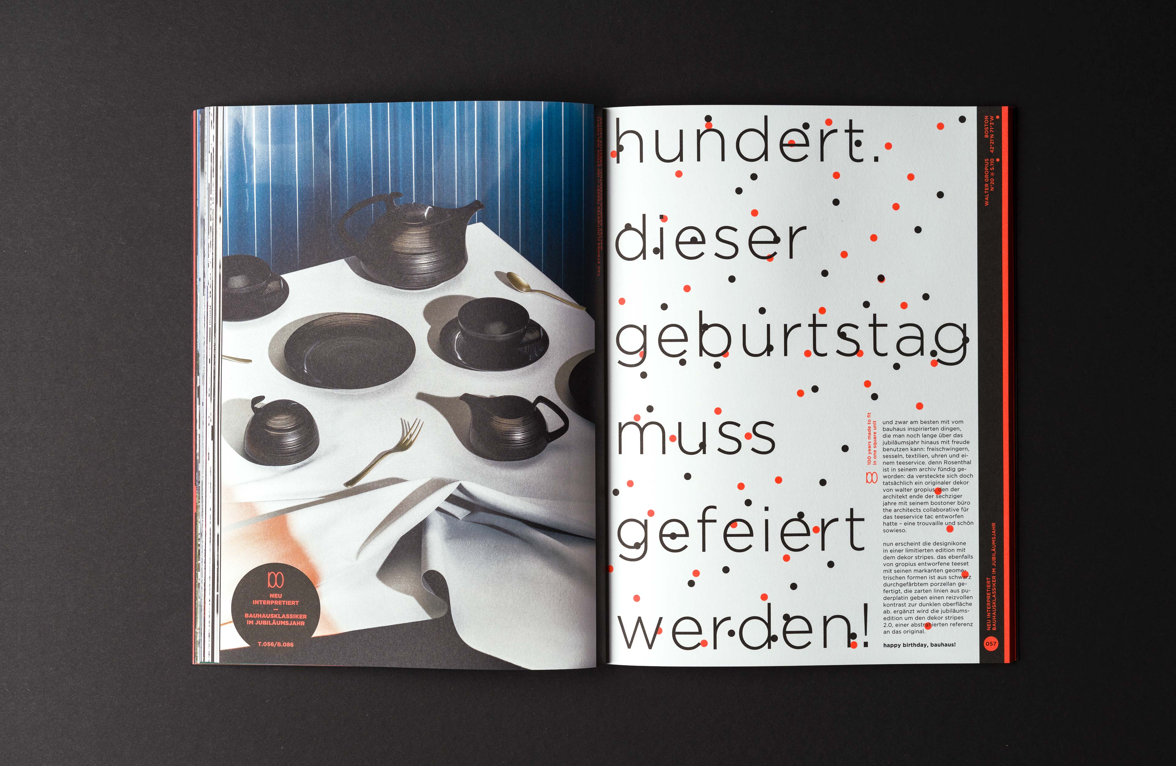
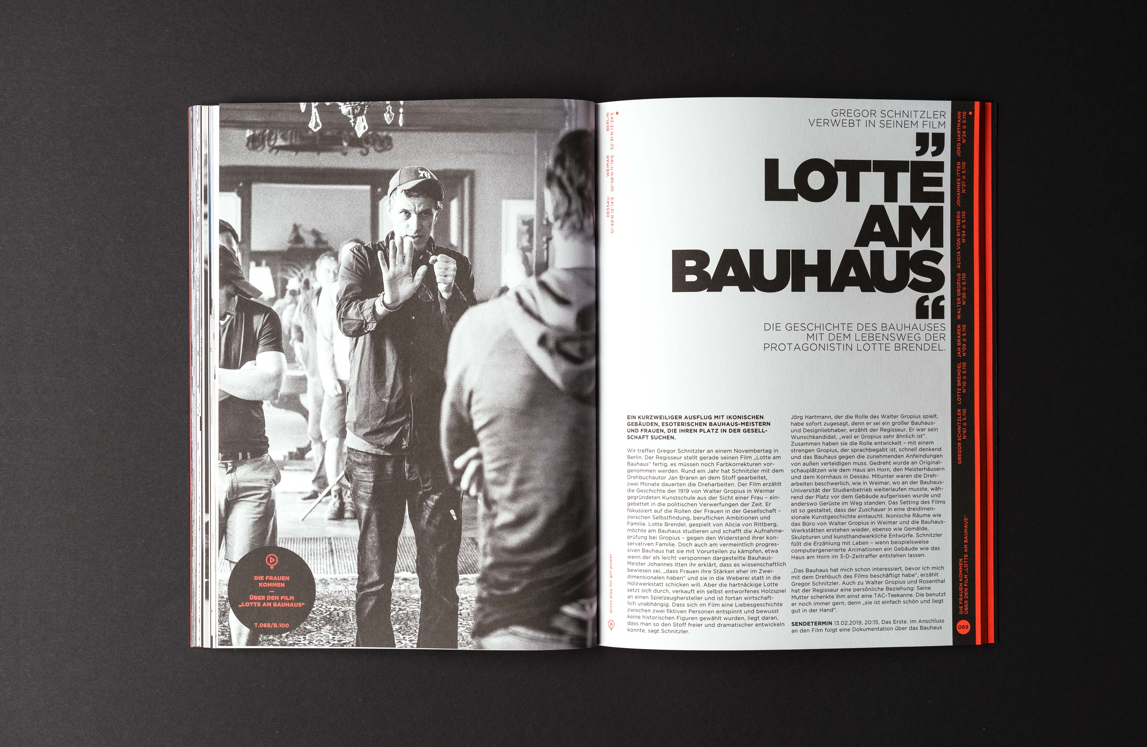
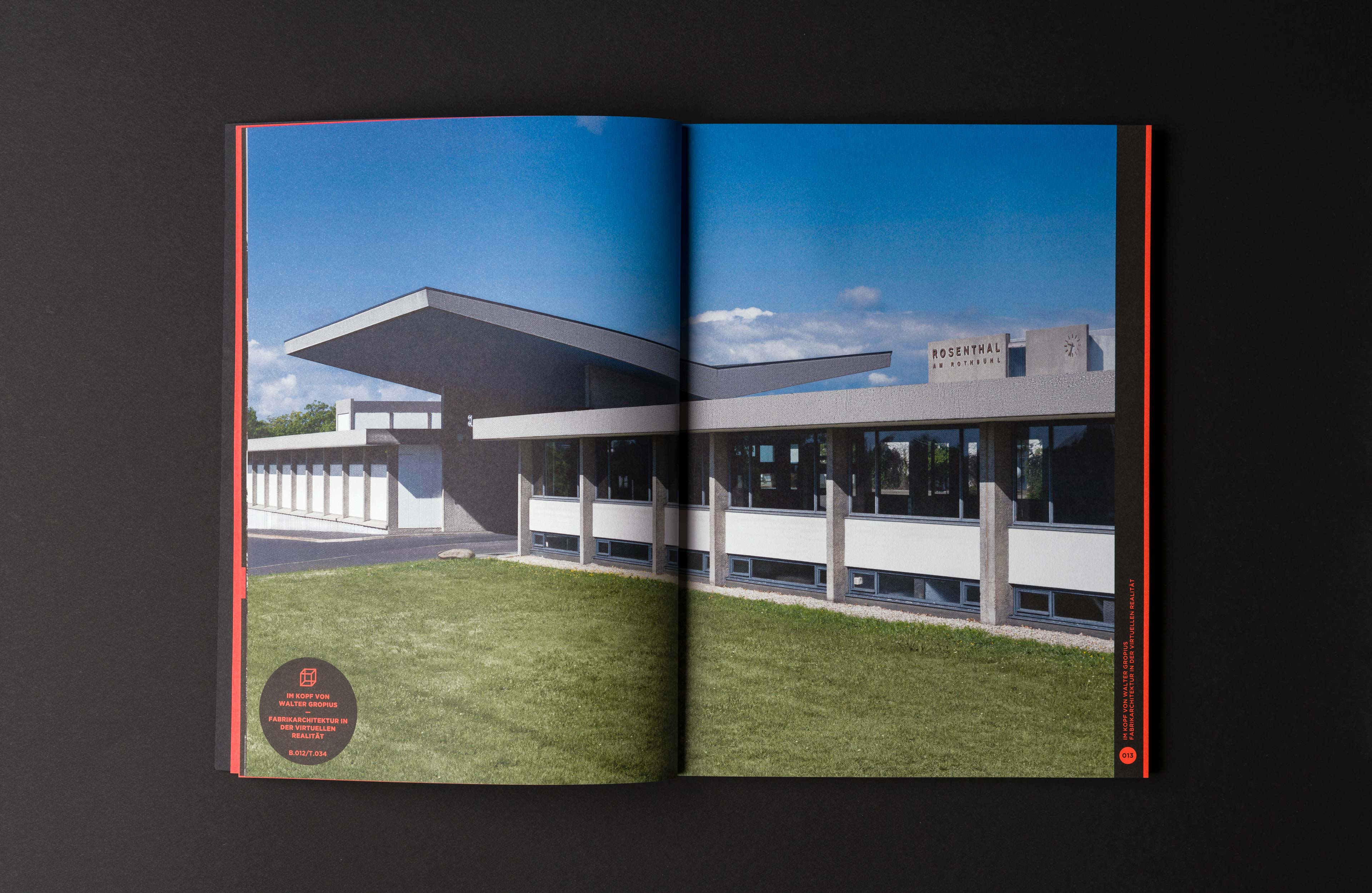
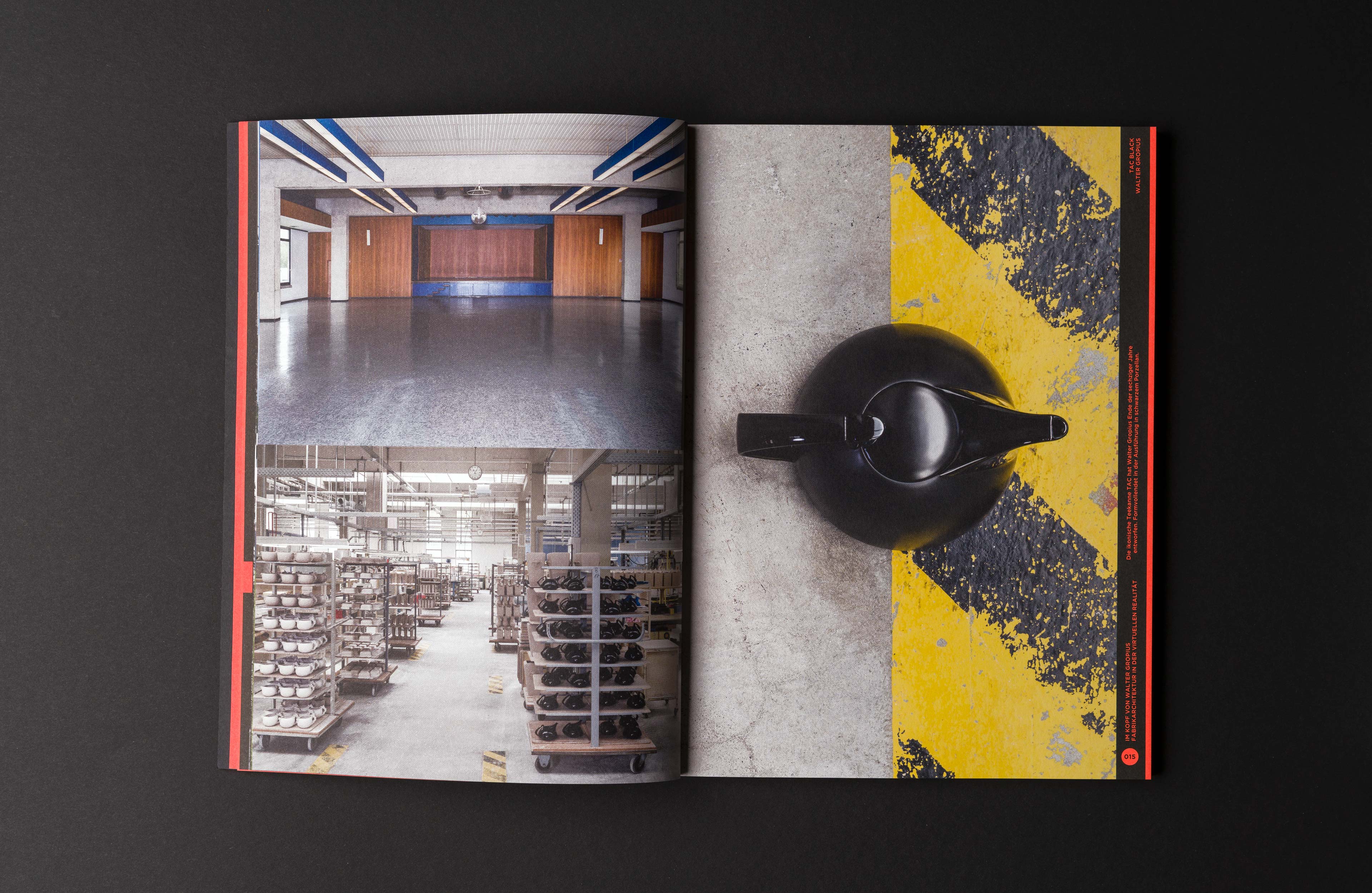
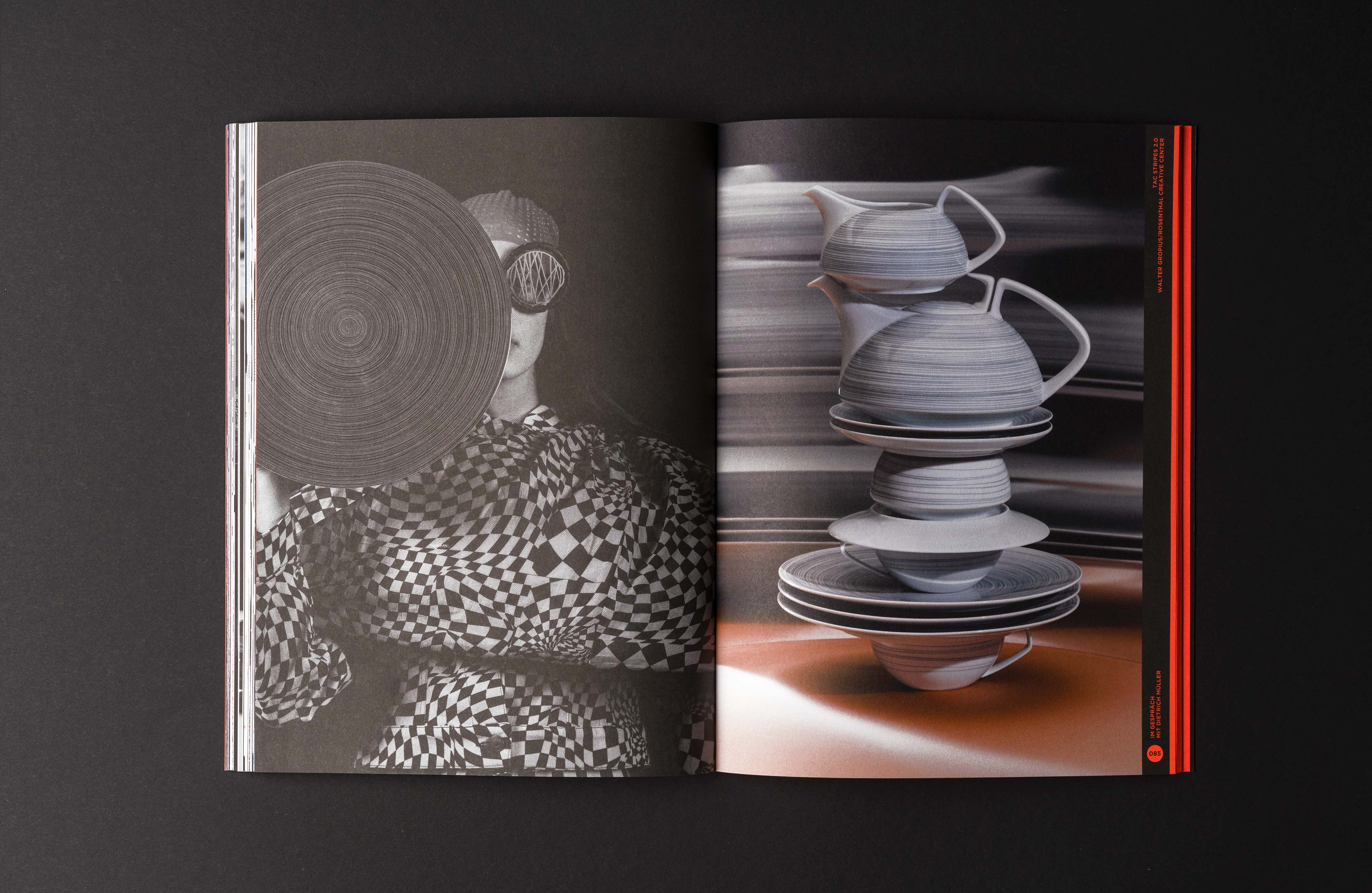
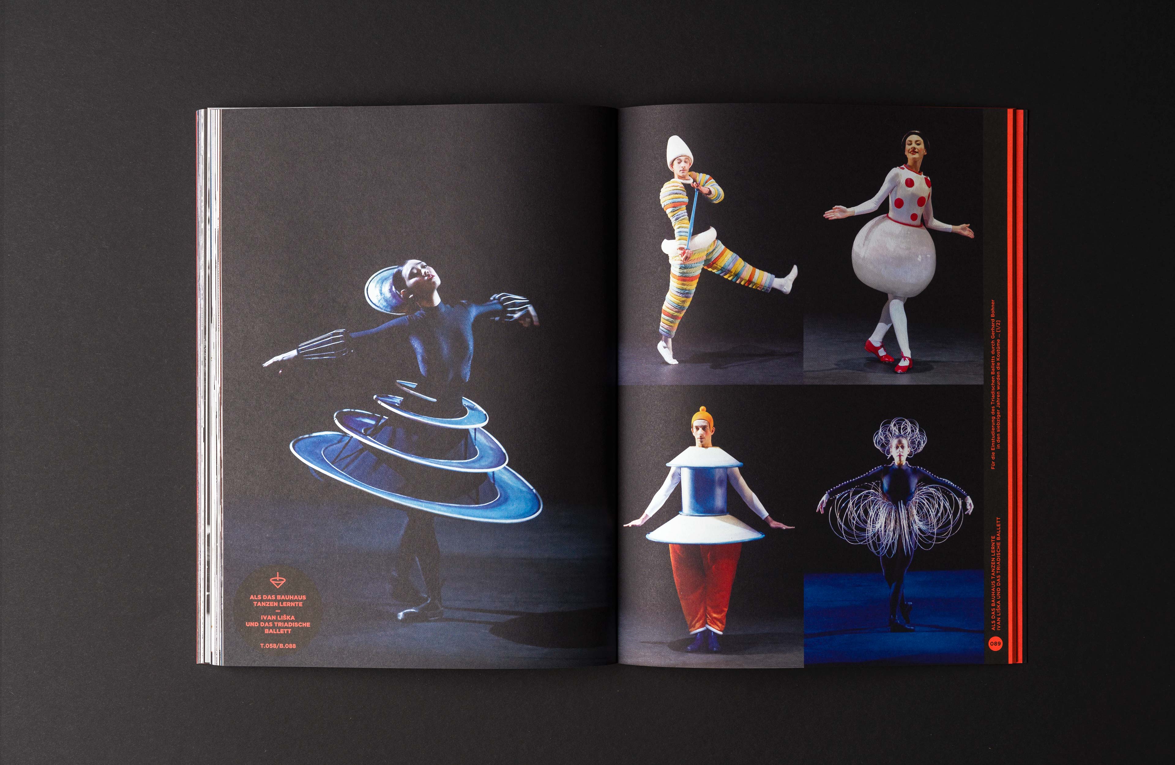
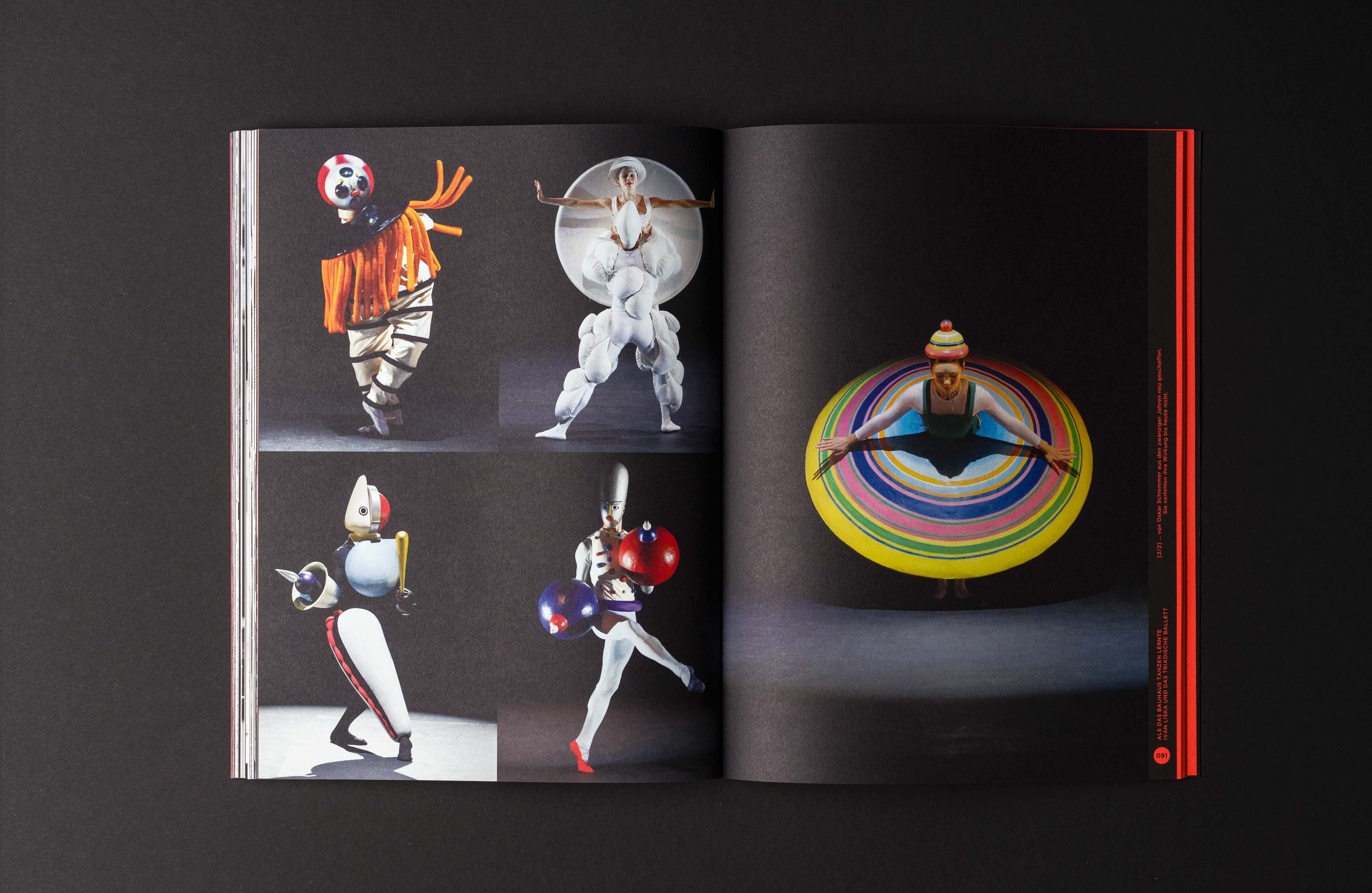
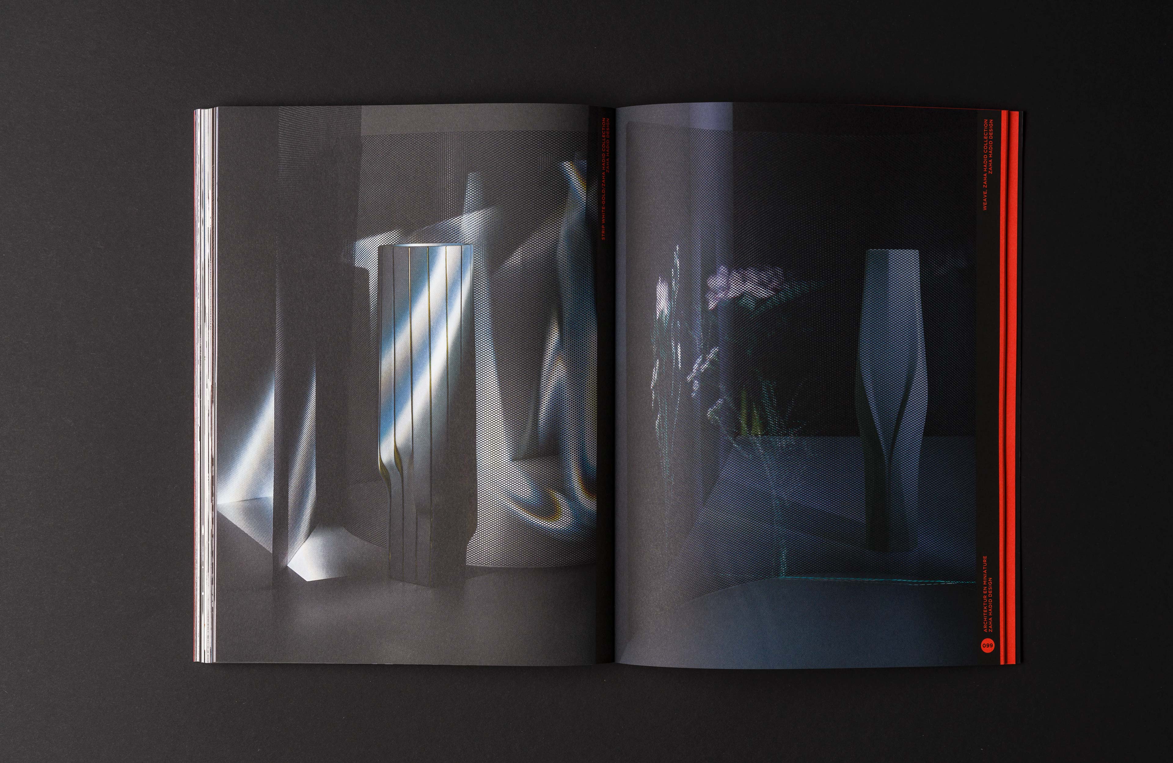
The best part of an anniversary is celebrating the occasion and bringing it into the spotlight. One of the ideas from the porcelain manufacturer Rosenthal to celebrate »100 Years of Bauhaus« and express their connection to Bauhaus founder Walter Gropius, who designed the Rosenthal factory in Selb, was a customer magazine titled »Radikal Zeitgemäß,« which was published in both English and German.
Influenced by my studies at the Hochschule für Gestaltung Schwäbisch Gmünd, which follows the Bauhaus tradition, I saw the project as a welcome opportunity to reflect on the impact of Bauhaus philosophy on today’s design world and gather inspiration for the design development.
Objective: The magazine should express that Rosenthal embodies the contemporary values of Bauhaus, through its design and production methods.
MAKING OF
My involvement in the project started after the magazine was collated. I received the final text and image material and began development of the structure, layout and design of the magazine.
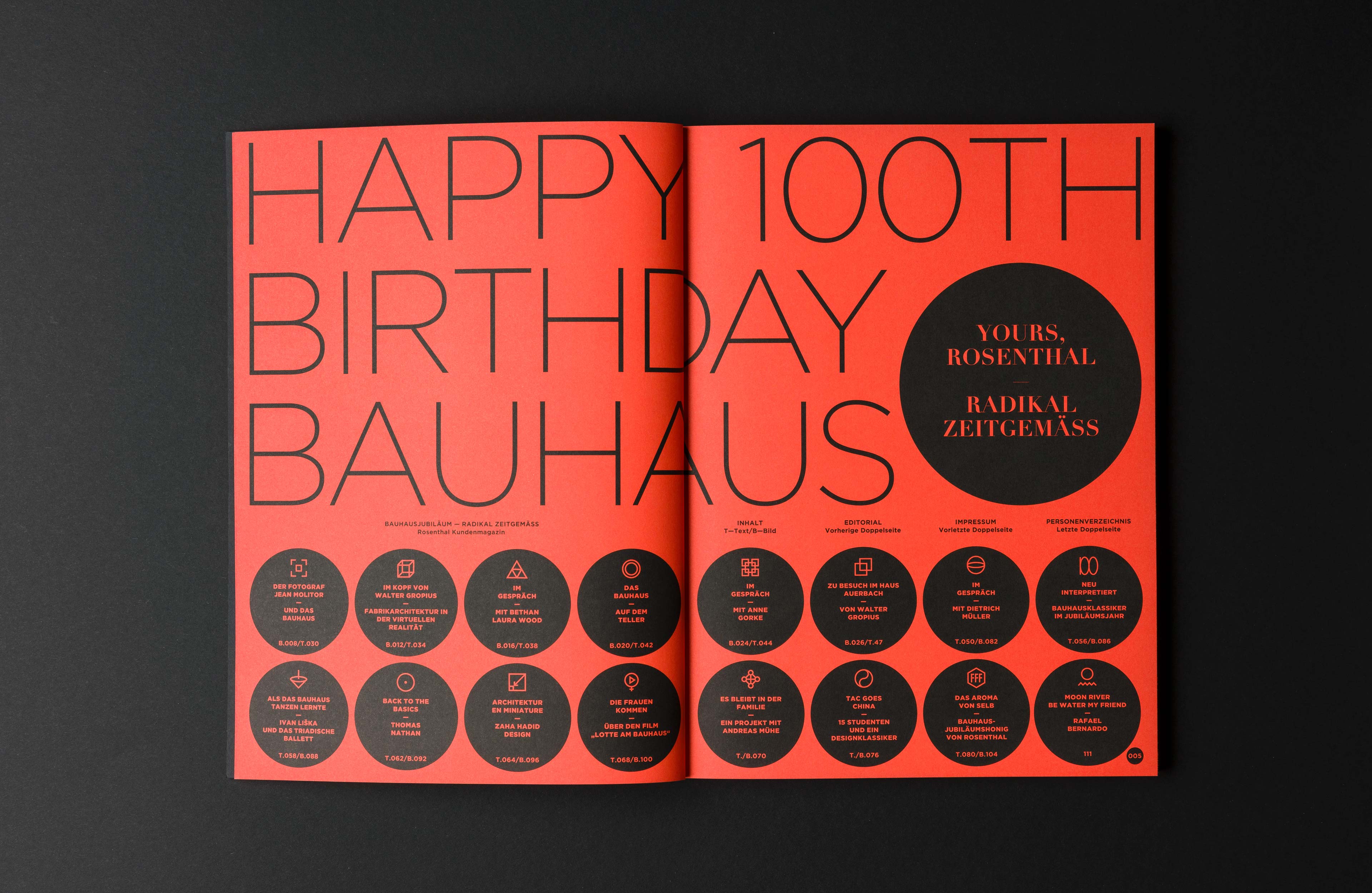
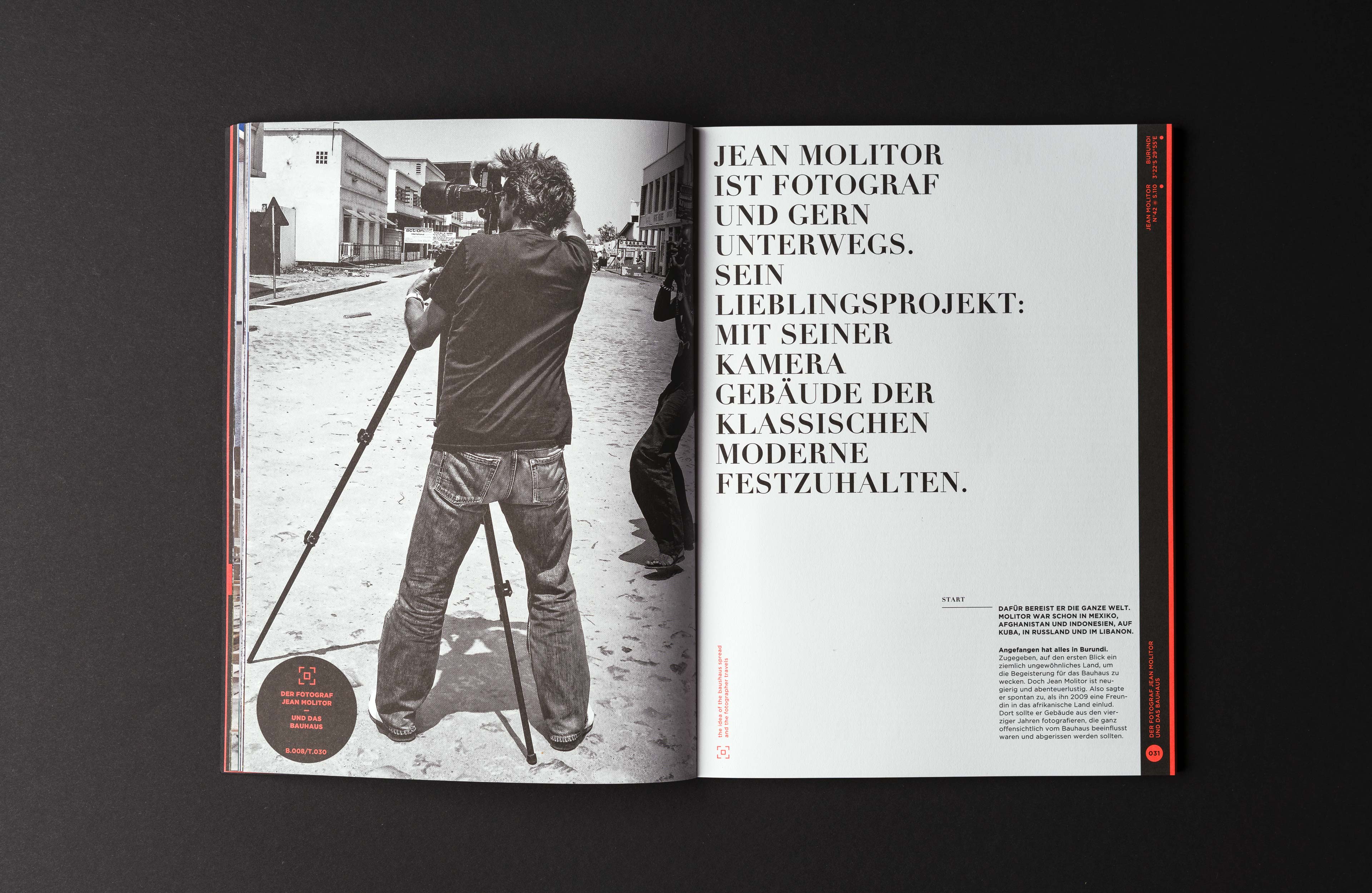
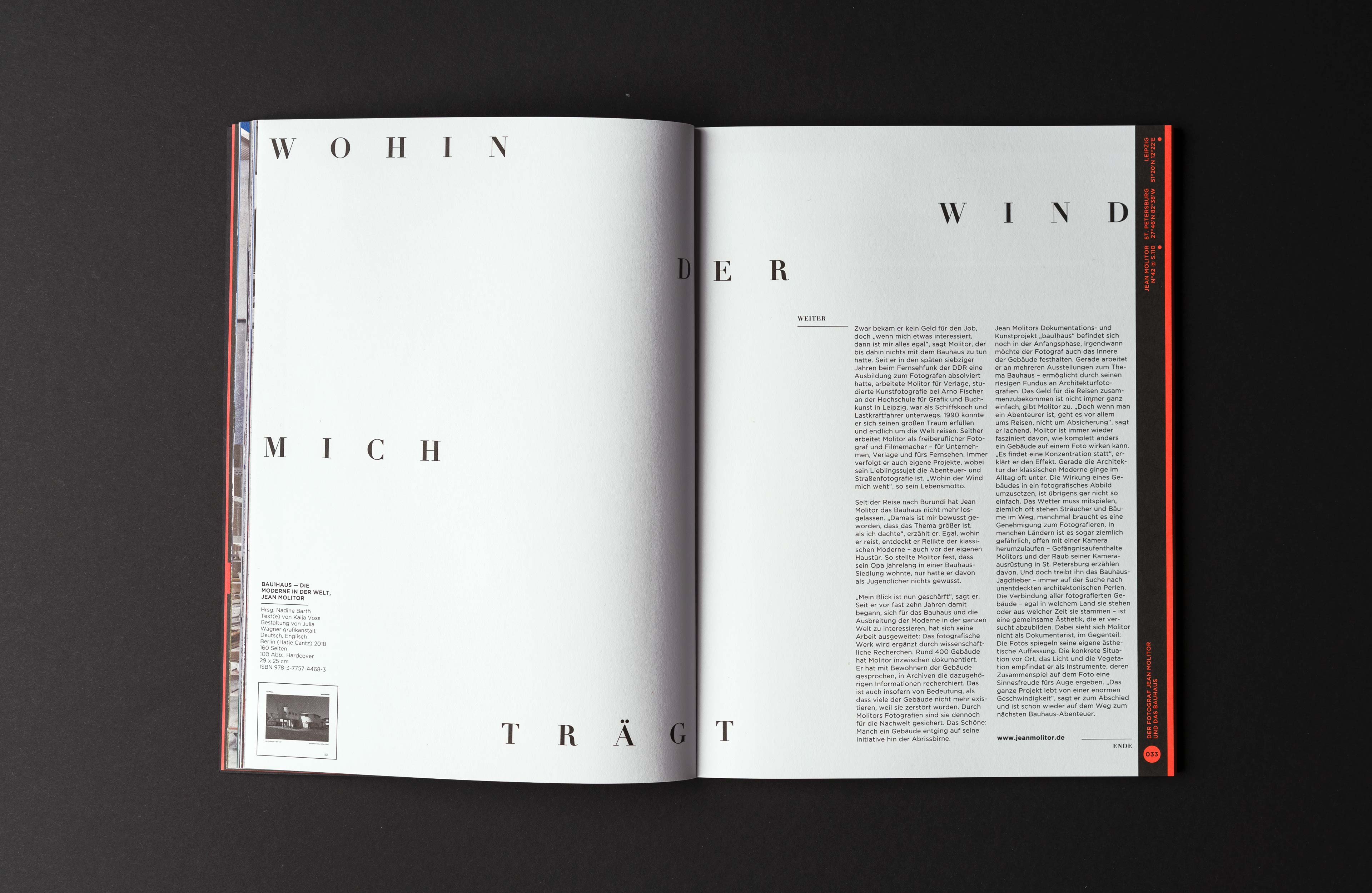
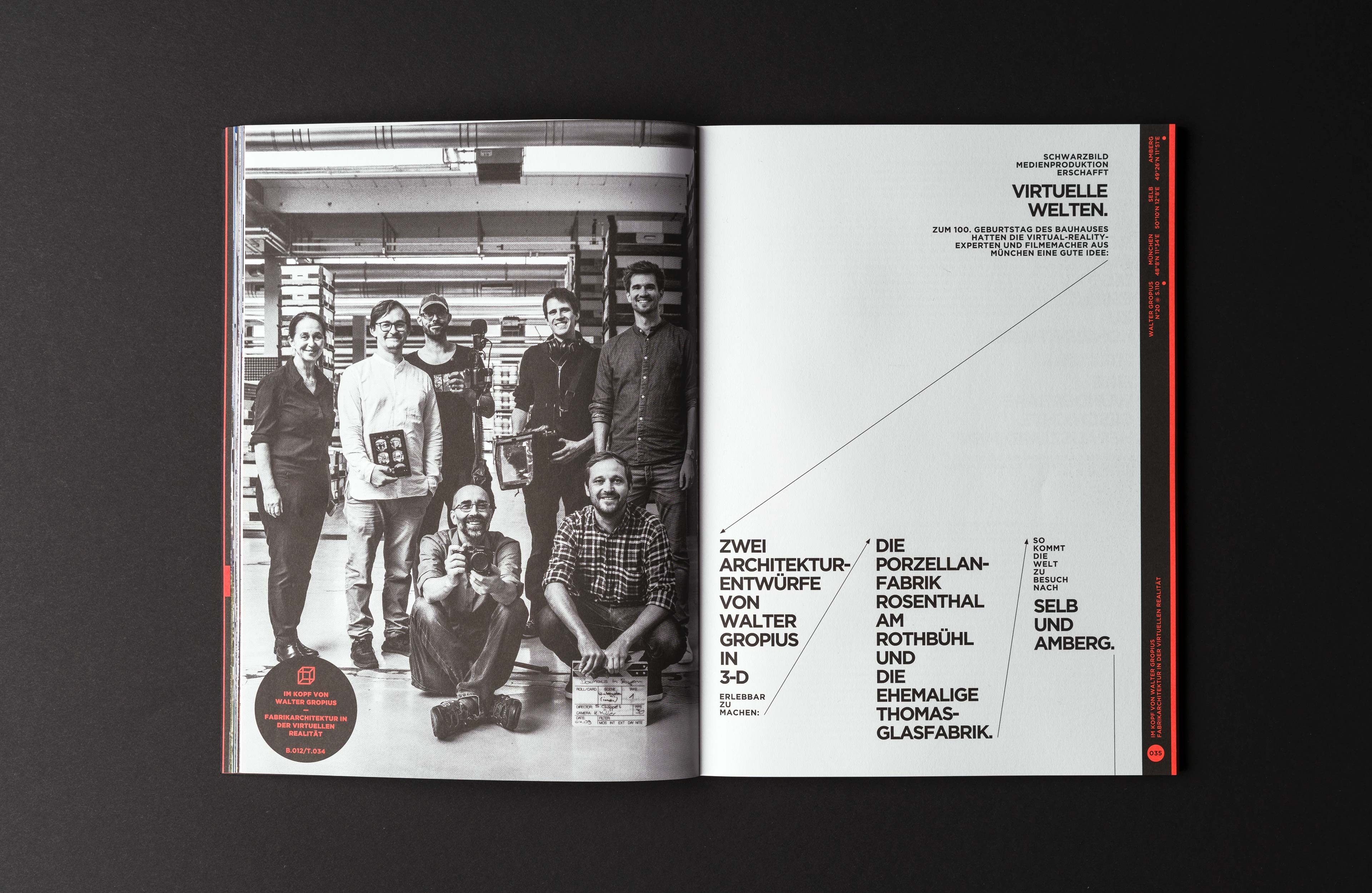
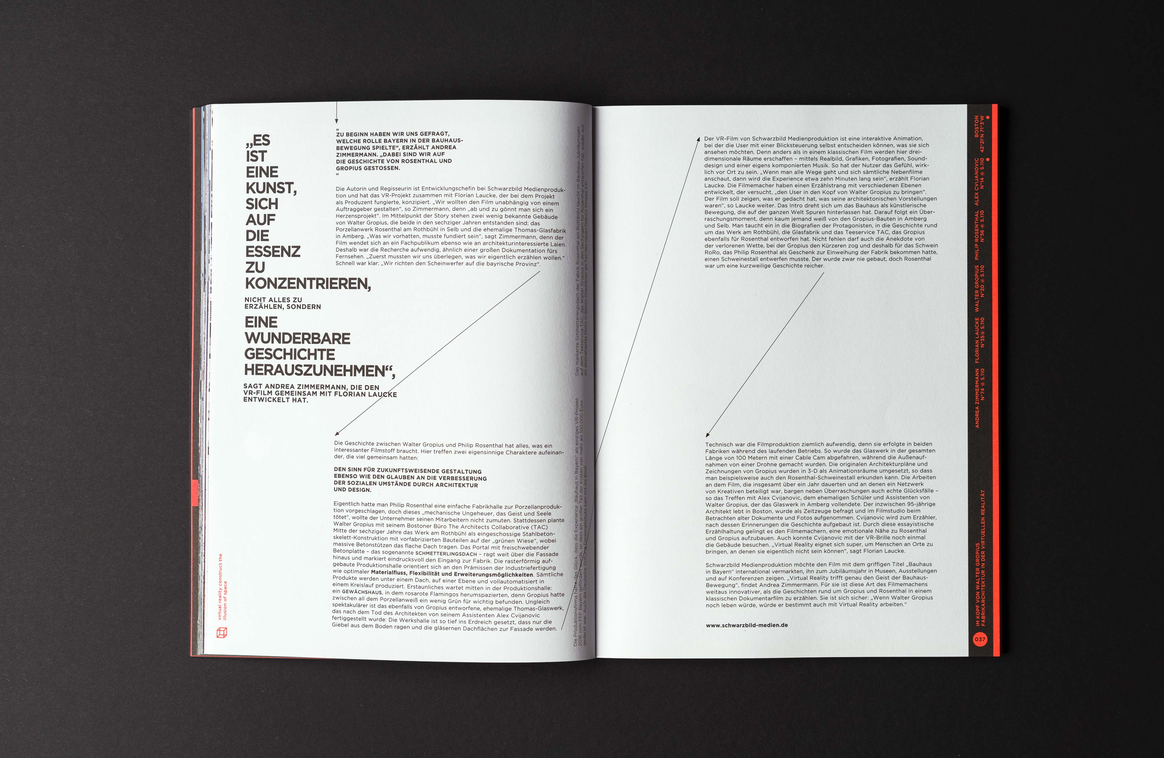
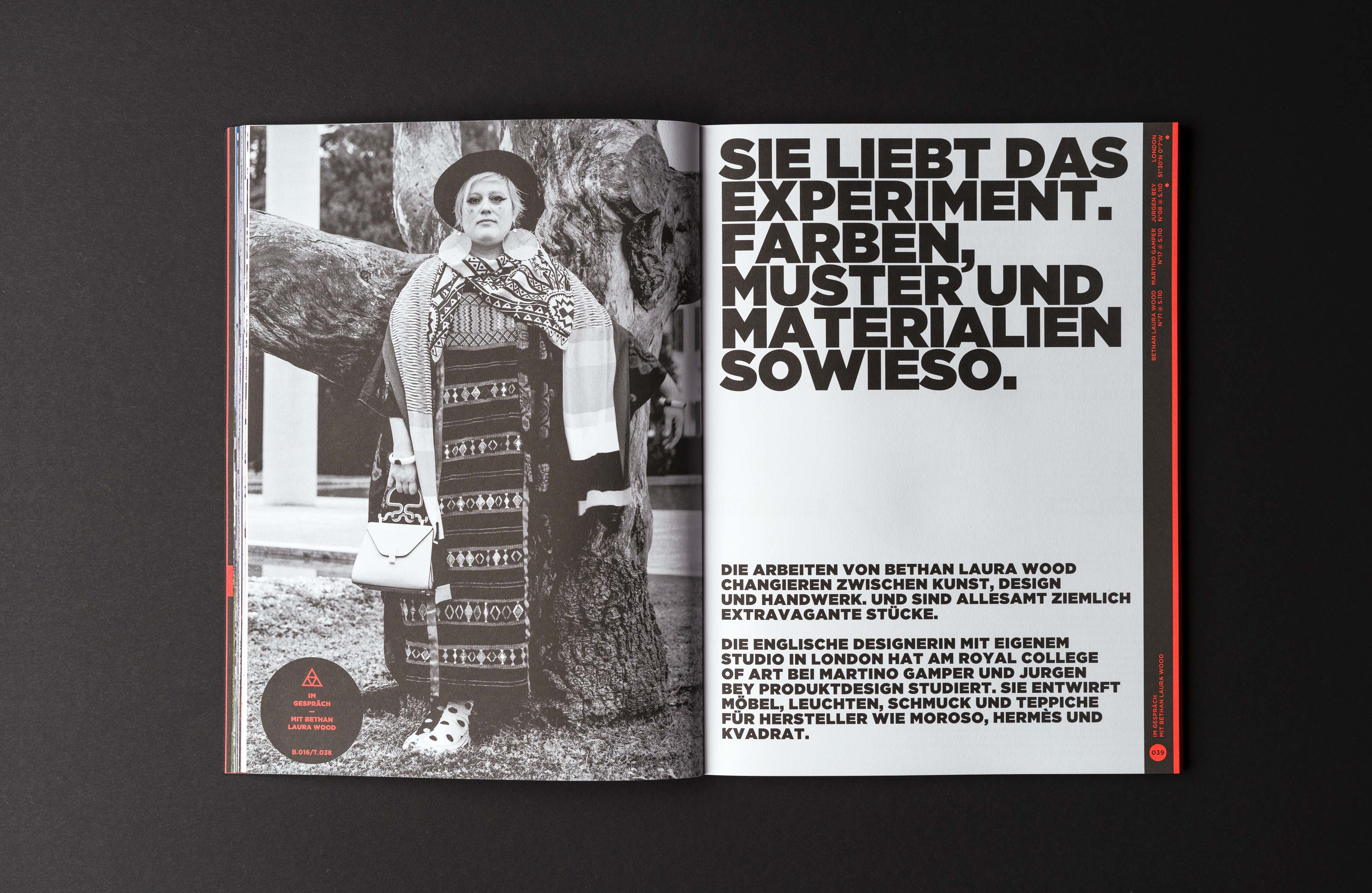
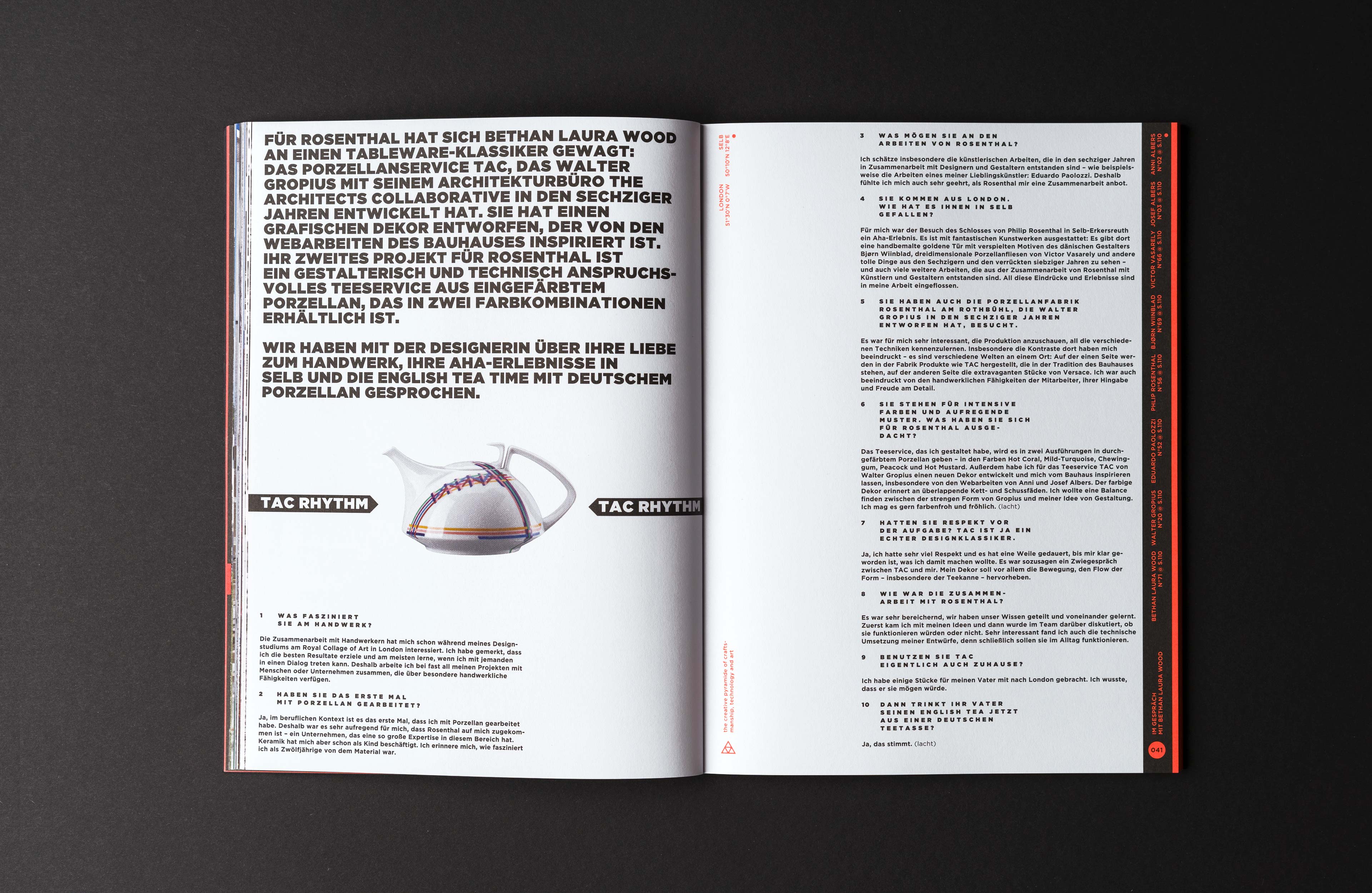
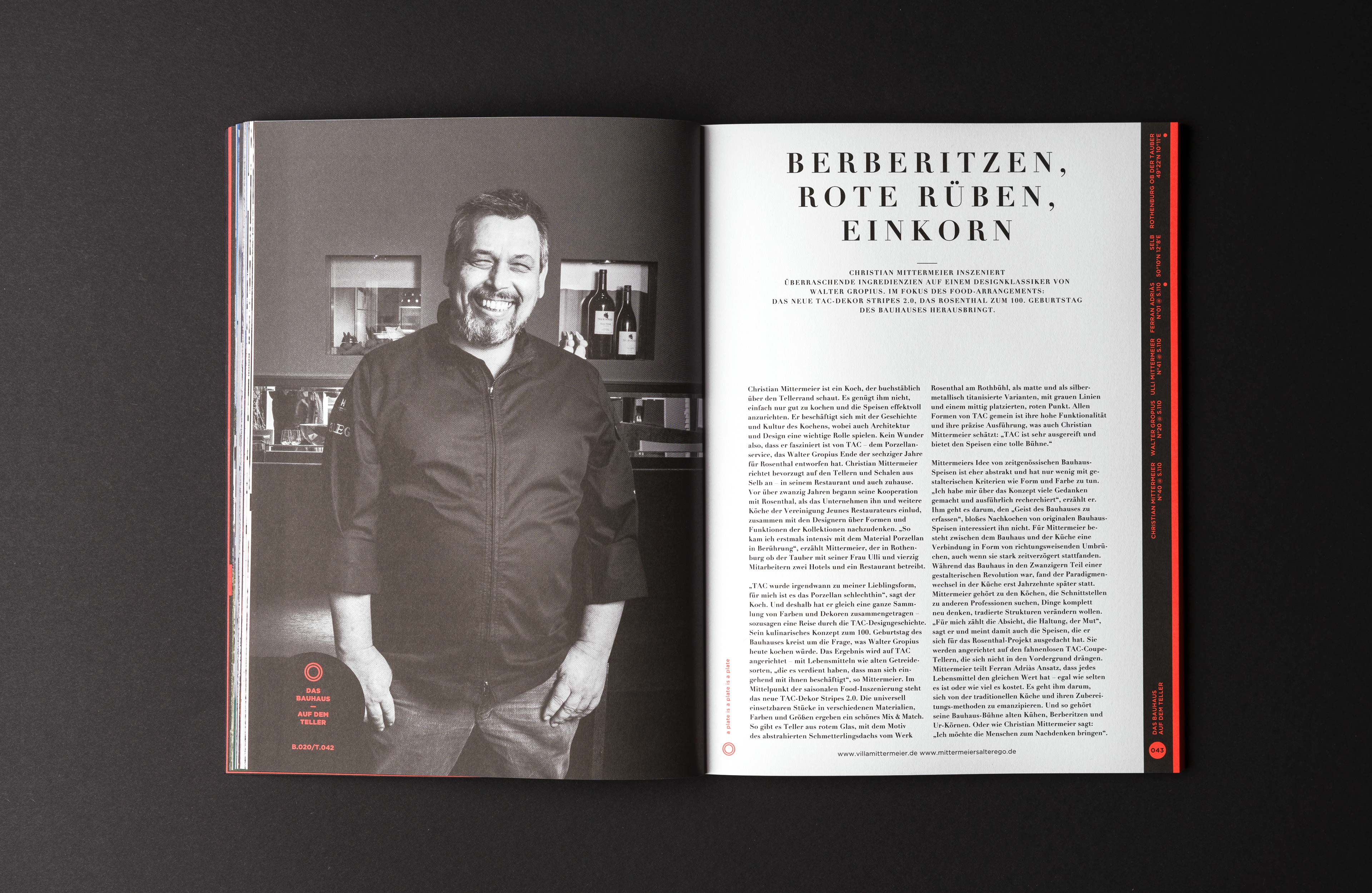
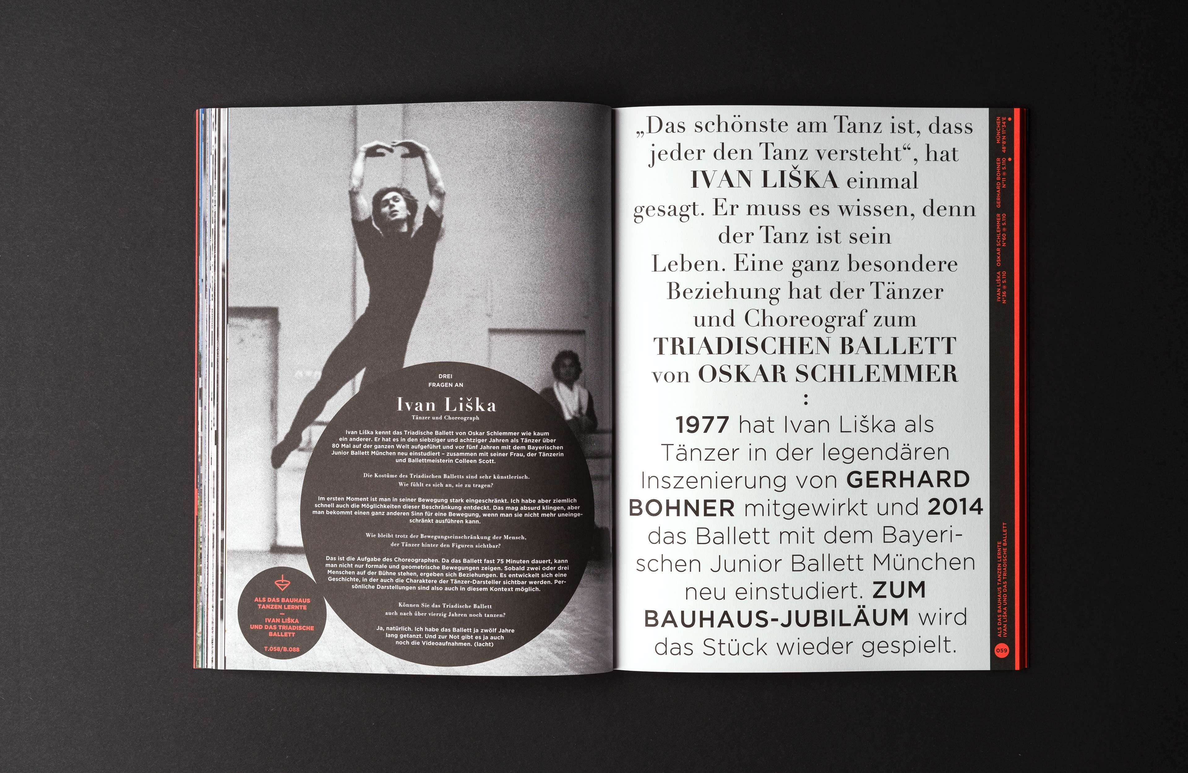
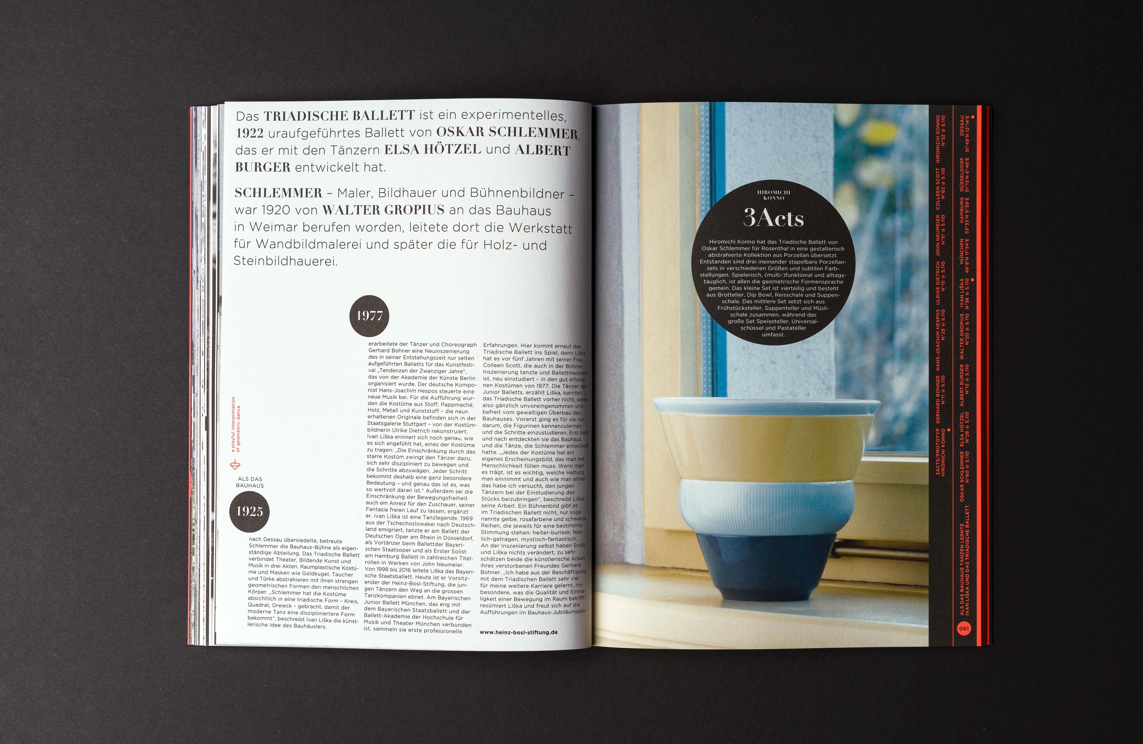
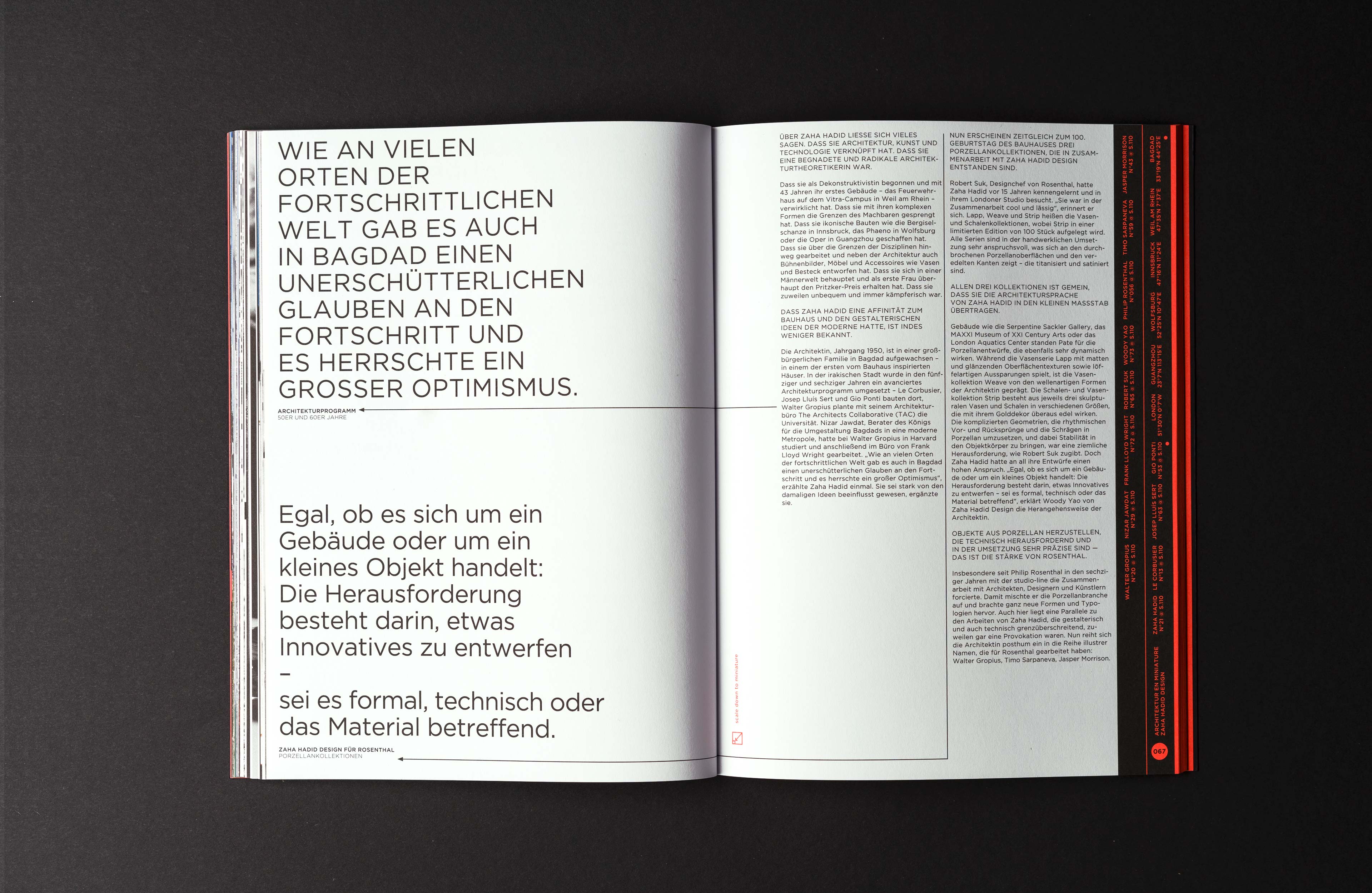
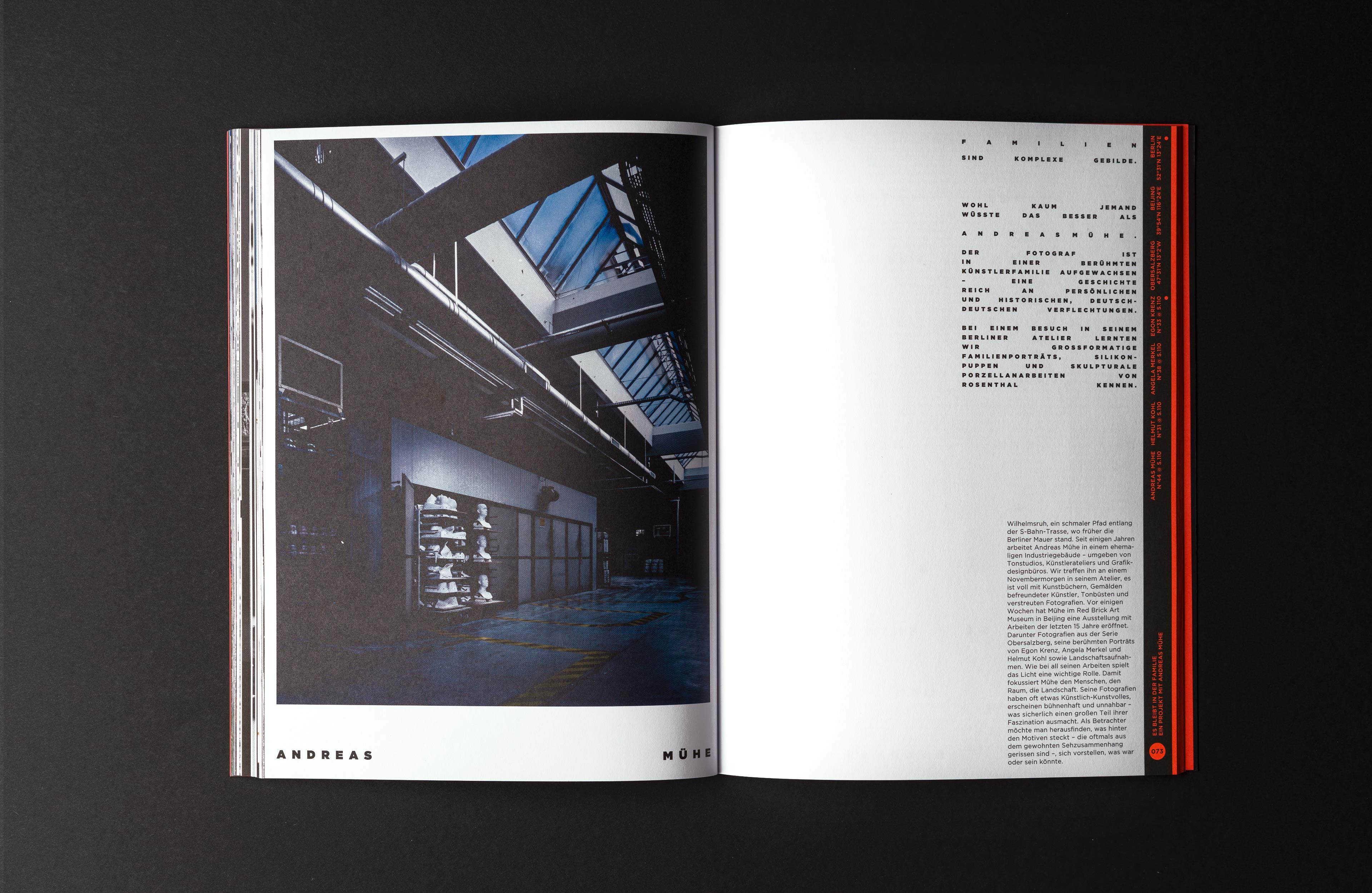
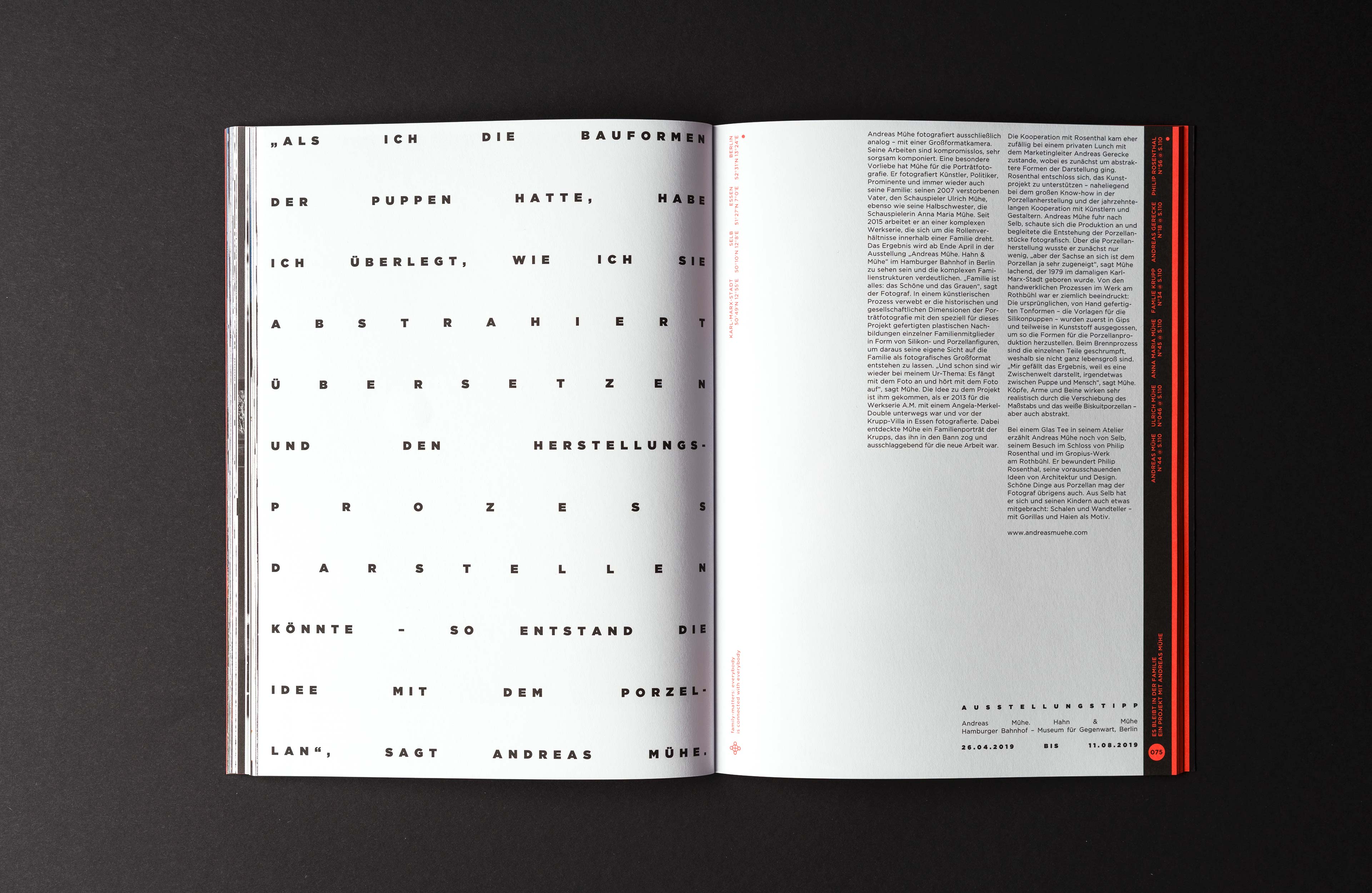
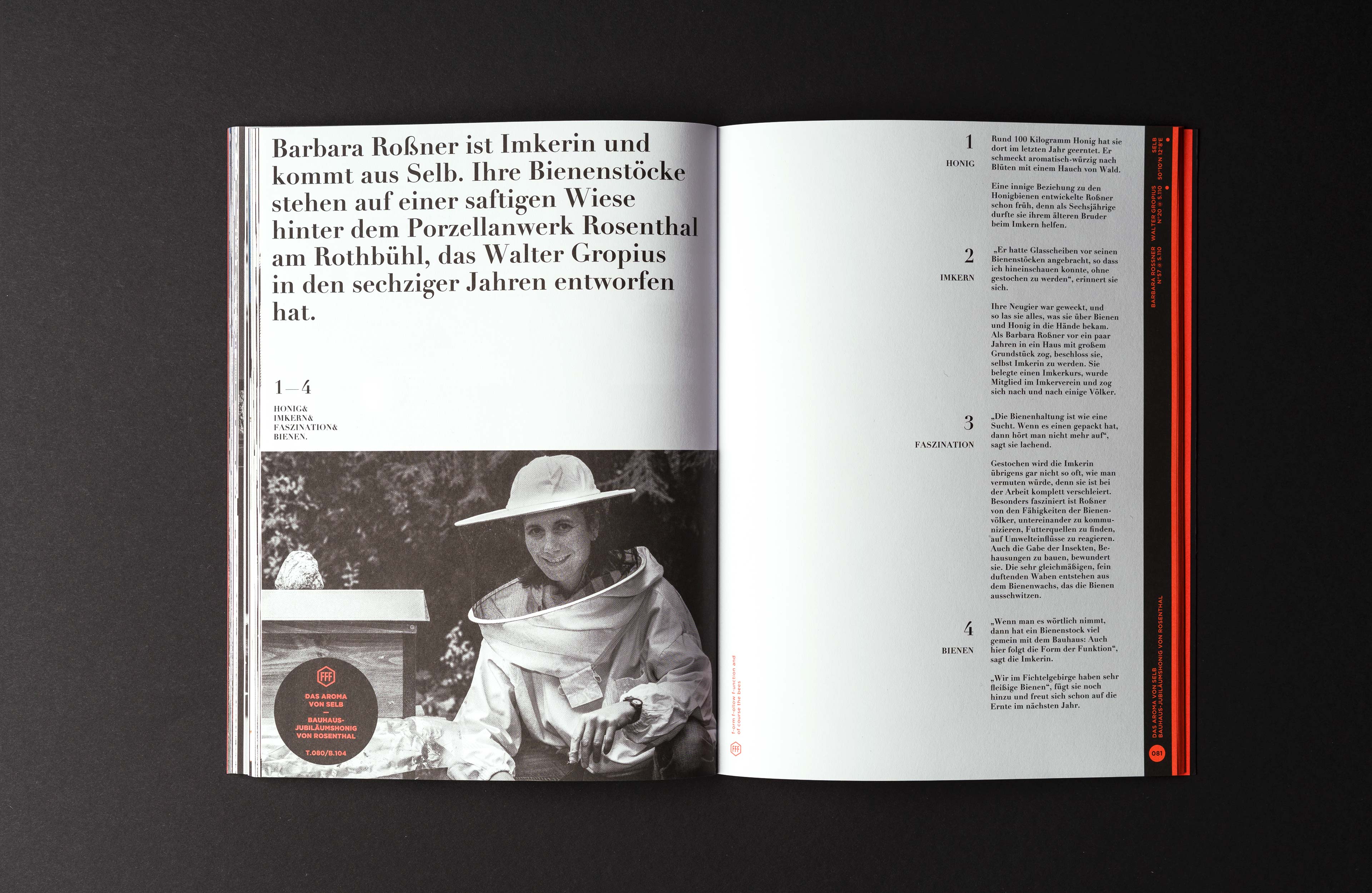
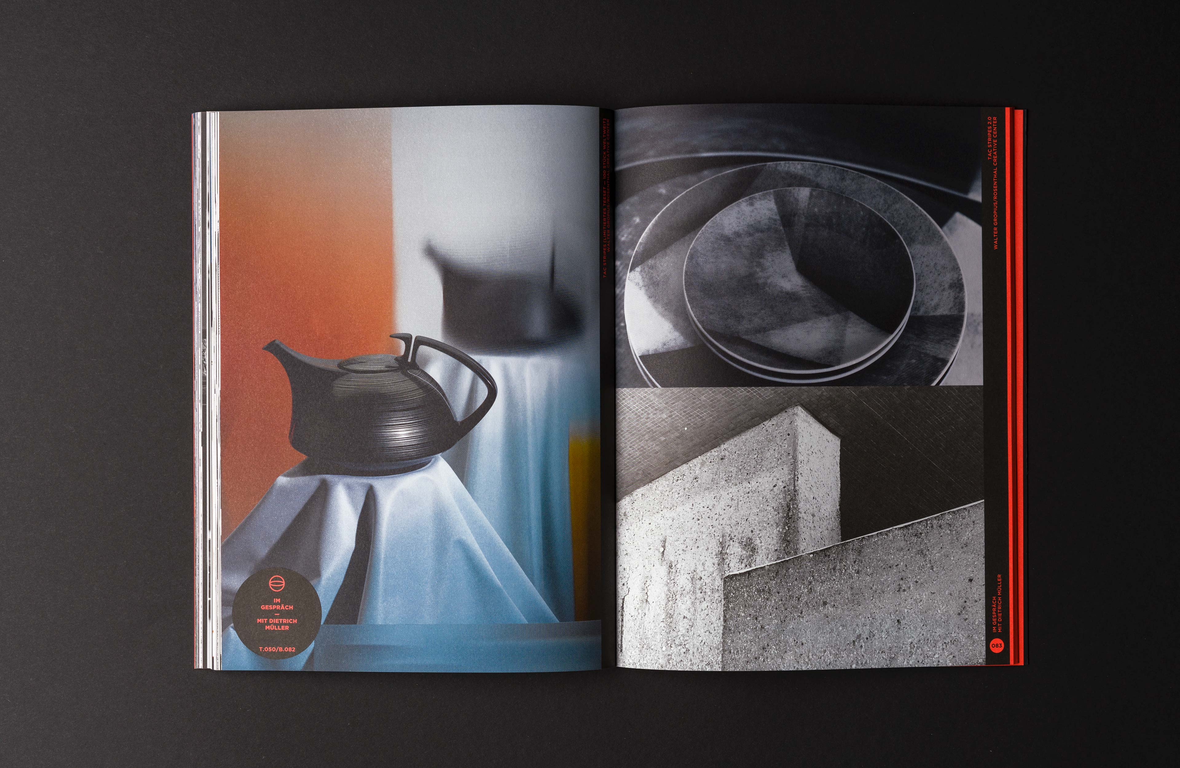
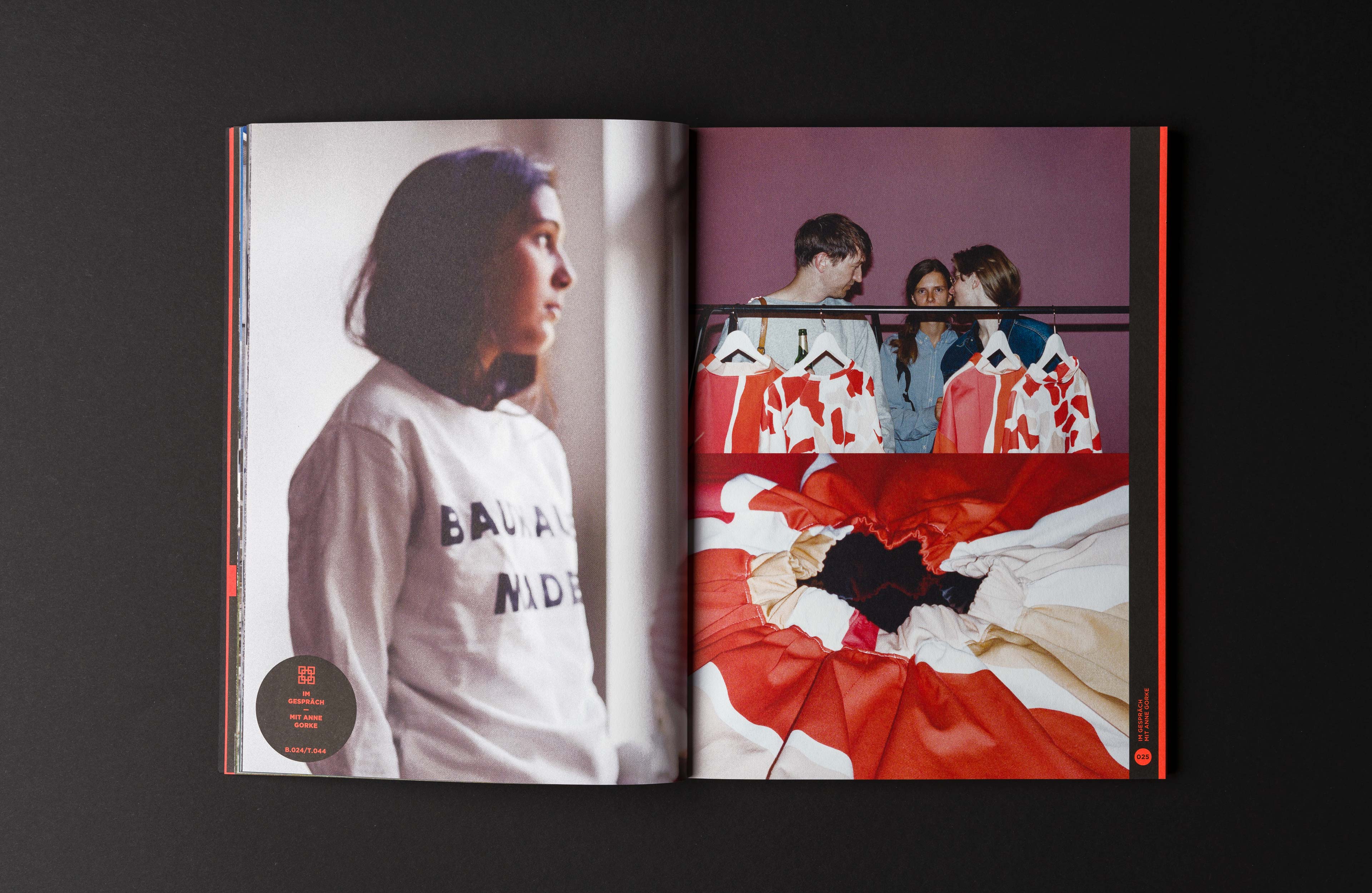
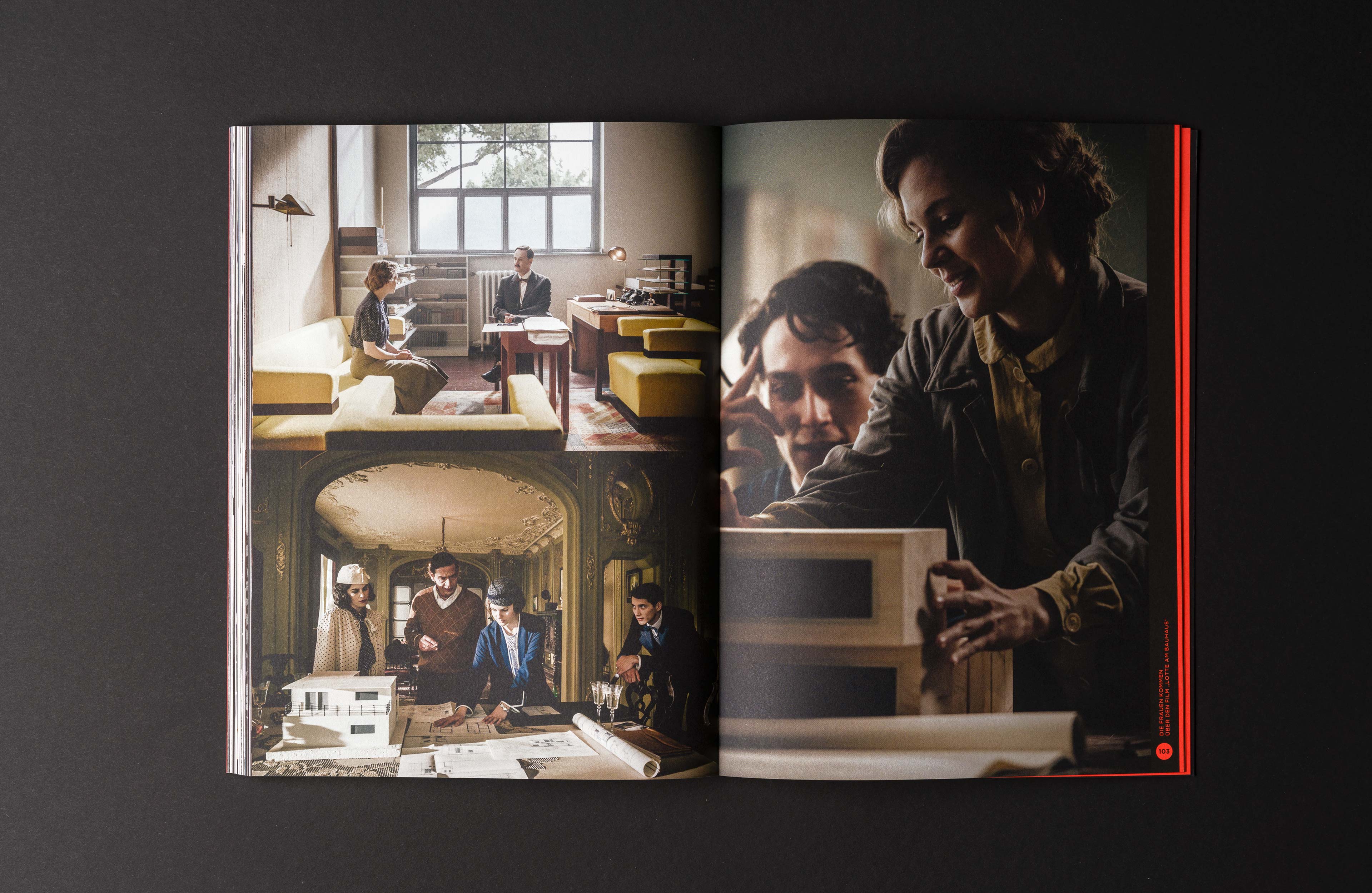
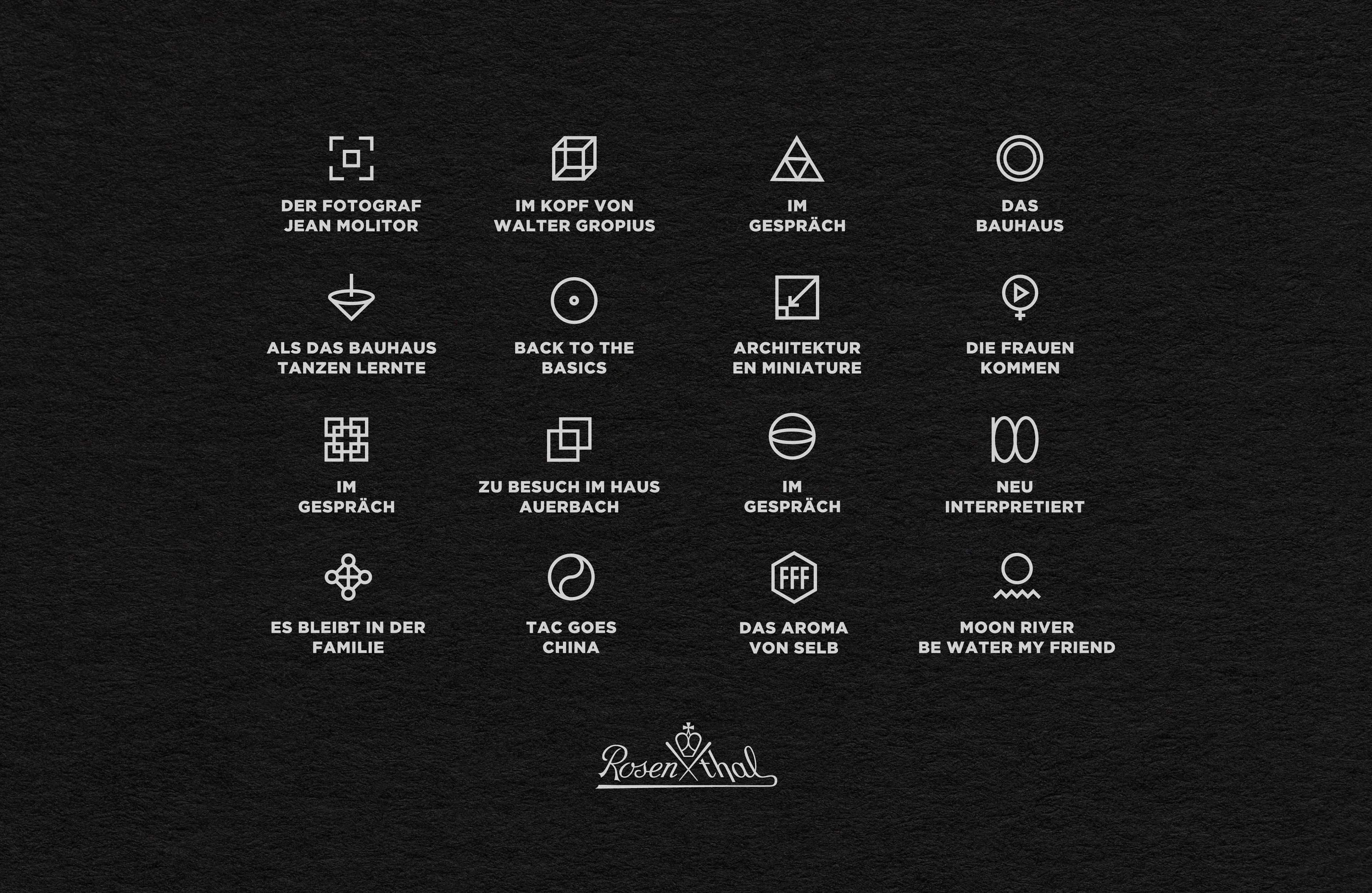
In the course of testing the basic idea evolved to divide the magazine into two parts. The images of the articles at the front and the texts at the back, respectively referencing each other through a corresponding pagination. To highlight these cross-references between content types, icons were developed for each article, which were also used in the table of contents. To express the individuality of the different topics and perspectives of each article, each piece was given not only its own icon but also a completely unique layout.
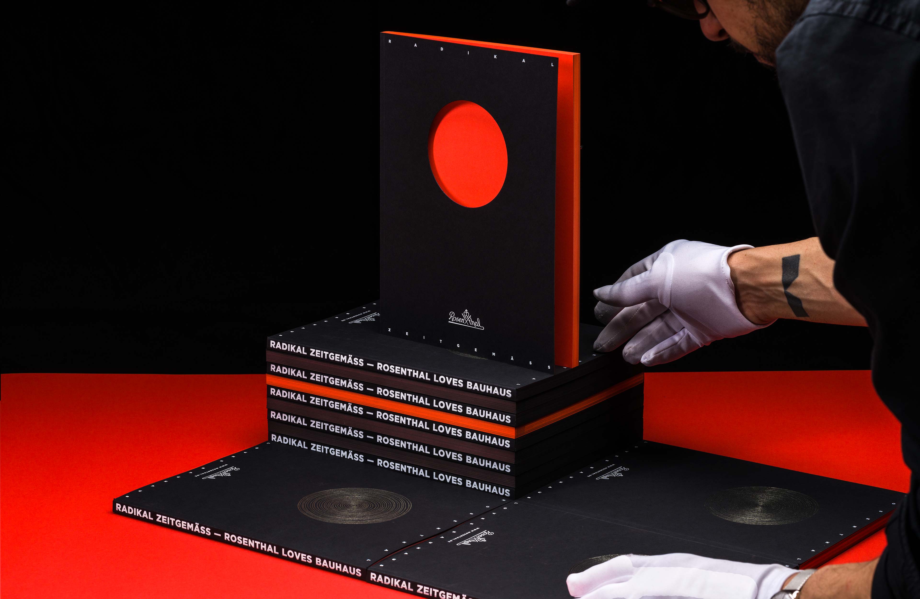
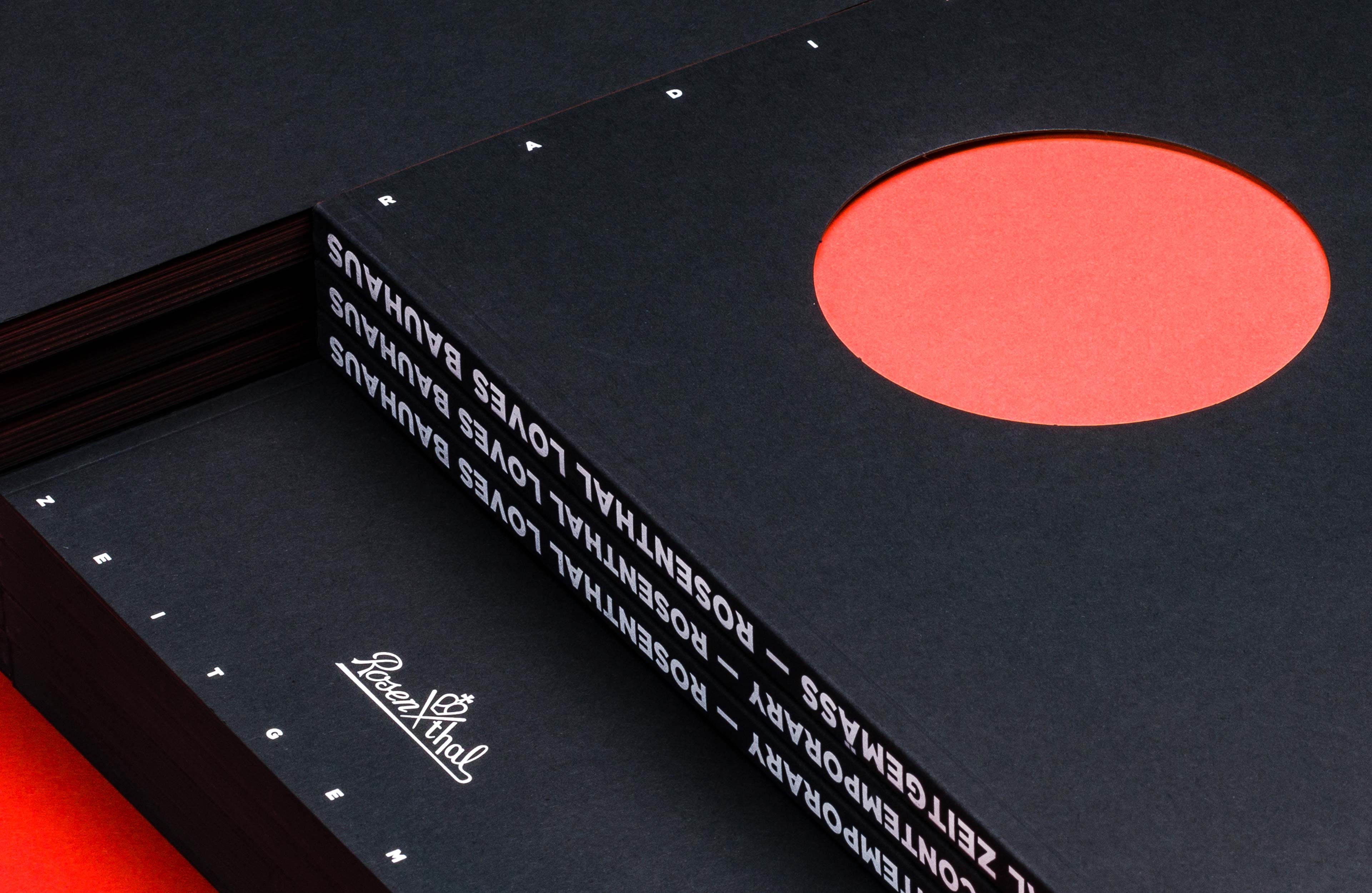
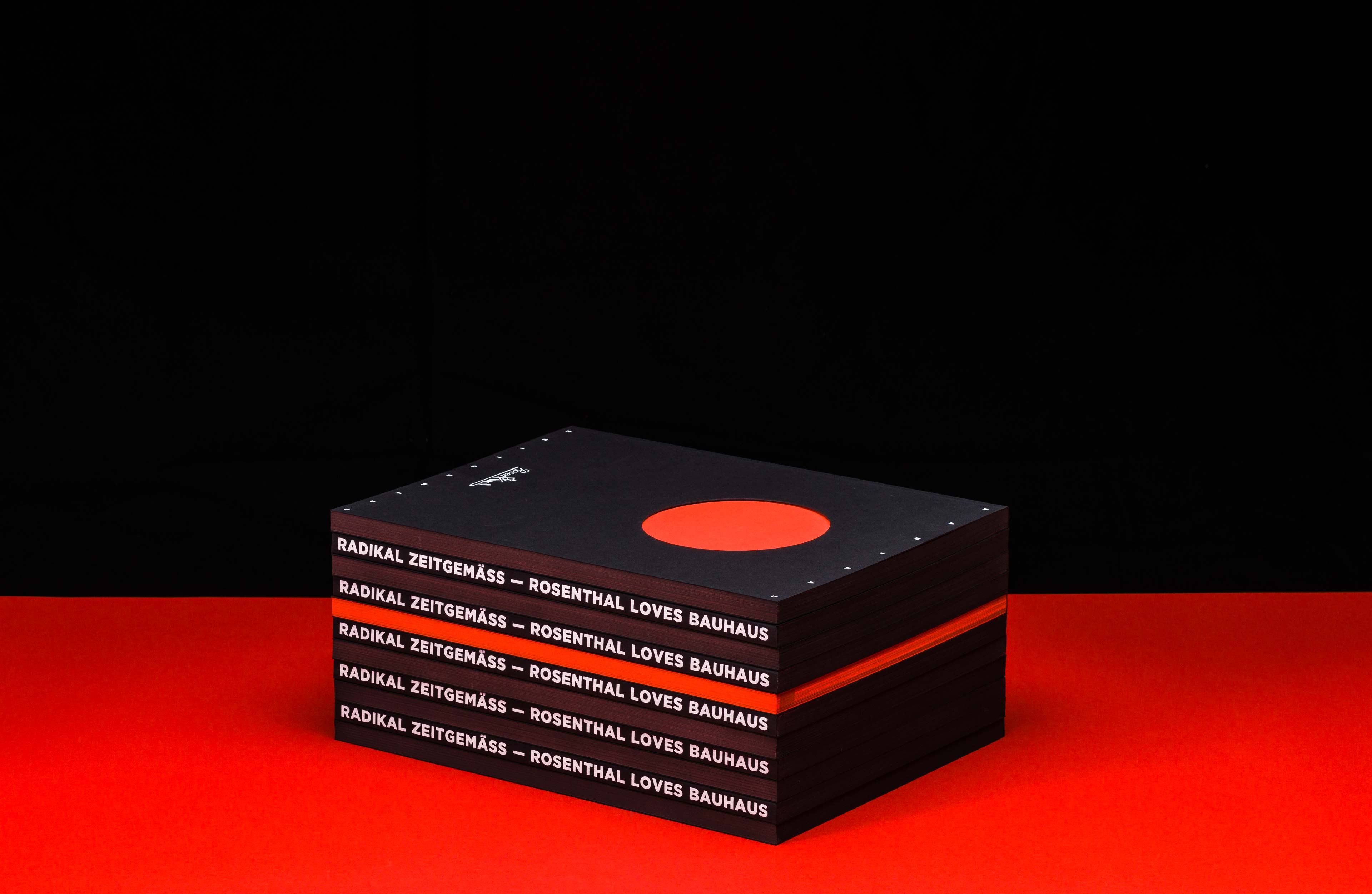
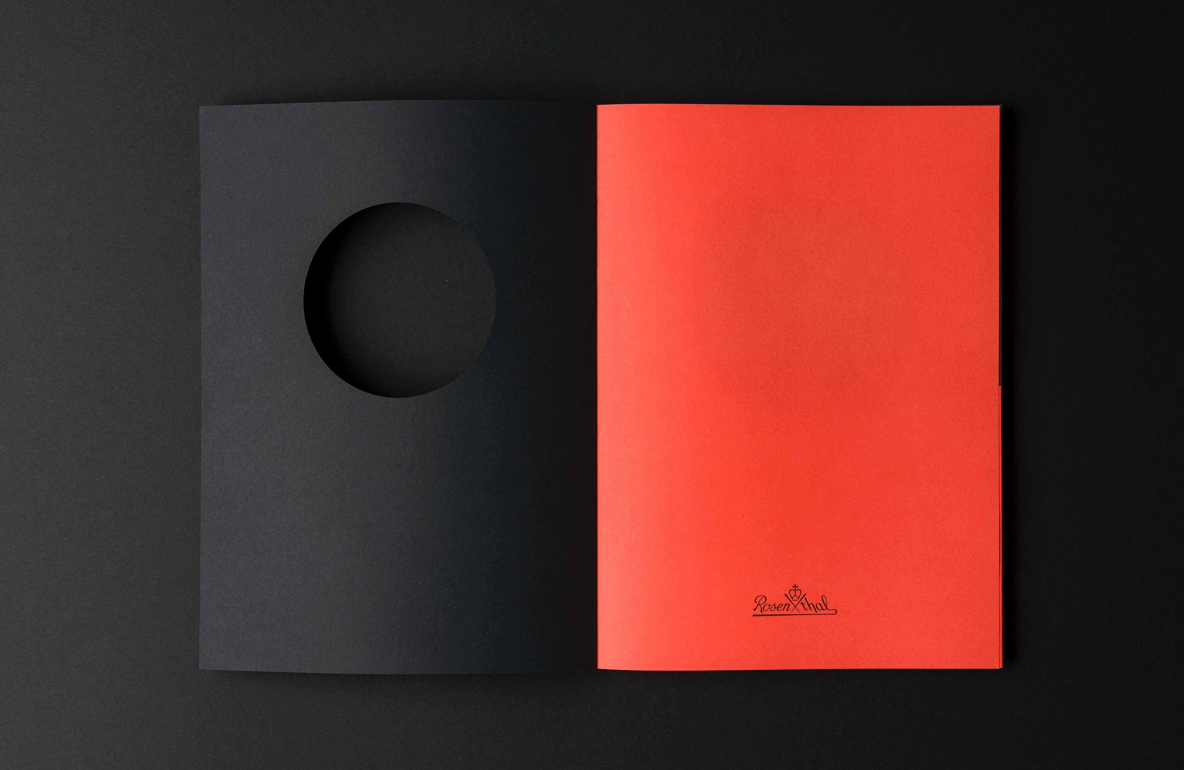
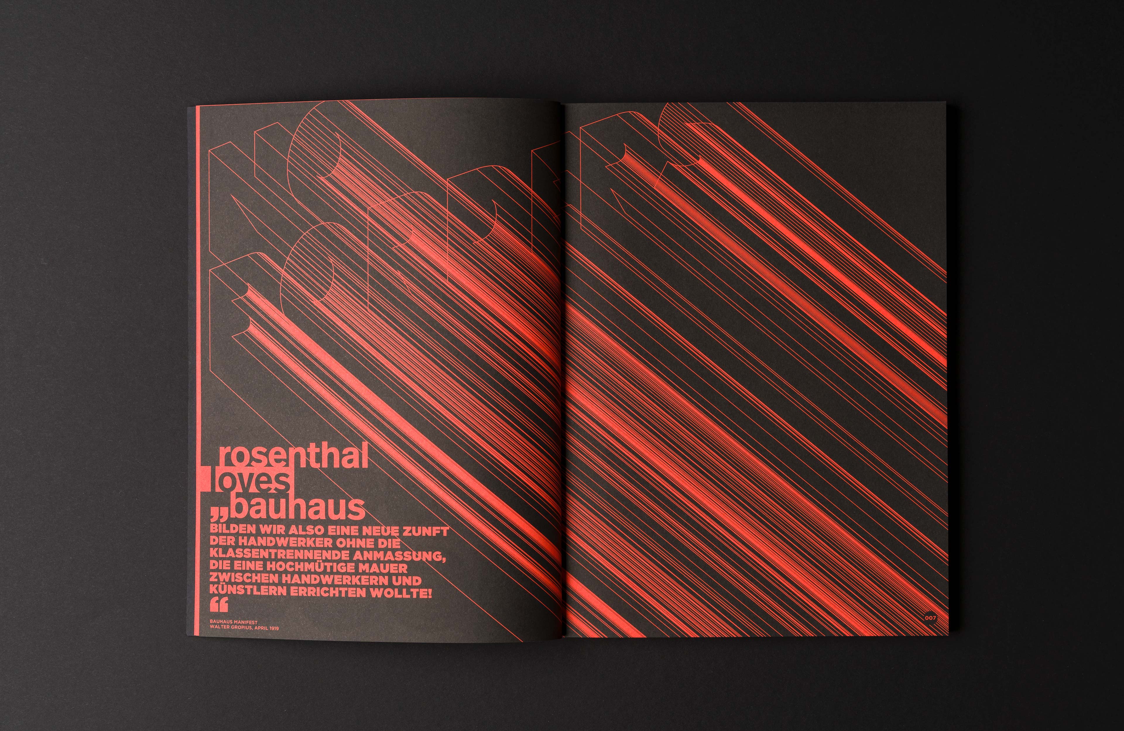
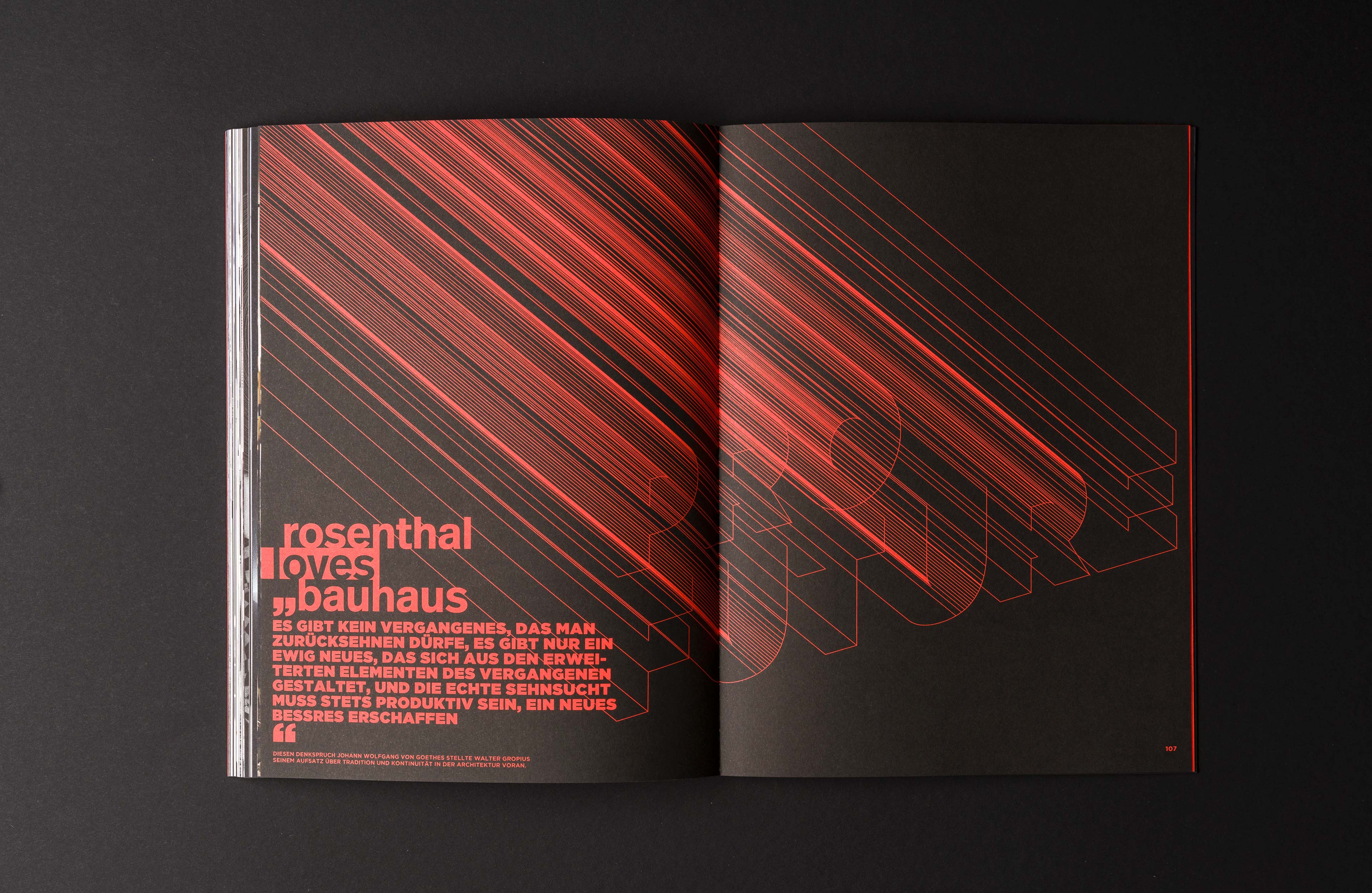
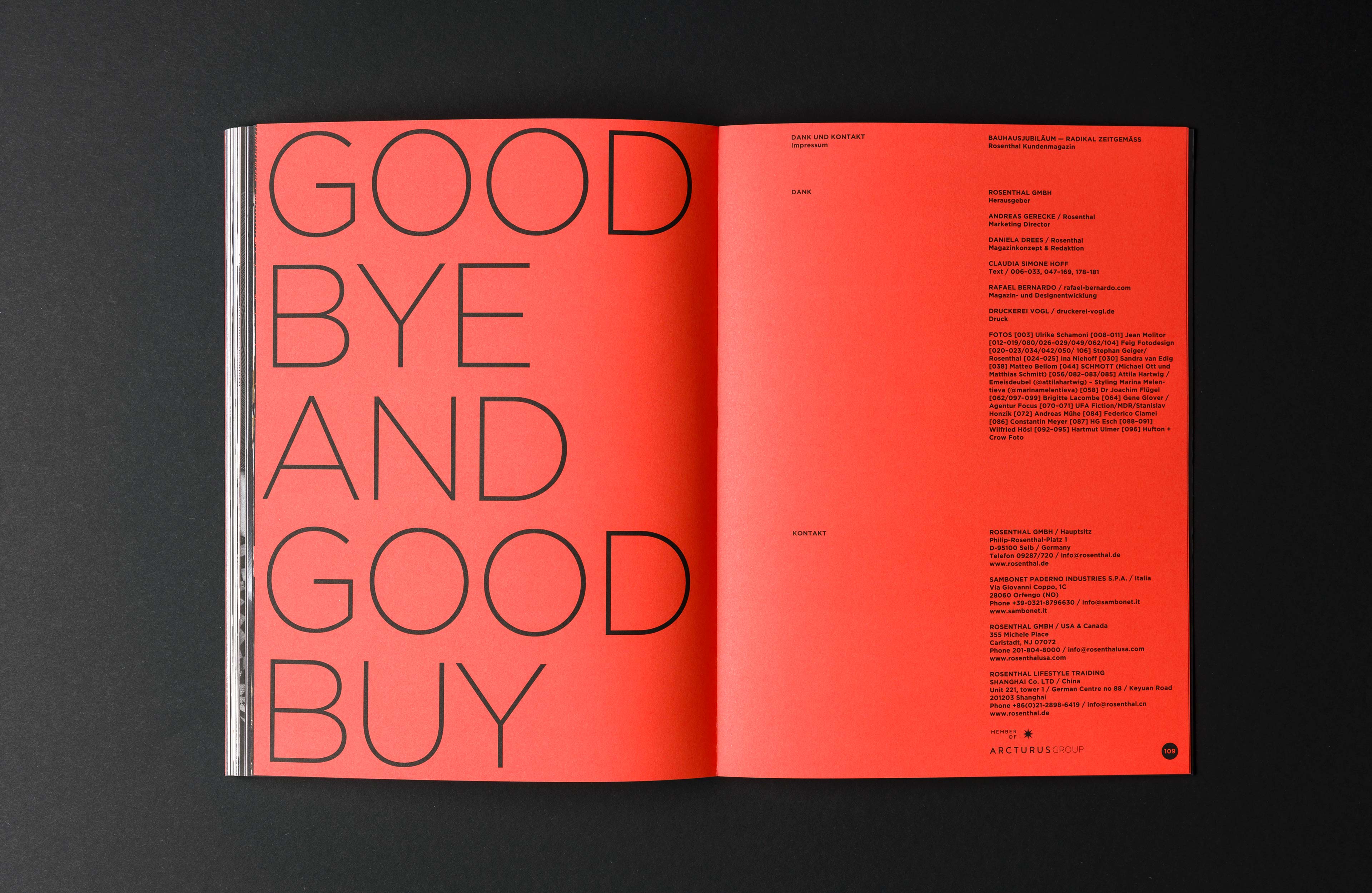
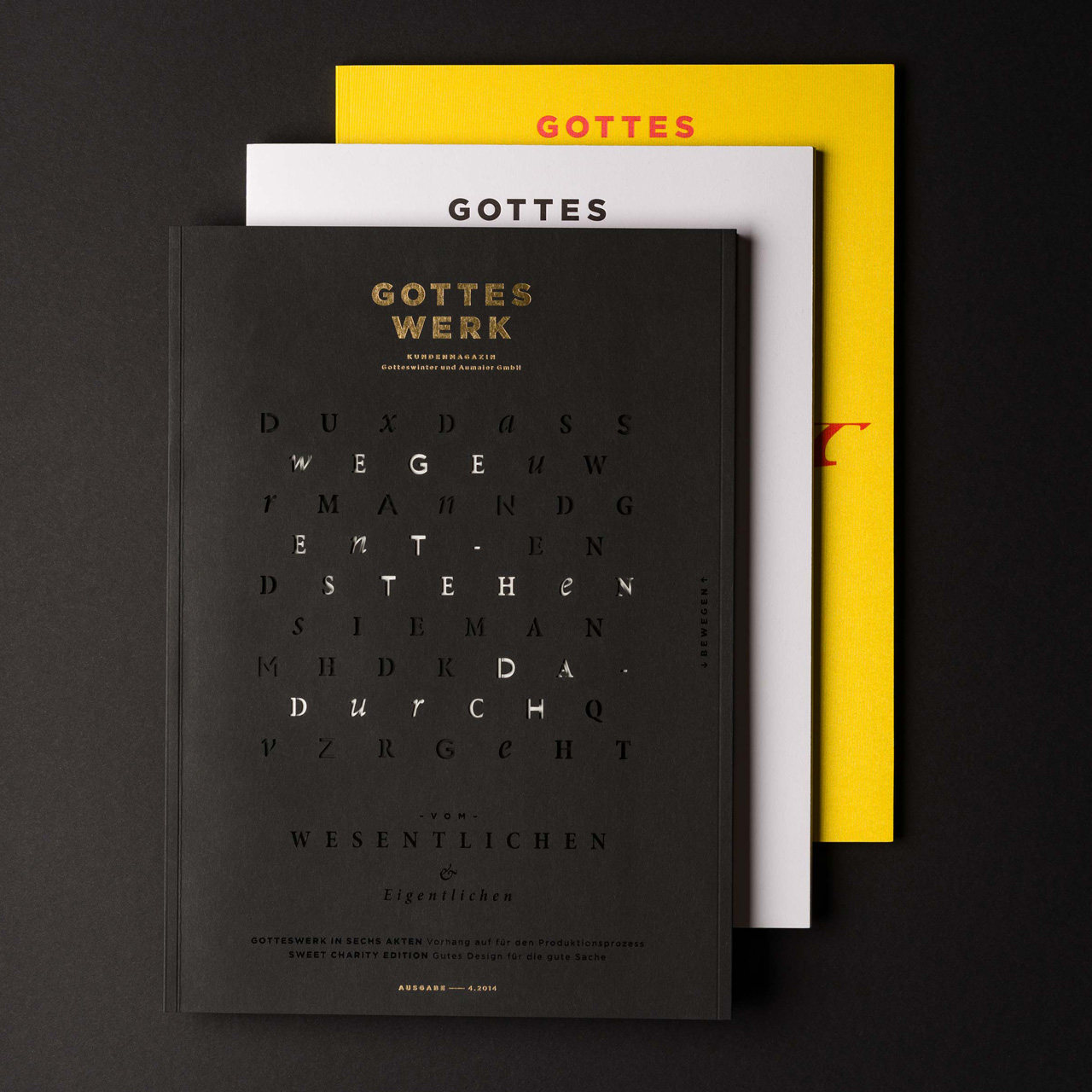
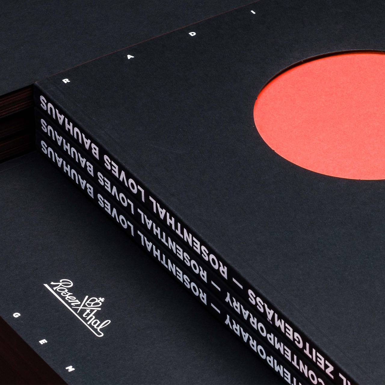
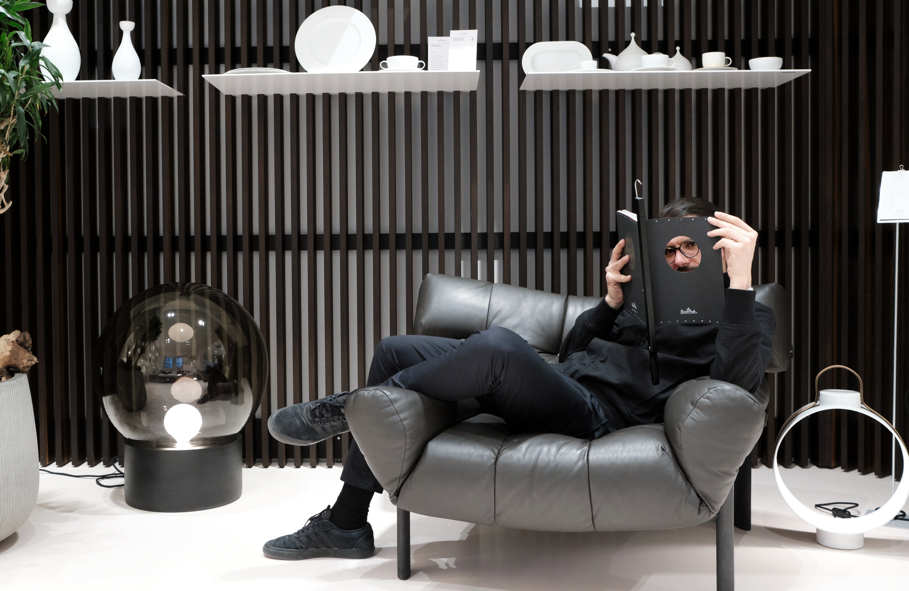
A highlight of the production is the die-cut circle on the cover, which symbolically represents all of Rosenthal’s plates and allows the first page to shine through in a special neon red color. Other distinctive features include the black-dyed paper, white screen printing and the colored edges, with the German version in black and the English version in neon red.
CREDITS
. Editorial Content: Rosenthal
. Case Shoot: Joern Blohm
. Store Shoot: Jan Averwerser
SERVICES
. Editorial Design
. Print- and Refinement Concept
. Icon Design
BLOG
ARTIKEL, PROJEKTE UND VIDEOS
How I developed a methodology to bring creativity into the flow [»Be Water my Friend«]
Article Rafael Bernardo — »Be Water my Friend« Creative Methodology EN
How I rediscovered myself through a personal design project [»Be Water my Friend«]
Article Rafael Bernardo — »Be Water my Friend« Graphic Journey EN
